8.1 परिचय

ऑस्सिलेटिंग इंडिकेटर, जैसा कि उनके नाम से पता चलता है, ऐसे इंडिकेटर हैं जो करेंसी पेयर बढ़ने और गिरने के साथ वापस और आगे बढ़ते हैं. ऑस्सिलेटिंग इंडिकेटर आपको यह निर्धारित करने में मदद कर सकते हैं कि करेंसी पेयर का मौजूदा ट्रेंड कितना मजबूत है और जब वह ट्रेंड मोमेंटम खोने और चारों ओर घूमने का खतरा होता है.
जब कोई ऑस्सिलेटिंग इंडिकेटर बहुत अधिक बढ़ता है, तो स्टॉक को ओवरबॉग माना जाता है (बहुत से लोगों ने स्टॉक खरीदा है और स्टॉक को अधिक बढ़ाने के लिए मार्केट में पर्याप्त खरीदार नहीं हैं). यह दर्शाता है कि स्टॉक गति को खोने और नीचे या साइडवे में जाने के जोखिम पर है. जब कोई ऑस्सिलेटिंग इंडिकेटर बहुत कम हो जाता है, तो स्टॉक को ओवरसोल्ड माना जाता है (बहुत से लोगों ने स्टॉक बेच दिया है और स्टॉक को कम करने के लिए मार्केट में पर्याप्त सेलर बाकी नहीं हैं). यह दर्शाता है कि स्टॉक में मोमेंटम खोने का जोखिम होता है और उच्च या साइडवे के लिए घूमने का जोखिम होता है.
विभिन्न ऑसिलेटर को समझने से पहले, यह समझना एक अच्छा विचार है कि मोमेंटम का क्या मतलब है. मोमेंटम वह दर है जिस पर कीमत बदलती है. उदाहरण के लिए, अगर स्टॉक की कीमत आज ₹100 है और यह अगले दिन ₹105 और दिन के बाद ₹115 हो जाती है, तो हम कहते हैं कि मोमेंटम अधिक है क्योंकि स्टॉक की कीमत केवल 3 दिनों में 15% बदल गई है. हालांकि, अगर ऐसा 15% बदलाव हुआ है, तो हम 3 महीने के लिए, हम यह निष्कर्ष निकाल सकते हैं कि मोमेंटम कम है. इसलिए अधिक तेज़ कीमत में बदलाव, अधिक गति.
महत्वपूर्ण ऑस्सिलेटिंग इंडिकेटर हैं:
- मूविंग एवरेज कन्वर्जेंस डाइवर्जेंस (MACD)
- स्टोकैस्टिक
- रिलेटिव स्ट्रेंथ इंडेक्स (आरएसआई)
8.2 मूविंग एवरेज कन्वर्जेंस एंड डाइवर्जेंस (MACD)

सत्तर के अंत में, जेराल्ड एप्पल ने मूविंग एवरेज कन्वर्जेंस एंड डाइवर्जेंस (MACD) इंडिकेटर विकसित किया. ट्रेडर्स MACD को इंडिकेटर्स के ग्रैंड ओल्ड डैडी के रूप में मानते हैं. हालांकि सतहत्तर में खोजा गया है, लेकिन MACD को अभी भी सबसे विश्वसनीय मोमेंटम ट्रेडर्स इंडिकेटर में से एक माना जाता है.
जैसा कि नाम से पता चलता है, MACD दो मूविंग एवरेज के कन्वर्जेंस और डाइवर्जेंस के बारे में है. कन्वर्जेंस तब होता है जब दो मूविंग एवरेज एक-दूसरे की ओर बढ़ते हैं, और एवरेज मूव करते समय डाइवर्जेंस होता है.
स्टैंडर्ड MACD की गणना 12 दिन के EMA और 26 दिन के EMA का उपयोग करके की जाती है. कृपया ध्यान दें, दोनों ईएमए क्लोजिंग प्राइस पर आधारित हैं. कन्वर्जेंस और डाइवर्जेंस (CD) वैल्यू का अनुमान लगाने के लिए, हम 12 दिन के EMA से 26 EMA घटाते हैं. इसकी एक सरल लाइन ग्राफ को अक्सर 'MACD लाइन' कहा जाता है'.
उदाहरण के लिए- अगर 6th जनवरी 2014, 12 दिन के स्टॉक के लिए EMA 6153 था, और 26 दिन का EMA 6198 था. इसलिए MACD 6153-6198=- 45 होगा
MACD से जुड़े साइन, स्टॉक के मूव की दिशा को दर्शाता है. उदाहरण के लिए, अगर 12 दिन का EMA 6380 है, और 26 दिन का EMA 6220 है, तो MACD वैल्यू +160 है. आपको लगता है कि 12 दिन का EMA 26 दिन की EMA से अधिक होगा? जब-शॉर्ट-टर्म औसत आमतौर पर लॉन्ग टर्म से अधिक होती है, तब जब स्टॉक की कीमत बढ़ जाती है.
याद रखें, शॉर्ट-टर्म एवरेज हमेशा लॉन्ग टर्म एवरेज की तुलना में वर्तमान मार्केट प्राइस के प्रति अधिक रिएक्टिव रहेगा. एक सकारात्मक संकेत हमें बताता है कि स्टॉक में सकारात्मक गति है, और स्टॉक ऊपर की ओर बढ़ रहा है. उच्च गति, उच्च मात्रा है. उदाहरण के लिए, +160 एक पॉजिटिव ट्रेंड को दर्शाते हैं जो +120 से मजबूत है.
जब MACD नेगेटिव है, तो इसका मतलब है 12 दिन का EMA 26 दिन की EMA से कम है. इसलिए मोमेंटम नेगेटिव है. MACD की उच्च मात्रा, नीचे के ट्रेंड में अधिक शक्ति.
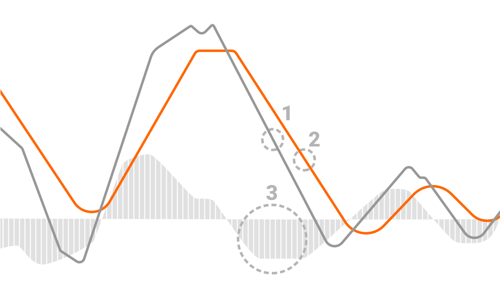
सिग्नल लाइन MACD इंडिकेटर का एक और हिस्सा है. इसकी वैल्यू के अनुसार, हम MACD लाइन के 9-अवधि के EMA का उपयोग करते हैं. इसका उद्देश्य ट्रेंड में टर्निंग पॉइंट होने पर पहचान करके ट्रेडिंग सिग्नल जनरेट करने में मदद करना है. इंडिकेटर का अंतिम भाग मूविंग एवरेज कन्वर्जेंस डाइवर्जेंस हिस्टोग्राम है. यह MACD लाइन और सिग्नल लाइन के बीच दूरी को दर्शाता है. अगर MACD लाइन सिग्नल लाइन से ऊपर है, तो हिस्टोग्राम पॉजिटिव है, और इसके विपरीत है.
इंडिकेटर का पढ़ना:
इंडिकेटर में तीन तत्व होते हैं जो शून्य लाइन के आस-पास चलते हैं: MACD लाइन, सिग्नल लाइन और हिस्टोग्राम. इनमें से प्रत्येक के बारे में कुछ और बताया गया है:
- MACD लाइन (12-पीरियड EMA - 26-पीरियड EMA) - यह ट्रेडर को आगामी बुलिश और बेयरिश मार्केट ट्रेंड निर्धारित करने में मदद करता है;
- सिग्नल लाइन (MACD लाइन का 9-पीरियड EMA) - इसका विश्लेषण MACD लाइन के अलावा किया जाता है, ताकि ट्रेंड रिवर्सल को स्पॉट करने और सबसे उपयुक्त एंट्री और एग्जिट पॉइंट को मार्क करने में मदद मिल सके;
- हिस्टोग्राम (MACD लाइन - सिग्नल लाइन) - हिस्टोग्राम पिछले दो, MACD और सिग्नल लाइनों के कन्वर्जेंस और डाइवर्जेंस का ग्राफिकल रिप्रेजेंटेशन प्रदान करता है;
इनमें से प्रत्येक पंक्ति का एक अलग मूल्य होता है. पॉजिटिव वैल्यू वाली MACD लाइन से पता चलता है कि कम EMA लंबे EMA से अधिक है. इसके अलावा छोटा ईएमए लंबे समय से है, एमएसीडी लाइन की पॉजिटिव वैल्यू में बड़ी वृद्धि. यह ऊपर की ओर बढ़ने की गति का संकेत है. दूसरी ओर, नेगेटिव MACD से पता चलता है कि छोटा EMA एक से कम समय तक है. एक बार फिर, नकारात्मक मूल्य बढ़ जाते हैं क्योंकि दोनों रेखाएं और भिन्न हो जाती हैं. उस मामले में, हमारे पास एक बढ़ता डाउनसाइड मोमेंटम है.
एक्सपोनेन्शियल मूविंग एवरेज के मूवमेंट के आधार पर, उनके बीच सहसंबंध या तो भिन्न या अभिसरण हो सकता है. विविधता तब होती है जब दोनों एक-दूसरे से दूर हो रहे होते हैं, जबकि अभिसरण तब होता है जब वे करीब हो रहे होते हैं.
8.3 MACD का उपयोग कब करें?

- क्रासिंग पॉइंट - अगर MACD शून्य से अधिक हो जाता है, तो सिग्नल बुलिश होता है. अगर यह ज़ीरो से कम हो जाता है, तो यह दर्शाता है कि बियर मार्केट को ओवरटेक कर रहे हैं.
- जहां यह शुरू होता है -अगर MACD ऊपर के शून्य से नीचे चला जाता है, तो यह एक बीयर सिग्नल है. दूसरी ओर, अगर यह शून्य से नीचे से आता है, तो इसे एक बुलिश सिग्नल मानें.
- पार करने की दिशा – अगर MACD नीचे से ऊपर तक जाता है, तो सिग्नल बुलिश होता है, और इसके विपरीत होता है. शून्य से आगे, मजबूत जनरेट किया हुआ सिग्नल है.
MACD का उपयोग करके ट्रेडिंग सिग्नल
मूविंग एवरेज कन्वर्जेंस डाइवर्जेंस के साथ, जब यह सिग्नल लाइन को पार करता है तो प्राथमिक खरीद साइन की तलाश होती है. इसका मतलब यह है कि मोमेंटम शिफ्ट हो रहा है, और बुल्स का अधिग्रहण हो रहा है. जब MACD सिग्नल लाइन से नीचे होता है तो एक और खरीद सिग्नल भी ट्रिगर होता है, और दोनों ज़ीरो लाइन से नीचे होते हैं. यदि MACD लाइन फिर संकेत लाइन के ऊपर खिसकती है, तो आपके पास एक खरीद संकेत है. यह वही स्थिति है जब ऑर्डर बेचने की बात आती है. MACD लाइन सिग्नल लाइन के नीचे गिरने के बाद, डाउनसाइड मोमेंटम शिफ्ट होता है.
संक्षेप में,
एंट्री सिग्नल - जब MACD ट्रिगर लाइन से ऊपर पहुंच जाता है, तो आप यह जानकर स्टॉक खरीद सकते हैं कि मोमेंटम बेयरिश से बुलिश हो गया है. जब MACD ट्रिगर लाइन से नीचे जाता है, तो आप यह जानकर स्टॉक बेच सकते हैं कि मोमेंटम बुलिश होने से बेयरिश होने में बदल गया है.
एक्जिट सिग्नल - जब MACD स्टॉक खरीदने पर ट्रिगर लाइन के नीचे वापस पार हो जाता है, तो आप स्टॉक को वापस बेच सकते हैं यह जानकर कि मोमेंटम बुलिश होने से बेयरिश हो गया है. जब आप स्टॉक बेचते हैं, तो जब MACD ट्रिगर लाइन के ऊपर वापस आ जाता है, तो आप स्टॉक वापस खरीद सकते हैं, यह जानकर कि मोमेंटम बेयरिश से बुलिश हो गया है.
अगर आप केवल दोनों लाइनों को देखकर MACD इंडिकेटर को समझने में संघर्ष करते हैं, तो आप इसके बजाय हिस्टोग्राम का उपयोग कर सकते हैं. यहां स्पष्टीकरण बहुत आसान है - अगर हिस्टोग्राम ऊपर की ओर बढ़ रहा है, तो आपके पास बुलिश सिग्नल है, और आप खरीद सकते हैं. अगर यह नीचे की ओर जाता है, तो आपके पास एक बेयरिश सिग्नल है, और आप बेच सकते हैं. हालांकि, बार के आकार को भी देखना सुनिश्चित करें. जब हिस्टोग्राम शून्य से कम है, तो बार ऊपर-नीचे हो जाते हैं. उस मामले में, अगर वे छोटे हो रहे हैं, तो इसका मतलब है कि बीयर कमजोर हो रहे हैं. हालांकि, सुनिश्चित करें कि बार ज़ीरो लाइन से ऊपर होने पर ही खरीदें.
MACD क्रॉसओवर के 8.4 प्रकार

क्रॉसओवर महत्वपूर्ण संकेत हैं जो MACD आपको पहचानने में मदद कर सकता है. क्रॉसओवर तब होता है जब MACD लाइन शून्य से ऊपर या नीचे या सिग्नल लाइन को पार कर जाती है. MACD आपको अपेक्षाकृत उच्च सटीकता के साथ सिग्नल लाइन क्रॉसओवर और ज़ीरो लाइन क्रॉसओवर दोनों की पहचान करने में मदद कर सकता है. अब आइए क्रॉसओवर के प्रकारों पर एक नज़र डालें:
सिग्नल लाइन क्रॉसओवर
यह सबसे आम संकेत है जो MACD उत्पन्न कर सकता है. सिग्नल लाइन मूल रूप से एक संकेतक का संकेतक है क्योंकि यह MACD लाइन के EMA की गणना करता है, यही कारण है कि यह पीछे रह जाता है.
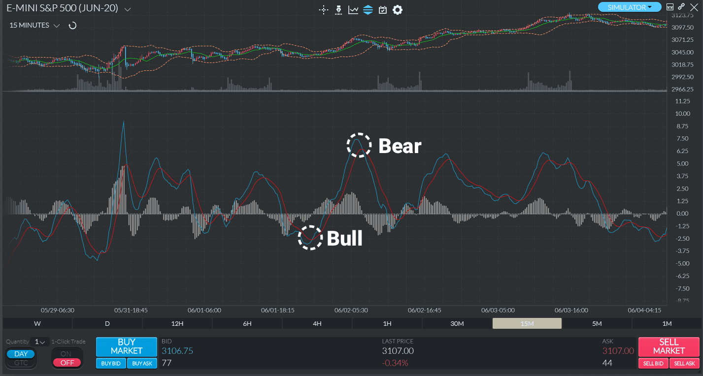
इसलिए, जब MACD लाइन सिग्नल लाइन से ऊपर या उससे नीचे पार हो जाती है, तो सिग्नल लाइन क्रॉसओवर होता है. मूव की ताकत यह निर्धारित करती है कि कितने समय तक क्रॉसओवर चलेगा. जब MACD लाइन सिग्नल लाइन से ऊपर पार करती है तो बुलिश सिग्नल लाइन क्रॉसओवर देखा जा सकता है. इसके विपरीत, जब MACD लाइन सिग्नल लाइन से नीचे की लाइन को पार करती है, तो बेयरिश क्रॉसओवर होता है.
नीचे दिए गए चार्ट पर, आपको बुलिश और बियरिश सिग्नल लाइन क्रॉसओवर के दो हाइलाइट किए गए उदाहरण दिखाई देंगे. ट्रेडेड इंस्ट्रूमेंट ES है. ब्लू लाइन MACD लाइन है, जबकि रेड लाइन सिग्नल लाइन है.
ज़ीरो लाइन क्रॉसओवर
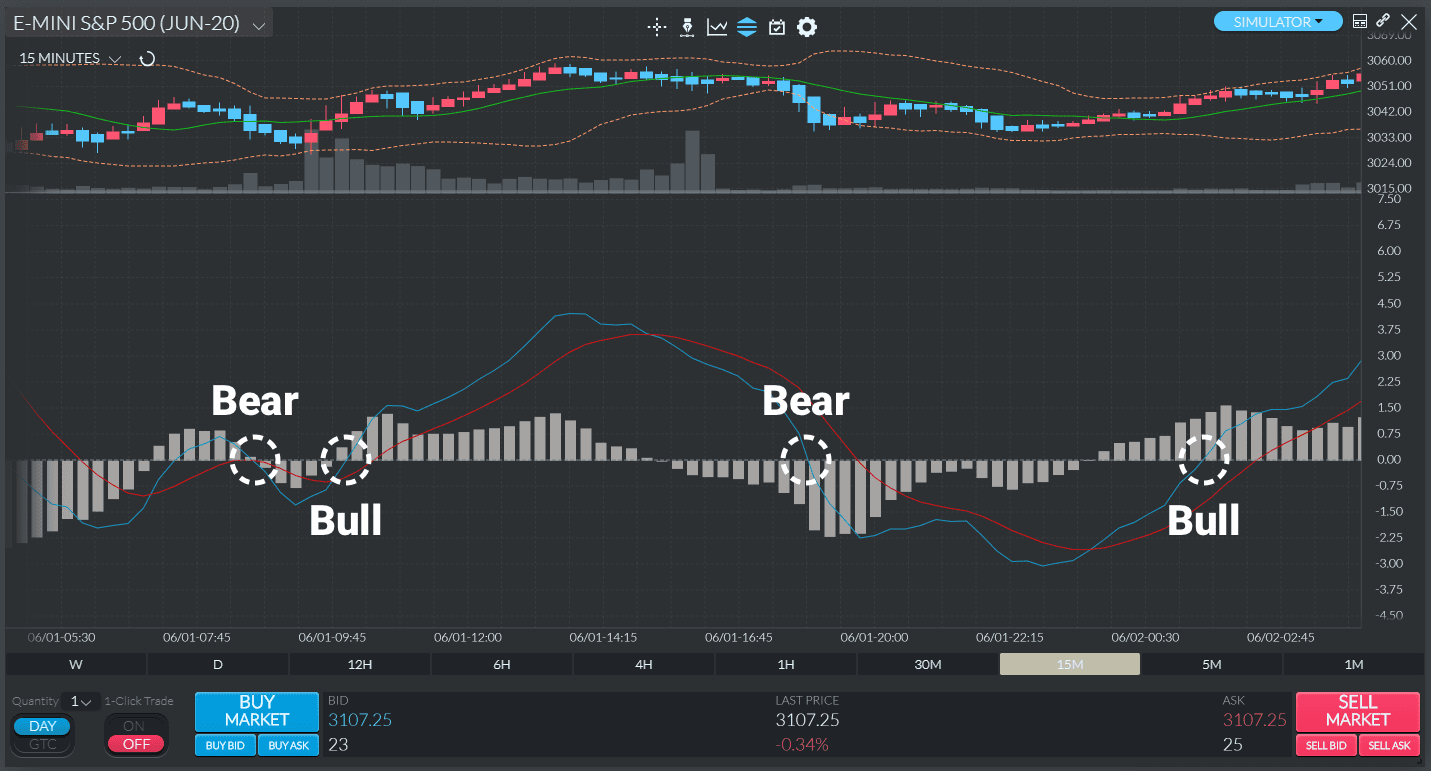
ज़ीरो लाइन क्रॉसओवर, जिसे "सेंटरलाइन क्रॉसओवर" भी कहा जाता है, तब होता है जब MACD लाइन शून्य लाइन को पार करती है और या तो पॉजिटिव या नेगेटिव बन जाती है. अगर MACD ज़ीरो लाइन से ऊपर और पॉजिटिव हो जाता है, तो हमारे पास बुलिश क्रॉसओवर है. अगर यह इसके नीचे पार हो जाता है और नेगेटिव हो जाता है, तो हमारे पास एक बेयरिश क्रॉसओवर है.
नीचे दिए गए चार्ट पर, आप बुलिश और बेयरिश ज़ीरो लाइन क्रॉसओवर के उदाहरण देखेंगे जो निर्धारित अवधि के दौरान कई बार हो रहे हैं. ट्रेडेड इंस्ट्रूमेंट AAPL है. ब्लू लाइन MACD लाइन है, जबकि ऑरेंज लाइन सिग्नल लाइन है.
MACD डाइवर्जेंस
MACD द्वारा उत्पन्न अन्य अत्यंत मूल्यवान सिग्नल डाइवर्जेंस है. विविधता ऐसी स्थिति का वर्णन करती है जिसमें MACD लाइन और इंस्ट्रूमेंट की कीमत विपरीत दिशा में जाती है. इसकी सीमाओं के कारण, आपको MACD डाइवर्जेंस का सावधानीपूर्वक और हमेशा अन्य सिग्नल के अलावा विश्लेषण करना चाहिए. ऐसा इसलिए है क्योंकि यह अक्सर गलत पॉजिटिव पैदा कर सकता है (यानी, एक संभावित ट्रेंड रिवर्सल को दर्शाता है जो बाद में कभी भौतिक नहीं होता है). इसके अलावा, यह कभी-कभी होने वाले सभी रिवर्सल की भविष्यवाणी करने का प्रबंध करता है. संक्षेप में, MACD डाइवर्जेंस कई रिवर्सल की भविष्यवाणी कर सकता है जो नहीं होते हैं, साथ ही वास्तविक रिवर्स को मिस कर सकता है.
MACD डाइवर्जेंस के दो प्रकार हैं - बुलिश और बेयरिश. जब इंस्ट्रूमेंट की कीमत कम हो जाती है और MACD अधिक कम हो जाती है, तो डाइवर्जेंस बुलिश होता है. दूसरी ओर, बेयरिश डाइवर्जेंस, ऐसी स्थिति का वर्णन करता है जहां MACD कम उच्च रिकॉर्ड करता है, जबकि कीमत अधिक है. बुलिश डाइवर्जेंस आमतौर पर मजबूत डाउनट्रेंड के दौरान होते हैं, जबकि बेयरिश डाइवर्जेंस मजबूत अपट्रेंड में होते हैं. नीचे दिए गए चार्ट पर, आप दोनों प्रकारों का उदाहरण देख सकते हैं.
8.5. रिलेटिव स्ट्रेंथ इंडेक्स (आरएसआई)

रिलेटिव स्ट्रेंथ Index (RSI) टेक्निकल एनालिसिस में सबसे व्यापक रूप से इस्तेमाल किए जाने वाले ट्रेडिंग इंडिकेटर में से एक है. इसे 1978 में जे. वेल्स विल्डर जूनियर द्वारा विकसित किया गया था, जिसे 1980 में फोर्ब्स मैगजीन द्वारा "अपने कार्य को आज प्रकाशित करने वाले प्रीमियर टेक्निकल ट्रेडर" के रूप में प्रकाशित किया गया था. सही तरीके से लागू, आरएसआई ट्रेडर को ओवरबॉट और ओवरसोल्ड मार्केट के संकेतों को पहचानने में मदद कर सकता है
रिलेटिव स्ट्रेंथ इंडेक्स एक इंडिकेटर है जो ट्रेडर को कीमत के उतार-चढ़ाव की मात्रा को मापकर मार्केट की गति को कैप्चर करने में मदद करता है. ट्रेडर ओवरसोल्ड और ओवरबॉट मार्केट को पहचानने और यह तय करने के लिए आरएसआई का उपयोग करते हैं कि किसी पोजीशन को कब खोलना है. इस प्रकार, आरएसआई पूर्वनिर्धारित अवधि में इसकी शक्ति और कमजोरी के बारे में अनुमान लगाने के लिए औसत लाभ और सिक्योरिटी के औसत नुकसान की तुलना करता है.
RSI स्केल को 0 से 100 तक प्लॉट किया जाता है, जिसमें क्षैतिज रेखाएं 70 और 30 स्तरों पर बनाई जाती हैं. 70 से अधिक की RSI रीडिंग को ओवरबॉट माना जाता है. 30 से कम की RSI रीडिंग को ओवरसोल्ड माना जाता है. RSI के लिए सबसे लोकप्रिय समय अवधि 9 और 14 दिन है.
आरएसआई सेक्योरिटी की आंतरिक शक्ति दर्शाता है.
आरएसआई की गणना करने का फॉर्मूला इस प्रकार है:
आरएसआई = 100- (100/1 + रु)
₹ = औसत लाभ/औसत हानि
आइए नीचे दिए गए उदाहरण की मदद से इस इंडिकेटर को समझें:
मान लें कि स्टॉक 0 दिन 199 पर ट्रेडिंग कर रहा है, इसके परिप्रेक्ष्य में; निम्नलिखित डेटा पॉइंट पर विचार करें:
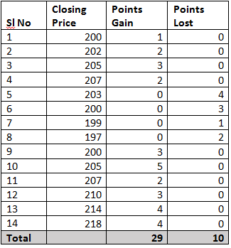
उपरोक्त टेबल में, प्राप्त/खोए गए पॉइंट पिछले दिन के बंद के संबंध में प्राप्त/खोए गए पॉइंट की संख्या को दर्शाते हैं. उदाहरण के लिए, अगर आज का बंद 204 है और कल का बंद 200 था, तो लाभ प्राप्त पॉइंट 4 होंगे और खोए गए पॉइंट 0 होंगे. इसी प्रकार, अगर आज का बंद 204 था और पिछले दिन का बंद 207 था, तो लाभ प्राप्त पॉइंट 0 होंगे और खोए गए पॉइंट 3 होंगे. कृपया ध्यान दें कि नुकसान की गणना सकारात्मक मूल्यों के रूप में की जाती है.
हमने चार्टिंग सॉफ्टवेयर में डिफॉल्ट अवधि सेटिंग, कैलकुलेशन के लिए 14 डेटा पॉइंट का उपयोग किया है. इसे 'लुक-बैक पीरियड' भी कहा जाता है'. अगर आप घंटे के चार्ट का विश्लेषण कर रहे हैं, तो डिफॉल्ट अवधि 14 घंटे है, और अगर आप दैनिक चार्ट का विश्लेषण कर रहे हैं, तो डिफॉल्ट अवधि 14 दिन है.
पहला चरण 'RS' की गणना करना है जिसे RSI कारक भी कहा जाता है. जैसा कि आप फॉर्मूला में देख सकते हैं, RS औसत पॉइंट खोने से प्राप्त औसत पॉइंट का रेशियो है.
प्राप्त औसत अंक = 29/14
= 2.07
औसत पॉइंट खो गया है = 10/14
= 0.714
₹ = 2.07/0.714
= 2.8991
आरएसआई फॉर्मूला में रु. की वैल्यू में प्लगिंग,
= 100 – [100/ (1+2.8991)]
= 100 – [100/3.8991]
= 100 – 25.6469
आरएसआई = 74.3531
RSI की गणना बहुत आसान है. RSI का उपयोग करने का उद्देश्य ट्रेडर को ओवरसोल्ड और ओवरबॉट प्राइस एरिया की पहचान करने में मदद करना है. ओवरबॉट का मतलब है कि स्टॉक की सकारात्मक गति इतनी अधिक है कि यह लंबे समय तक टिकाऊ नहीं हो सकती है, और इसलिए सुधार हो सकता है. इसी प्रकार, एक ओवरसोल्ड पोजीशन यह दर्शाती है कि नेगेटिव मोमेंटम अधिक है, जिससे संभावित रिवर्सल हो सकता है.
आरएसआई में रेंज
जब RSI रीडिंग 30 से 0 के बीच होती है, तो सिक्योरिटी को ओवरसोल्ड किया जाना चाहिए और ऊपर की ओर सुधार के लिए तैयार किया जाना चाहिए. जब सिक्योरिटी रीडिंग 70 से 100 के बीच होती है, तो सिक्योरिटी को भारी रूप से खरीदा जाना चाहिए और डाउनवर्ड सुधार के लिए तैयार किया जाना चाहिए.
8.6 आरएसआई इंडिकेटर बाय एंड सेल सिग्नल

सिग्नल खरीदें
हम ट्रेंड रिवर्सल और ट्रेंड कन्फर्मेशन के संकेतों से संबंधित तीन परिस्थितियों पर नज़र डालेंगे. वे सभी डाउनवर्ड मार्केट मूवमेंट के दौरान देखे जाते हैं.
बुलिश ओवरसोल्ड सिग्नल
बुलिश ओवरसोल्ड सिग्नल एक ट्रेंड रिवर्सल सिग्नल है जो उन स्थितियों में होता है जहां RSI 30% से कम होता है और वापस बाउंस होता है. इसमें कोई अंतर नहीं है कि यह कितना कम होगा. यहां महत्वपूर्ण बात यह है कि इसे फिर से 30% मार्क से ऊपर उठना है. एक बार ऐसा होने के बाद, यह संकेत है कि बुल्स अपना रहे हैं, और एक नया ऊपर की ओर रुझान बना रहा है.
इसे कैसे ट्रेड करें? ओपन पोजीशन के बिना ट्रेडर लंबे समय तक जा सकते हैं. जिन ट्रेडर्स ने अपने सेल ऑर्डर को पहले ही बंद कर दिया है, वे लाभ को लॉक कर सकते हैं और खरीद ऑर्डर खोल सकते हैं.
बुलिश (सकारात्मक) डायवर्जेंस सिग्नल
यह एक और ट्रेंड रिवर्सल सिग्नल है जो RSI और कीमत एक-दूसरे से डाइवर्ट होने पर होता है. ऐसा तब होता है जब कीमत कम हो जाती है और आरएसआई अधिक कम हो जाती है. इस इवेंट की पुनरावृत्ति की संख्या के आधार पर, ट्रेडर सिग्नल बनाने की ताकत का अनुमान लगा सकता है (अधिक, बुल के लिए बेहतर). यह दर्शाता है कि आरएसआई और प्राइस मूवमेंट दोनों को देखना आवश्यक है.
जो ट्रेडर सकारात्मक विचलन संकेतों को पहचानते हैं, उन्हें पता होना चाहिए कि शॉर्ट-टर्म लाभ लगभग हैं. ओवरसोल्ड मार्केट के संकेत के साथ, इस संकेत को खरीद ऑर्डर के लिए एक बहुत शक्तिशाली ट्रिगर माना जाता है.
सेल सिग्नल
यहां हम तीन परिस्थितियों पर भी नज़र डालेंगे, जो ट्रेंड रिवर्सल या कन्फर्मेशन सिग्नल को दर्शाते हैं. इन्हें ऊपर की ओर मार्केट मूवमेंट के दौरान देखा जाता है, जहां RSI संभावित बिक्री दबाव को दर्शाता है.
बेयरिश ओवरबॉट सिग्नल
बेयरिश ओवरबॉट सिग्नल दर्शाता है कि ट्रेंड रिवर्सल कब होने वाला है. ऐसे संकेत को पहचानने के लिए, ऐसी स्थितियों को देखना सुनिश्चित करें जहां आरएसआई 70% मार्क से अधिक हो और फिर इसके नीचे वापस आ जाए. इसे एक कन्फर्मेशन के रूप में लें कि बीयर मजबूत हो रहे हैं, और ट्रेंड रिवर्सल जल्द ही होने वाला है.
लंबी पोजीशन वाले ट्रेडर अपने लाभ को लॉक कर सकते हैं और अपनी ओपन पोजीशन को बंद कर सकते हैं ताकि वे बिक्री के साथ मार्केट से बाहर निकल सकें. ओपन पोजीशन के बिना ट्रेडर इस सिग्नल को शॉर्ट पोजीशन खोलने के लिए ग्रीन लाइट के रूप में विचार कर सकते हैं.
बेरिश (नेगेटिव) डाइवर्जेंस सिग्नल
बुलिश डाइवर्जेंस सिग्नल के विपरीत, बियरिश को देखा जाता है जब RSI कम उच्च होता है, और कीमत अधिक होती है. एक बार फिर, यह प्रोसेस अधिक बार-बार हो रही है, मजबूत आगामी बियरिश सिग्नल होगा. यह एक और ट्रेंड रिवर्सल सिग्नल है जो RSI और प्राइस मूवमेंट दोनों को ध्यान में रखने और उनमें से किसी का अलग-अलग विश्लेषण न करने के महत्व की पुष्टि करता है.
नकारात्मक अंतर की उपस्थिति से पता चलता है कि ट्रेडर को ट्रेडेड एसेट की कीमतों में शॉर्ट-टर्म कमी की उम्मीद करनी चाहिए. टेक्निकल एनालिस्ट इसे ओवरबॉट सिग्नल के साथ जोड़ने का सुझाव देते हैं ताकि आपको कब बेचना चाहिए इसका बेहतर संकेत मिल सके.
8.7 रियल लाइफ एप्लीकेशन

कभी-कभी अन्य टेक्निकल इंडिकेटर और RSI ट्रेंड की घटना को कन्फर्म करने के लिए पूरी तरह से अलाइन नहीं होते हैं. इस परिदृश्य में- आरएसआई की व्याख्या करने का एक और दिलचस्प तरीका है. निम्नलिखित दो परिस्थितियों की कल्पना करें:
परिस्थिति 1) एक स्टॉक जो लगातार अपट्रेंड में है (याद रखें कि अपट्रेंड कुछ दिनों से कुछ वर्षों तक चल सकता है) RSI लंबे समय तक ओवरबॉट क्षेत्र में फंसे रहेगा, और ऐसा इसलिए है क्योंकि RSI 100 के लिए ऊपरी स्तर पर बाध्य है. यह 100 से अधिक नहीं हो सकता है. ट्रेडर हमेशा अवसरों को कम करने पर विचार करेगा, लेकिन स्टॉक, दूसरी ओर, एक अलग कक्षा में होगा.
परिस्थिति 2)एक स्टॉक जो निरंतर डाउनट्रेंड में है, RSI ओवरसोल्ड क्षेत्र में फंस जाएगा क्योंकि यह 0 तक कम है. यह 0 से अधिक नहीं हो सकता है. इस मामले में, ट्रेडर खरीदने के अवसरों पर विचार करेगा, लेकिन स्टॉक कम हो जाएगा.
इससे हमें क्लासिकल अर्थव्यवस्था के अलावा कई अलग-अलग तरीकों से आरएसआई की व्याख्या करने में मदद मिलती है –
- अगर आरएसआई लंबे समय तक ओवरबॉट क्षेत्र में फिक्स्ड है, तो शॉर्टिंग के बजाय खरीदने के अवसरों की तलाश करें. अधिक पॉजिटिव मोमेंटम के कारण आरएसआई लंबे समय तक ओवरबॉट क्षेत्र में रहता है.
- अगर आरएसआई लंबे समय तक ओवरसोल्ड क्षेत्र में फिक्स्ड है, तो खरीदने के बजाय बेचने के अवसरों की तलाश करें. अधिक नेगेटिव मोमेंटम के कारण आरएसआई लंबे समय तक ओवरसोल्ड क्षेत्र में रहता है
- अगर आरएसआई वैल्यू लंबी अवधि के बाद ओवरसोल्ड वैल्यू से दूर होना शुरू करती है, तो खरीदने के अवसरों की तलाश करें. उदाहरण के लिए, आरएसआई लंबे समय के बाद 30 से अधिक हो जाता है, इसका मतलब यह हो सकता है कि स्टॉक नीचे आ गया हो, इसलिए लंबे समय तक जाने का मामला हो सकता है.
- अगर आरएसआई वैल्यू लंबी अवधि के बाद ओवरबॉट वैल्यू से दूर होना शुरू करती है, तो बिक्री के अवसरों की तलाश करें. उदाहरण के लिए, आरएसआई लंबे समय के बाद 70 से कम हो रहा है. इसका मतलब है कि स्टॉक टॉप आउट हो सकता है, इसलिए शॉर्टिंग का मामला.
8.8 स्टोकैस्टिक्स

स्टॉकास्टिक ऑसिलेटर चार्ट आपको फाइनेंशियल एसेट की कीमत में गति की पहचान करने की अनुमति देता है. इस सूचक के मूल में स्टोकैस्टिक ऑसिलेटर फॉर्मूला है. यह सिक्योरिटी की क्लोजिंग प्राइस की तुलना हाल ही की उच्च और कम कीमतों से करता है. फिर आप इसे 0 और 100 के बीच एक आंकड़ा में बदल देते हैं जो वास्तविक स्टॉकास्टिक ऑसिलेटर मूल्य है.
एक ओर, स्टॉकास्टिक ऑसिलेटर ऊपर और नीचे दोनों ओर गति का संकेतक है. दूसरी ओर, कुछ ट्रेडर इसे ओवरबॉट और ओवरसोल्ड कीमतों के संकेतक के रूप में देखते हैं. दोनों सिद्धांत में सही हैं. महत्वपूर्ण अंतर यह है कि आप अपनी इन्वेस्टमेंट स्ट्रेटजी के भीतर इंडिकेटर का उपयोग कैसे करते हैं.
स्टोकैस्टिक ऑसिलेटर कैसे काम करता है?
स्टोकैस्टिक ऑसिलेटर के पीछे की मूल अवधारणा गति है. यह आपको एसेट की कीमत की गति पर नज़र रखने की क्षमता देता है. ऐसा करने से आप यह देख सकते हैं कि हाल ही के उच्च और निचले स्तरों की तुलना में यह संभावित रूप से ओवरसोल्ड है या ओवरबॉइड है. हालांकि, इसमें एक संभावित गड़बड़ी है.
एक सरल उदाहरण
आकाश में एक रॉकेट की गोलीबारी का चित्र उदाहरण. यह केवल अचानक बंद नहीं होगा और ईंधन समाप्त होने के तुरंत बाद पृथ्वी पर वापस नहीं आएगा. फेडिंग मोमेंटम इसे काफी गिरती गति पर उच्च स्तर पर धकेलना जारी रखेगा. हालांकि, जब पॉजिटिव मोमेंटम अंततः समाप्त हो जाता है, तो रॉकेट बदल जाएगा और पृथ्वी की ओर वापस जाएगा. इसके परिणामस्वरूप, यह रास्ते में नई गति का निर्माण करता है. यह स्टोकैस्टिक ऑसिलेटर के पीछे का विचार है. तुलना के लिए हाल ही के हाई और लो का उपयोग करके, आपको मोमेंटम में बदलाव की पहचान करने में सक्षम होना चाहिए. यह परिणाम चार्ट में भी दिखाई देना चाहिए.
एक सामान्य सहमति है कि जब स्टोकैस्टिक ऑसिलेटर का स्तर 20 से कम होता है, तो यह दर्शाता है कि एसेट की अधिक बिक्री हो जाती है. इस बीच, अगर यह 80 से अधिक हो जाता है, तो यह दर्शाता है कि एसेट ओवरबॉट है. आइए हमारी मिड-वैल्यू के रूप में 50 लेते हैं. सिद्धांत में, सकारात्मक गति रेखा से ऊपर है, जबकि नकारात्मक गति इसके नीचे है.
स्टोकैस्टिक ऑसिलेटर फॉर्मूला
![]()
C= सबसे हाल ही की क्लोजिंग प्राइस
L14 = पिछले 14 ट्रेडिंग सेशन में सबसे कम कीमत पर ट्रेड की जाती है
H14 = पिछले 14 ट्रेडिंग सेशन में ट्रेड की गई उच्चतम कीमत
% K = स्टॉकैस्टिक इंडिकेटर की वर्तमान वैल्यू प्रतिशत के रूप में
आइए एक उदाहरण लेते हैं- उदाहरण के लिए, मान लें कि ब्रिटानिया के निम्नलिखित स्तर हैं
वर्तमान लेवल = 3555
लो पॉइंट पिछले 14 ट्रेडिंग सेशन = 3430
हाई पॉइंट पिछले 14 ट्रेडिंग सेशन = 3800
तो गणना इस प्रकार है:-
3500-3430/3800-3430 = 125/370
(125/370) x 100 = 33%
इसलिए, स्टोकैस्टिक ऑसिलेटर इंडिकेटर के अनुसार, ब्रिटानिया में कम गति है और संभावित रूप से "ओवरसोल्ड" क्षेत्र में है. कई लोग इसे 14 ट्रेडिंग सेशन के आधार पर स्टैंडर्ड स्टोकैस्टिक ऑसिलेटर इंडिकेटर कैलकुलेशन के रूप में वर्गीकृत करेंगे.
संक्षेप में,
- आमतौर पर, 80 से अधिक का क्षेत्र एक ओवरबॉट क्षेत्र को दर्शाता है, जबकि 20 से कम के क्षेत्र को ओवरसोल्ड क्षेत्र माना जाता है.
- जब ऑसिलेटर 80 लेवल से अधिक होता है और फिर 80 से नीचे वापस जाता है, तो सेल सिग्नल दिया जाता है.
इसके विपरीत, जब ऑसिलेटर 20 से कम होता है और फिर 20 से अधिक को पार करता है तो खरीद सिग्नल दिया जाता है.


