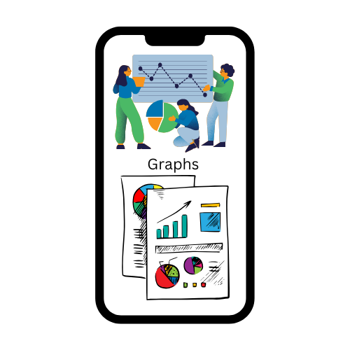
In the realm of finance, information is power. The ability to analyze, understand, and act upon data can mean the difference between financial stability and missed opportunities. One of the most effective tools for interpreting financial data is the use of graphs. Visualizations, such as line charts, bar graphs, and pie charts, simplify complex information, making it easier to identify patterns, trends, and insights that numbers alone may not reveal. In this blog, we will explore how you can harness the power of graphs to make smarter financial decisions and achieve your financial goals.
Analyzing Investment Performance
Tracking investment performance is one of the most fundamental uses of graphs in finance. Investors often rely on line graphs and bar charts to evaluate the historical performance of their portfolios or specific assets. For instance, a line chart depicting a stock’s price movement over a year can help you identify trends—whether the stock is consistently appreciating, experiencing seasonal fluctuations, or showing signs of stagnation. Similarly, bar graphs comparing annual returns across different years provide insights into long-term performance and the potential impact of economic conditions on your investments. These visualizations allow investors to make more informed decisions about buying, holding, or selling assets based on objective data rather than speculation.
Graphs are particularly useful for recognizing underperforming investments. For example, if you notice that a mutual fund’s growth line consistently lags behind the benchmark index on a performance chart, it might prompt a review of its management strategy or an exploration of alternative funds. By regularly analyzing such visual data, you can ensure that your investment choices align with your financial goals.
Budgeting and Expense Tracking
Creating and sticking to a budget is a cornerstone of financial success. Visual tools, such as pie charts and stacked bar graphs, offer a clear picture of where your money is going. Pie charts are especially effective for categorizing expenses, allowing you to see the percentage of income allocated to necessities like housing, groceries, and transportation versus discretionary spending on dining out, entertainment, and travel. This birds-eye view helps you identify areas where overspending occurs and opportunities to reallocate funds toward savings or debt repayment.
Bar graphs, on the other hand, are ideal for tracking monthly expenses over time. A stacked bar chart showing a breakdown of expenses can highlight seasonal spending patterns, such as increased utility bills during winter or holiday shopping spikes in December. These insights make it easier to anticipate financial needs and adjust your budget accordingly. Ultimately, leveraging graphs for expense tracking fosters financial discipline and helps you stay on top of your financial health.
Comparing Investment Options
With the plethora of investment opportunities available today—ranging from stocks and mutual funds to real estate and cryptocurrencies—comparison is key. Bar graphs and bubble charts are particularly effective for evaluating and contrasting investment options. For instance, a bar graph comparing the annualized returns of different asset classes—such as equities, bonds, and ETFs—can reveal which ones have historically outperformed or remained resilient during market downturns.
Bubble charts take this analysis a step further by integrating multiple variables into a single visualization. Imagine a bubble chart where the x-axis represents risk (volatility), the y-axis reflects returns, and the bubble size indicates liquidity. Such a graph allows you to assess the trade-off between risk and reward while considering how quickly you can access your funds if needed. These comparative tools not only provide clarity but also empower you to make well-informed decisions that suit your financial risk tolerance and investment goals.
Forecasting Future Trends
Financial decisions are often forward-looking, and graphs play a pivotal role in forecasting future trends. Trendlines, exponential graphs, and histograms are commonly used for predictive analysis. A trendline superimposed on a stock’s price chart, for example, can indicate its expected trajectory based on past data, giving you insights into potential growth or decline. Exponential graphs, often used in compound interest calculations, illustrate how investments grow over time, making them invaluable for long-term financial planning.
Histograms, which depict the probability distribution of returns, are another essential forecasting tool. By analyzing the frequency of different return levels for an asset, you can gauge its risk profile and the likelihood of achieving specific financial outcomes. Such data-driven forecasts enable investors to plan more effectively, hedge against potential losses, and seize opportunities as they arise.
Monitoring Portfolio Allocation
A well-diversified portfolio is the foundation of risk management in investing. Visualizing your asset allocation through graphs ensures that your portfolio maintains the right balance between equity, debt, and alternative investments. Donut charts and heat maps are particularly effective for this purpose. A donut chart provides a clear breakdown of your investments by category, showing the proportion of assets allocated to stocks, bonds, real estate, or cash.
Heat maps, on the other hand, offer a more granular view of diversification by highlighting your exposure to specific sectors, industries, or regions. For example, if a heat map of your equity portfolio reveals overconcentration in the technology sector, you may decide to rebalance by adding stocks from healthcare or energy. Regularly monitoring your portfolio using these visual tools helps you adapt to changing market conditions and ensures alignment with your financial objectives.
Assessing Financial Ratios
Financial ratios are a crucial part of evaluating companies, yet they can be challenging to interpret in numerical form. Graphs simplify the process by presenting these ratios visually. For instance, a bar chart comparing the price-to-earnings (P/E) ratios of companies within the same industry can help you identify undervalued or overvalued stocks. Similarly, a line graph depicting changes in a company’s debt-to-equity ratio over time reveals whether its financial leverage is increasing, decreasing, or stable.
Graphs also facilitate benchmarking, enabling you to assess how a company’s metrics stack up against industry averages. This insight is invaluable when making investment decisions, as it highlights potential strengths, weaknesses, and risks that may not be immediately apparent from raw data alone.
Enhancing Financial Literacy with Interactive Dashboards
Modern financial tools and apps often include interactive dashboards that integrate multiple graphs, providing a holistic view of your finances. These dashboards may combine waterfall charts, which illustrate how income flows into savings or investments after expenses, with other visualizations like line graphs for tracking net worth growth. The interactivity of these platforms allows users to manipulate variables—such as adjusting savings contributions or altering investment allocations—and instantly see the impact on their financial goals.
For instance, by increasing the percentage allocated to equity in an interactive portfolio allocation graph, you can visualize potential changes in returns and risks. These tools not only make financial planning more engaging but also empower users to make data-driven adjustments that align with their priorities.
Avoiding Common Pitfalls
While graphs are undeniably valuable for financial decision-making, they are not without limitations. Misinterpreting data due to poor graph design or relying solely on historical trends without considering external factors can lead to flawed conclusions. For instance, a stock’s upward trendline might not account for an impending regulatory change or economic event that could impact its performance.
To use graphs effectively, always ensure that they are constructed with accurate, up-to-date data. Cross-check visual insights with fundamental analysis and stay informed about macroeconomic conditions. Combining graphical analysis with a comprehensive understanding of the underlying data will enable you to make more balanced and prudent financial decisions.
Example
![]()
Ravi, a young professional in Mumbai, had always struggled to manage his finances. Despite earning a decent salary, he often found himself living paycheck to paycheck and feeling uncertain about his financial future. One day, inspired by a conversation with a financially savvy friend, Ravi decided to take control of his finances. Determined to make smarter decisions, he discovered the power of graphs as a tool for financial clarity.
He started by tracking his expenses. Using a budgeting app, he created a pie chart that displayed where his money went each month. To his surprise, he saw that a significant portion of his income was being spent on dining out and subscriptions he barely used. Motivated by the insight, Ravi decided to cut back on unnecessary expenses and reallocate more funds toward his savings. The visual clarity of the pie chart helped him stay disciplined and accountable.
Next, He turned his attention to investments. He wanted to grow his wealth but wasn’t sure where to start. Using line graphs from his investment platform, he analyzed the historical performance of various mutual funds. He noticed that while some funds offered high returns, their volatile trends indicated higher risk. Ravi decided to begin with a balanced mutual fund that showed steady growth over the years, as the graph gave him confidence in its consistency.
As his confidence grew, Ravi explored more advanced tools. A bubble chart comparing different investment options caught his attention. It showed risk levels on one axis and expected returns on another, with the bubble size indicating liquidity. This helped Ravi diversify his portfolio, balancing low-risk government bonds with medium-risk ETFs and a small allocation to equities. The visualization made it easier to understand how each investment complemented the other.
Over time, He started using graphs to monitor his portfolio allocation. A donut chart from his investment dashboard revealed that his portfolio had become overly skewed toward the technology sector. Recognizing the risk of overexposure, Ravi decided to rebalance by adding stocks from healthcare and energy sectors. This adjustment helped him maintain diversification and reduced his vulnerability to market fluctuations in one sector.
One of Ravi’s favourite tools became the trendline graph, which he used for forecasting. For instance, by analyzing a graph that projected the growth of his savings with regular SIP contributions, Ravi realized he could achieve his goal of buying a new car in three years. The visual representation motivated him to stick to his investment plan and avoid impulsive withdrawals.
Ravi also became vigilant about avoiding common pitfalls. He learned to cross-check the insights from graphs with other financial data and news. For example, a stock might show an upward trendline, but he knew to investigate whether external factors—like regulatory changes—could impact its future performance. This balanced approach allowed him to make informed decisions.
Real life example
An investor tracking the NIFTY 50 index over six months uses a line chart to observe the overall trend.
Use: Provides a simple visualization of stock movement over time.
Conclusion
Graphs are more than just visual aids—they are indispensable tools for interpreting financial data, uncovering insights, and making informed decisions. From tracking investment performance and monitoring expenses to forecasting trends and evaluating asset allocation, graphs simplify complex information and empower individuals to take control of their financial futures. By understanding and leveraging the various types of graphs available, you can transform raw data into actionable insights, guiding you toward smarter, more strategic financial decisions. Remember, the key to effective graph usage lies not only in what you see but also in how you interpret and act on the information presented. With practice, patience, and a data-driven approach, you can harness the full potential of graphs to achieve financial success.