Understanding the Dow Jones Industrial Average (DJIA)
The Dow Jones Industrial Average (DJIA) is one of the most widely recognized stock market indices in the world. It serves as a benchmark for U.S. equity performance and is often considered an indicator of broader economic health. Investors and analysts closely watch the DJIA to gauge market trends, investor sentiment, and economic stability.
What is the Dow Jones?
The Dow Jones Industrial Average, often referred to simply as “the Dow,” is a stock market index that tracks the performance of 30 prominent publicly traded companies in the United States. These companies represent various industries and are considered leaders in their respective sectors. The DJIA was created in 1896 by Charles Dow and Edward Jones and was originally designed to reflect economic conditions by tracking the performance of large industrial firms.
Unlike some indices that weigh stocks based on market capitalization, the Dow is a price-weighted index, meaning that stocks with higher prices have a greater impact on the index’s movement. This methodology differentiates the DJIA from indices like the S&P 500, which is weighted by market capitalization.
Components of the Index
The Dow consists of 30 blue-chip stocks, which are leading companies with a history of financial stability and strong market presence. The index is periodically updated by S&P Dow Jones Indices to ensure it reflects changes in the economy. Some of the major sectors represented in the index include:
- Technology: Apple, Microsoft
- Financial Services: JPMorgan Chase, Goldman Sachs
- Healthcare: Johnson & Johnson, Merck
- Consumer Goods: Coca-Cola, Procter & Gamble
- Industrial & Manufacturing: Boeing, Caterpillar
- Retail & Entertainment: Walmart, Disney
The index composition is reviewed and adjusted as industries evolve. For example, traditional industrial firms have been replaced over time by leading tech companies to reflect changing economic dynamics.
Why the Dow Matters to Investors
Investors use the DJIA as a key indicator of market performance and economic conditions. Here’s why it holds significance:
- Market Sentiment: The Dow’s movement reflects investor confidence. A rising Dow suggests optimism in corporate earnings and economic growth, while a declining index indicates uncertainty or economic weakness.
- Economic Health Indicator: Because the index consists of industry-leading firms, its performance often correlates with overall economic trends. Analysts use it alongside other indicators, like employment data and GDP growth, to assess economic stability.
- Investment Decisions: Many traders and investors use DJIA trends to guide their buying and selling strategies. Some prefer investing in Dow-listed stocks due to their strong financial track record.
- Benchmark for Portfolio Performance: Mutual funds, hedge funds, and individual investors often compare their portfolio returns to the Dow’s performance to determine relative success in the market.
While the DJIA provides a snapshot of market strength, it’s important to complement its insights with broader indices like the S&P 500 and Nasdaq Composite, which may offer a more comprehensive view of the stock market.
Setting Up for Chart Analysis
Understanding how to analyze charts is crucial for traders who want to interpret market movements effectively. Proper chart analysis helps traders make informed decisions by identifying trends, reversals, and potential trading opportunities. Here’s a detailed breakdown of key elements involved in setting up for chart analysis.
Choosing the Right Charting Platform
Selecting the best charting platform is essential for successful trading. There are numerous platforms available, each offering unique features and tools that cater to different trading styles. When choosing a charting platform, consider the following factors:
- User Interface & Customization: A platform should allow customization of charts, indicators, and layouts for easy navigation and readability.
- Data Accuracy & Real-Time Updates: Reliable data feeds ensure traders get the most accurate and up-to-date market information.
- Technical Indicators & Drawing Tools: The ability to overlay indicators like moving averages, RSI, MACD, and Bollinger Bands is critical for in-depth analysis.
- Multi-Timeframe Analysis: A platform that supports different timeframes allows traders to perform a comprehensive review of price action.
- Broker Integration: Some platforms enable direct trading, reducing latency between analysis and execution.
Selecting Timeframes (Daily, Weekly, Monthly)
Timeframes play a crucial role in technical analysis, helping traders determine trends and market Behavior:
- Daily Charts: Used for swing trading or position trading, allowing traders to analyze short-term trends over several days.
- Weekly Charts: Suitable for long-term investors who want to assess broader trends without frequent market noise.
- Monthly Charts: Ideal for macro investors or those analyzing economic cycles and multi-year trends.
Shorter timeframes like 5-minute or 15-minute charts are preferred by day traders, while longer timeframes such as weekly and monthly cater to investors focusing on broader trends.
Types of Charts: Line, Bar, Candlestick
In technical analysis, traders rely on different types of price charts to interpret market movements and make trading decisions. Each chart type presents price action differently, offering unique insights into trends, patterns, and potential trade setups.
Line charts are the simplest form of price visualization. They connect closing prices over a specified period, forming a smooth curve. These charts are widely used for long-term trend analysis since they filter out market noise and emphasize overall direction.
Key Features:
- Displays only closing prices, making it less cluttered.
- Ideal for identifying broad market trends.
- Best suited for investors analyzing macroeconomic shifts rather than short-term price action.
Limitations:
- Lacks information on price fluctuations within a period.
- Does not show open, high, or low prices, limiting detailed analysis.
Bar charts provide a more detailed view of price movements within a specific time frame. Each bar consists of four crucial data points:
- Open price: The price at which an asset starts the period.
- High price: The highest price reached during the period.
- Low price: The lowest price recorded during the period.
- Close price: The final price at the end of the period.
Key Features:
- Displays full price action (open, high, low, close).
- Helps traders understand volatility and trend strength.
- Suitable for both short-term and long-term analysis.
Limitations:
- Can be difficult to read, especially for beginners.
- Less visually intuitive compared to candlestick charts.
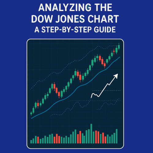
Candlestick charts are the most widely used in trading due to their visual appeal and detailed insights into price movements. Similar to bar charts, each candlestick represents a specific time period but provides a more intuitive color-coded format.
A candlestick consists of:
- Body: The difference between the open and close price.
- Wick (Shadow): The high and low points of the trading session.
- Colour: Green/white indicates a bullish move (closing price is higher than opening price), while red/black signifies a bearish move (closing price is lower than opening price).
Benefits of Using Candlestick Charts
Candlestick charts offer several advantages over other chart types, making them the preferred choice for traders:
- Clear Visualization of Price Action: Candlesticks make it easy to identify market trends and price reversals. Their color-coded nature allows traders to quickly see whether buyers or sellers dominate the market.
- Identification of Trading Patterns” Candlesticks form recognizable patterns that indicate bullish or bearish momentum, such as:
- Doji (Indecision in the Market)
A Doji forms when the opening and closing prices are nearly the same, resulting in a small or non-existent body with long wicks. This pattern signals market uncertainty, as neither buyers nor sellers are in control. Traders watch Doji’s at key support or resistance levels for potential trend reversals or continuations, depending on confirmation signals.
- Hammer (Bullish Reversal)
A Hammer appears at the bottom of a downtrend, characterized by a small body and a long lower wick. This formation indicates that sellers initially pushed the price lower, but buyers regained control by the close. When confirmed with strong bullish momentum, the Hammer signals a potential trend reversal upward, suggesting a buying opportunity.
- Shooting Star (Bearish Reversal)
The Shooting Star is the inverse of the Hammer, forming at the top of an uptrend. It has a small body with a long upper wick, showing that buyers attempted to drive prices higher, but sellers regained control. If confirmed by bearish follow-through, the Shooting Star suggests a trend reversal downward, warning traders of potential price declines.
- Engulfing Patterns (Strong Trend Confirmation)
Engulfing patterns come in bullish and bearish variants:
- Bullish Engulfing: A large green candle completely engulfs the previous red candle, signalling strong buying pressure and trend reversal.
- Bearish Engulfing: A large red candle overtakes the prior green candle, indicating selling dominance and potential price decline.
- Better Interpretation of Market Sentiment
The structure of candlestick formations helps traders understand whether buyers or sellers have control. Long wicks indicate rejection at a price level, signalling potential reversals.
- Works Across All Timeframes
Whether analyzing short-term fluctuations for day trading or long-term trends for investing, candlestick charts remain effective for assessing price movement.
- Combines Well with Other Technical Tools
Candlestick patterns work seamlessly alongside indicators such as moving averages, RSI (Relative Strength Index), and MACD (Moving Average Convergence Divergence) to enhance trading accuracy. Candlestick charts empower traders to refine their strategies by revealing price behaviour and market psychology.
Key Elements to Analyze on the Chart
Technical analysis relies on several key components to evaluate market behaviour and predict future price movements. Traders use these elements to make informed decisions, whether for short-term trades or long-term investments.
Trend Analysis
Trend analysis helps traders determine the overall direction of price movements. A trend can be upward (bullish), downward (bearish), or sideways (range-bound). Recognizing trends is crucial for identifying entry and exit points.
Identifying Uptrends and Downtrends
- Uptrend (Bullish Market): Price forms higher highs and higher lows. This suggests strong buying pressure, with demand outweighing supply.
- Downtrend (Bearish Market): Price makes lower highs and lower lows, indicating that sellers dominate the market.
- Sideways Trend: Price moves within a horizontal range, signalling consolidation before a breakout in either direction.
Traders use trendlines and moving averages to confirm the presence of trends and determine their strength.
Support and Resistance Levels
Support and resistance levels are essential in technical analysis, as they highlight price points where the market tends to reverse or consolidate.
- Support Level: A price level where buying interest is strong enough to prevent further decline. It acts as a floor where buyers step in.
- Resistance Level: A price level where selling pressure is strong enough to halt upward movement. It acts as a ceiling where sellers emerge.
Traders watch these levels for breakout or reversal signals, helping them place stop-loss and take-profit orders strategically.
Moving Averages
Moving averages smooth price data over a selected period, helping traders identify trends and reversals.
50-Day and 200-Day Moving Averages
- 50-Day Moving Average: Used to gauge short-to-medium-term trends. When prices remain above the 50-day moving average, it suggests bullish momentum.
- 200-Day Moving Average: A key indicator for long-term trends. When the price is above the 200-day moving average, it signifies a strong uptrend, while prices below indicate a bearish market.
A golden cross (when the 50-day MA crosses above the 200-day MA) is a bullish signal, while a death cross (50-day MA falling below the 200-day MA) suggests a bearish trend.
Technical Indicators
Technical indicators complement price analysis by providing deeper insights into market momentum and potential reversals.
RSI (Relative Strength Index)
- Measures price momentum on a scale of 0 to 100.
- Above 70 indicates overbought conditions (possible sell signal).
- Below 30 signals oversold conditions (potential buy signal).
MACD (Moving Average Convergence Divergence)
- Uses moving averages to identify trend reversals and momentum shifts.
- The MACD crossover (MACD line crossing the signal line) suggests buy or sell opportunities.
- Divergence between MACD and price movement often indicates a weakening trend.
Bollinger Bands
- Consist of three bands: upper, middle, and lower.
- Bollinger Bands expand during high volatility and contract when volatility declines.
- Price touching the upper band suggests overbought conditions, while reaching the lower band signals oversold conditions.
Volume Analysis
Volume represents the number of shares or contracts traded within a period. It confirms price movements and trend strength.
- High Volume on Price Increases: Validates bullish momentum, signalling strong buyer interest.
- High Volume on Price Declines: Suggests aggressive selling pressure, confirming bearish sentiment.
- Low Volume During Breakouts: Indicates weak conviction in price movement, increasing the likelihood of false breakouts.
Volume analysis helps traders assess the strength of trends and reversals, ensuring they make informed decisions.
Case Study:
The Dow Jones Industrial Average (DJIA) serves as a barometer for the U.S. stock market, reflecting economic trends and investor sentiment.
- Economic Indicators: GDP growth, inflation rates, and employment data impact Dow trends.
- Federal Reserve Policy: Interest rate decisions influence investor confidence and stock valuations.
- Sector Performance: Technology, financials, and industrial stocks drive index fluctuations.
- Global Events: Trade agreements, geopolitical tensions, and economic policies affect market sentiment.
For a detailed breakdown of recent Dow movements, you can explore this analysis on key market trends.
Drawing Conclusions and Making Predictions
Analyzing chart patterns and technical indicators allows traders to forecast potential market movements. Here’s how traders draw conclusions and make predictions:
- Trend Confirmation:
- If the Dow is forming higher highs and higher lows, it signals a bullish trend.
- If the index is making lower highs and lower lows, it suggests a bearish trend.
- Support & Resistance Levels:
- A break above resistance may indicate continued upward momentum.
- A break below support could signal further declines.
- Moving Averages:
- A golden cross (50-day MA crossing above 200-day MA) suggests bullish momentum.
- A death cross (50-day MA falling below 200-day MA) warns of bearish sentiment.
- Technical Indicators:
- RSI above 70 suggests overbought conditions, potentially leading to a pullback.
- MACD crossover signals trend reversals.
- Bollinger Bands expansion indicates increased volatility.
Common Mistakes to Avoid in Chart Reading
Even experienced traders can fall into common pitfalls when analyzing charts. Here are key mistakes to avoid:
- Ignoring Volume: Price movements without strong volume confirmation may lead to false breakouts.
- Over-Reliance on Indicators: Using too many indicators can create conflicting signals.
- Neglecting Market Context: External factors like economic reports and geopolitical events influence price action.
- Failing to Set Stop-Loss Orders: Risk management is crucial to prevent excessive losses.
- Chasing Price Movements: Reacting impulsively to short-term fluctuations can lead to poor trading decisions.
Conclusion
Analyzing the Dow Jones chart requires a structured approach, incorporating trend analysis, support and resistance levels, moving averages, technical indicators, and volume data. By following a step-by-step guide, traders can identify market trends, anticipate price movements, and make informed decisions. Recognizing patterns like bullish reversals or bearish signals enhances trading accuracy. Additionally, understanding broader economic influences on the Dow helps traders interpret market sentiment effectively. Avoiding common pitfalls, such as misreading signals or ignoring volume trends, improves trading success. With a disciplined approach to chart analysis, investors can navigate market fluctuations confidently and optimize their trading strategies.