3.1 Introduction to Line Chart
Charts are the foundational tools of technical analysis, providing a visual representation of price movements over time. They allow traders and analysts to observe trends, identify patterns, and make informed decisions based on historical price behaviour. The type of chart selected can significantly influence how price action is interpreted, as each format presents data differently in terms of detail, clarity, and focus. Below are the primary types of charts used in the stock market:
3.1 Line Chart
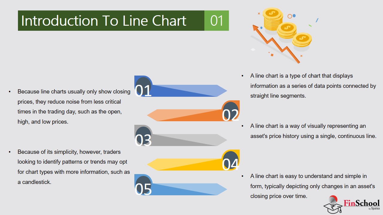
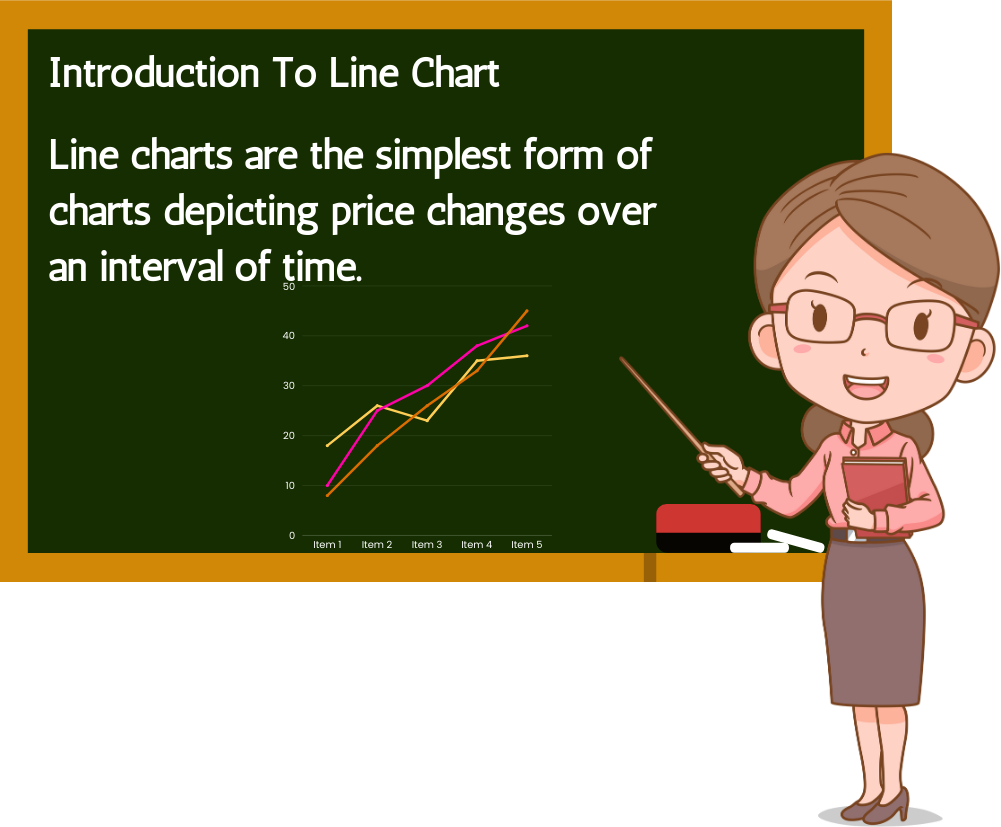
A line chart is one of the most fundamental tools in technical analysis, offering a clear and streamlined way to visualize price movements over time. It connects a series of data points typically the closing prices of a financial instrument using a continuous line. This simplicity makes it especially useful for identifying broad trends without the distraction of intraday volatility.
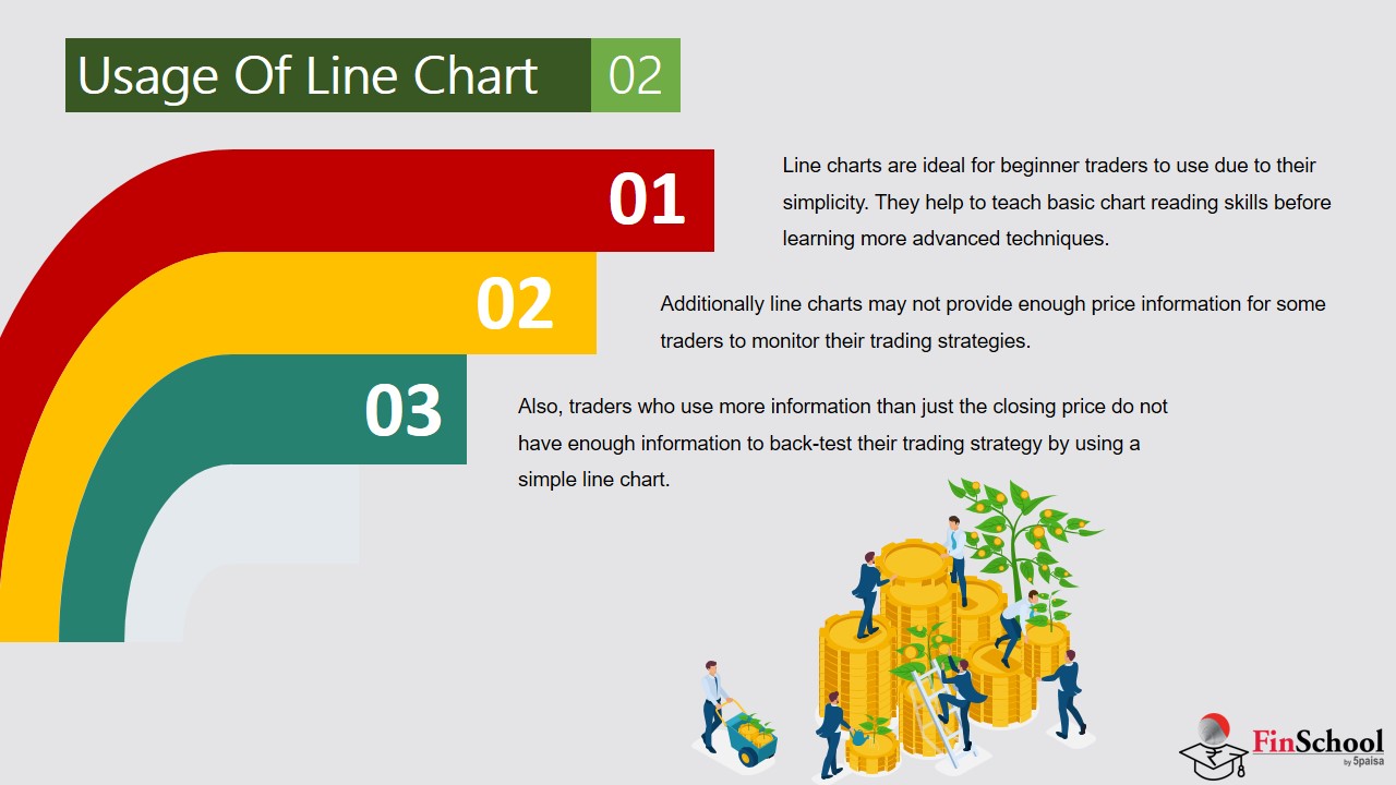
Line charts are mainly used for long-term or comparative analysis. Line charts are easy to read and interpret, especially for beginners. But by only showing closing prices, line charts ignore other key data like opening price, highs, lows, and volume limiting deeper analysis.You can’t see how volatile a trading day was. A stock might have swung wildly before settling at the close, but a line chart won’t show that.Intraday traders or those relying on precise entry/exit points often prefer candlestick or bar charts for their richer data.
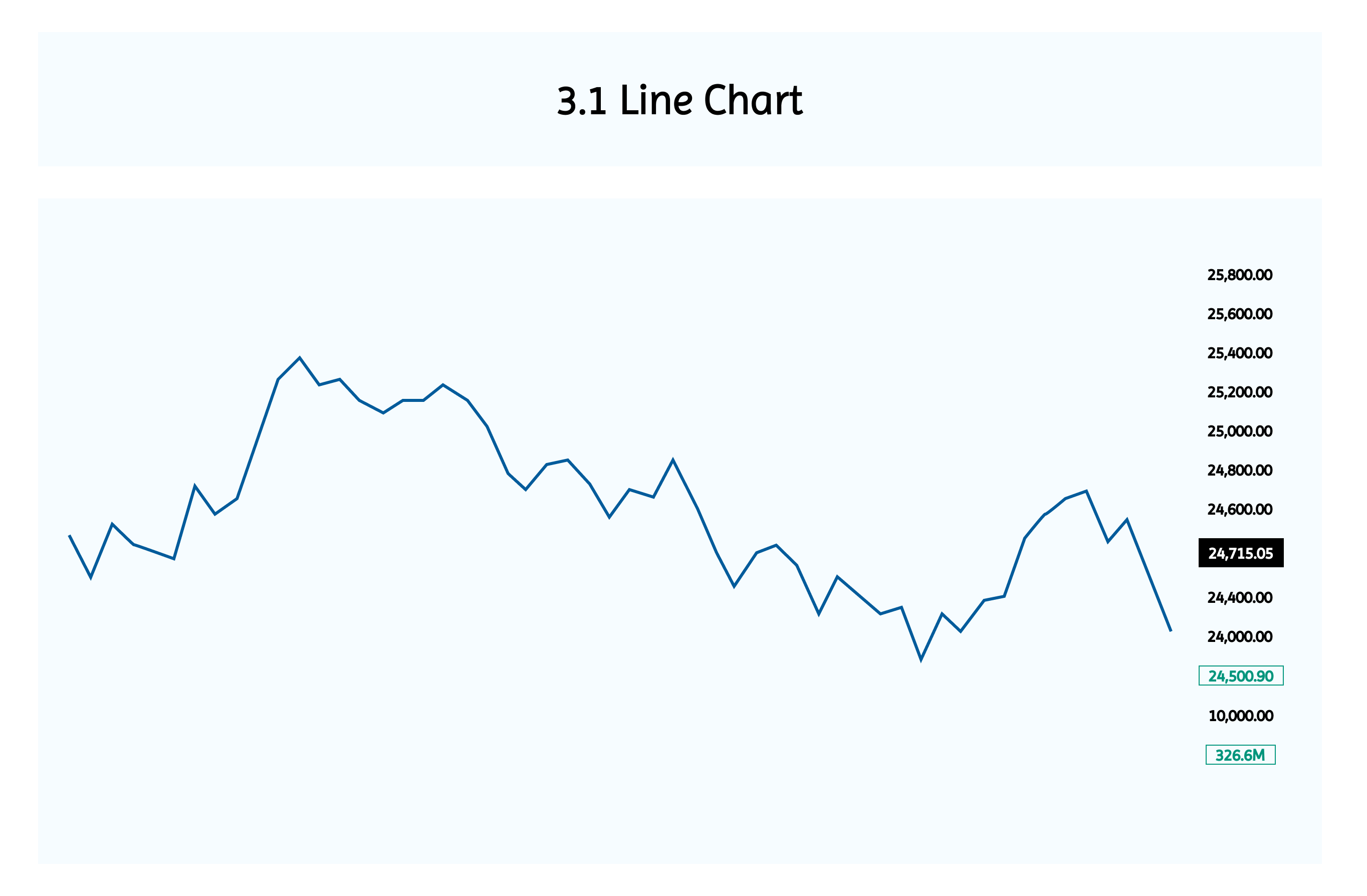
If you observe the chart above, it shows the blue and purple line which indicates the closing price of Nifty 50 each day. Nifty 50 is India’s benchmark stock market index that tracks the performance of the top 50 large-cap companies listed on the National Stock Exchange (NSE).
This gives traders a clean view of the trend without any intraday movements. It’s a daily chart where each point on the line indicates 1 trading day’s closing price. If the line moves up market is in uptrend and if the line moves downward market is in downtrend. If the line moves sideways market is in consolidation.
3.2 Bar Chart
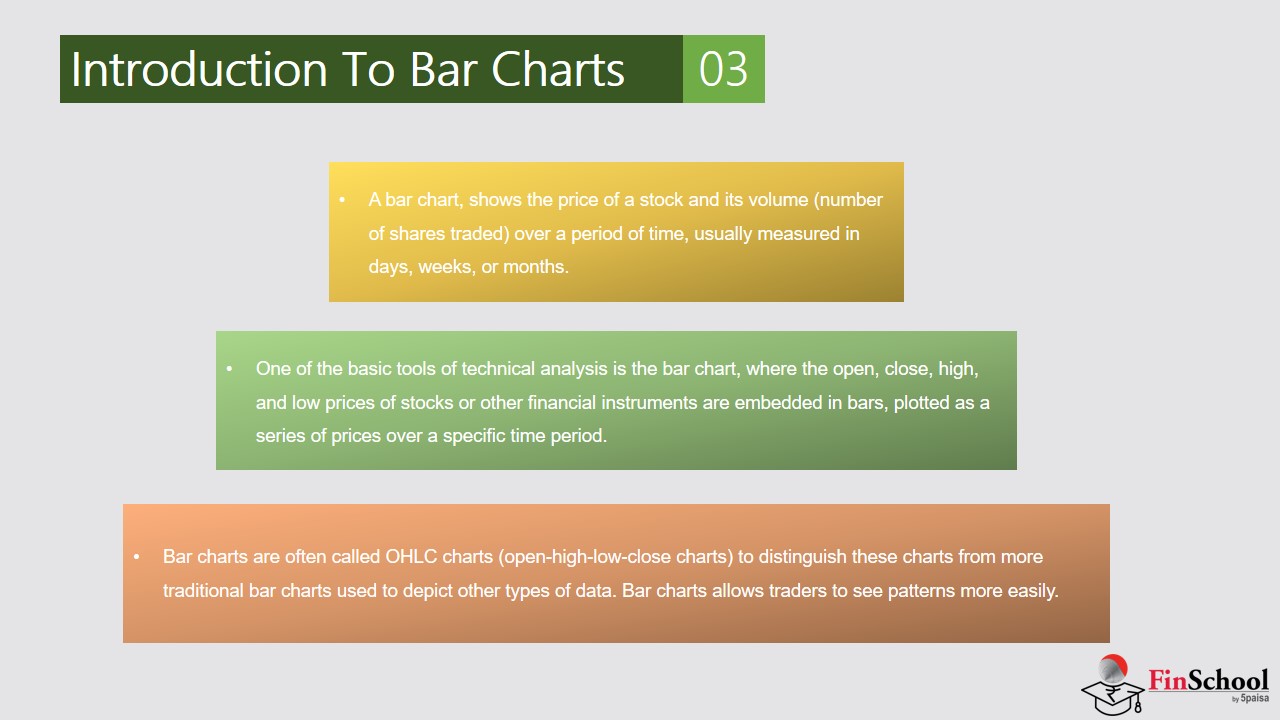
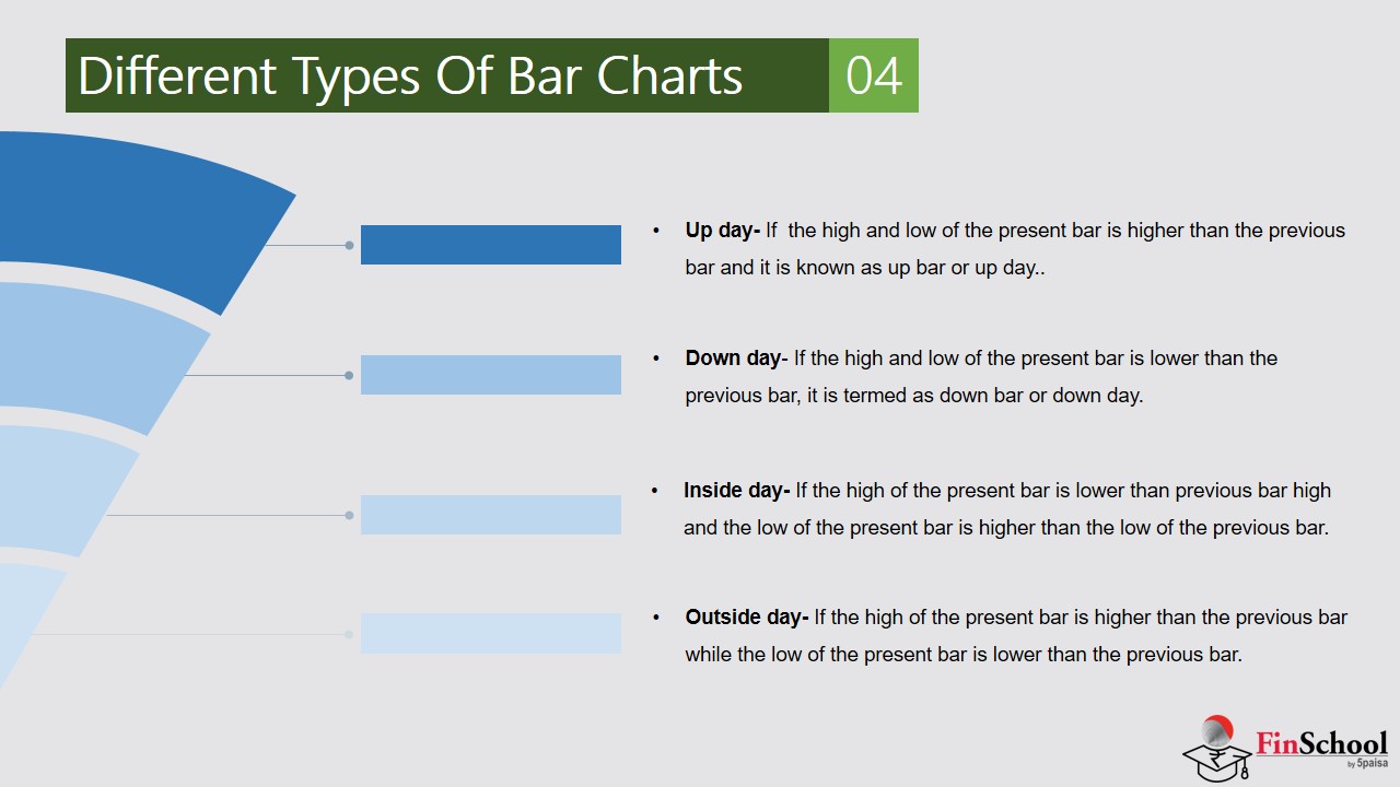
A bar chart also called an OHLC chart shows how a stock’s price moved during a specific time period (e.g., one day, one hour). Each bar represents four key price points:
Example
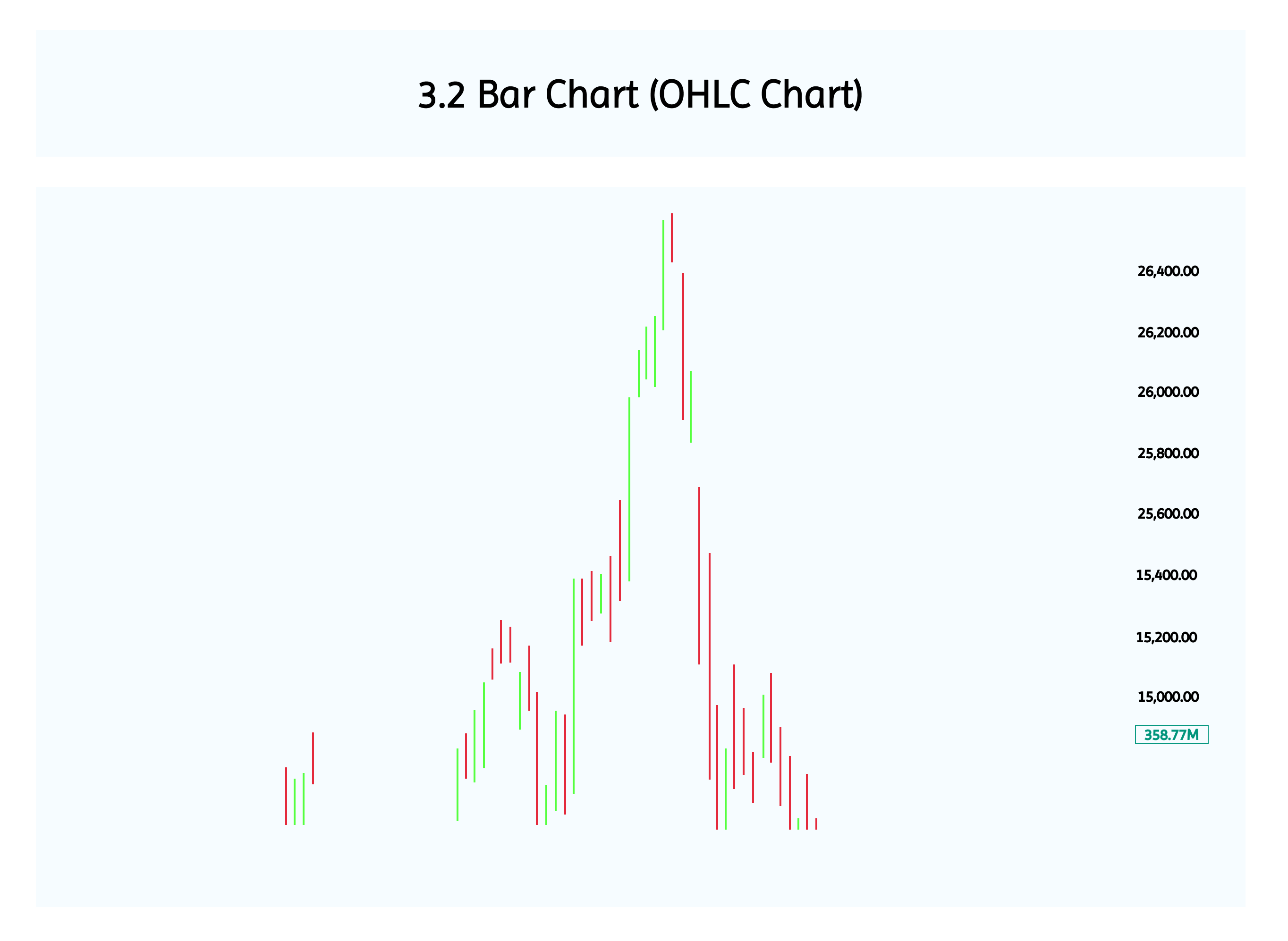
Now each vertical line shows the price range (High-Low) of the day.
- Open: Where the price started
- High: The highest price reached
- Low: The lowest price reached
- Close: Where the price ended
Structure of a Single Bar
Each bar looks like this:
- A vertical line shows the range between the high and low.
- A left tick marks the opening price.
- A right tick marks the closing price.
How to Interpret the Bar
|
Price Movement |
Interpretation |
Visual Cue |
|
Close > Open |
Bullish (price went up) |
Often colored green or blue |
|
Close < Open |
Bearish (price went down) |
Often colored red |
|
Long vertical line |
High volatility (big price range) |
Indicates active trading |
|
Short vertical line |
Low volatility (small price range) |
Indicates quiet session |
The bars at the bottom are volume bars (trading activity).Traders use bar charts to see daily price action (OHLC) along with market volume.
Bullish Bar (Close > Open)
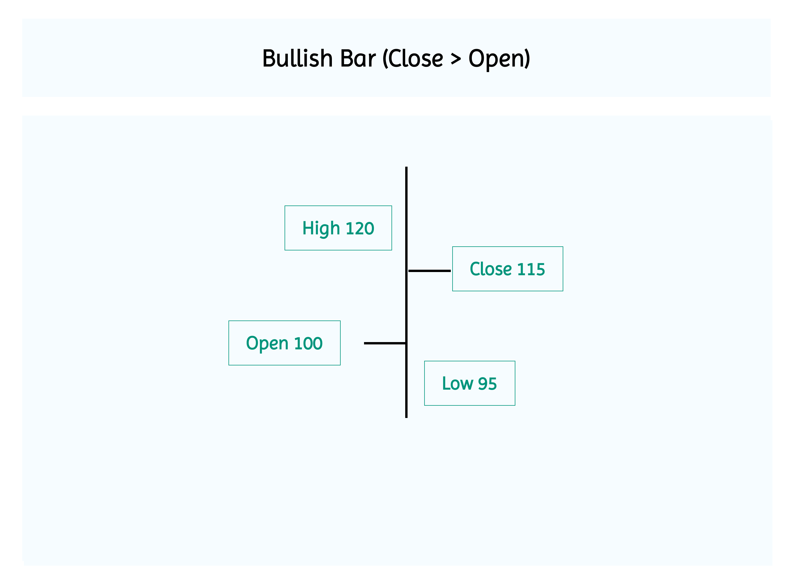
- Open:100
- High:120
- Low:95
- Close:115
The market opened at 100, dipped to 95, rose to 120, and closed higher at 115, forming a bullish bar showing buyer strength.
Bearish Bar (Close < Open)
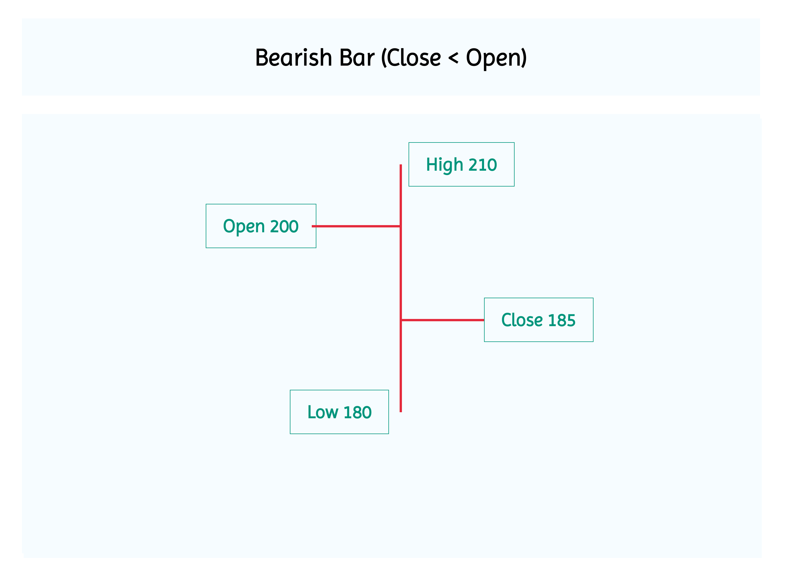
- Open:200
- High:210
- Low:180
- Close:185
The market opened at 200, touched 210, dropped to 180, and closed lower at 185, forming a bearish bar showing seller strength.
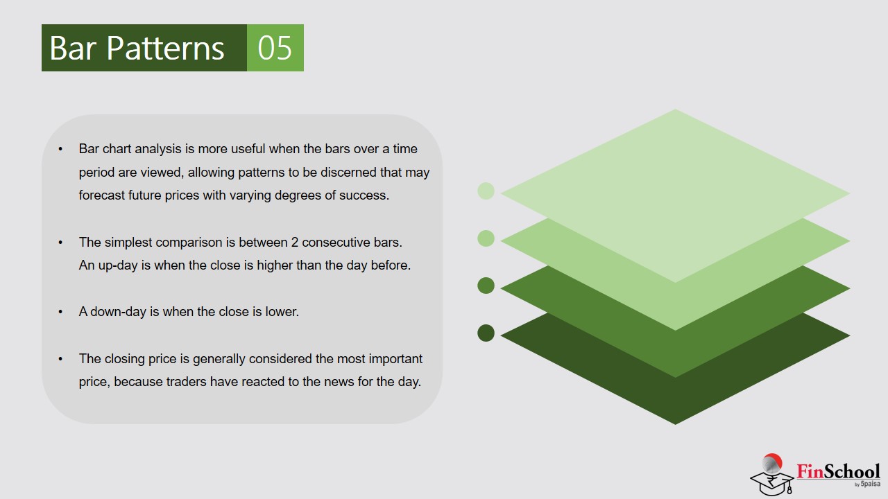
Why Traders Use Bar Charts
- Trend Analysis: Sequences of bars help identify uptrends, downtrends, or sideways movement.
- Volatility Insight: The length of the bar shows how much price fluctuated.
- Momentum Clues: Where the close sits relative to the high/low shows strength or weakness.
Limitations
- Less visual claritythan candlestick charts.
- Harder to spot patternsquickly, especially when scanning multiple charts.
3.3 Candlestick Pattern
Candlestick charts are similar to bar charts but offer a more visual and intuitive representation of price action. Each candlestick shows the open, high, low, and close for a given period, with the body color indicating bullish or bearish movement.
A candlestick chart is a powerful visual tool in technical analysis that conveys price movements over a specific time frame. Each candlestick represent one period (e.g., a day, hour, or minute) and contains four key data points: open, high, low, and close. The shape and color of the candlestick help traders interpret market sentiment and potential price direction.
Structure of a Candlestick
Each candlestick has two main components:
Body: The rectangular portion between the open and close prices.
- If the close is higher than the open, the body is typically hollow or green (bullish).
- If the close is lower than the open, the body is filled or red (bearish).
Wicks (or Shadows): The thin lines above and below the body.
- The upper wick shows the highest price reached.
- The lower wick shows the lowest price reached.
This structure allows traders to quickly assess volatility and price rejection within a session.
Bullish Candlestick Pattern Structure
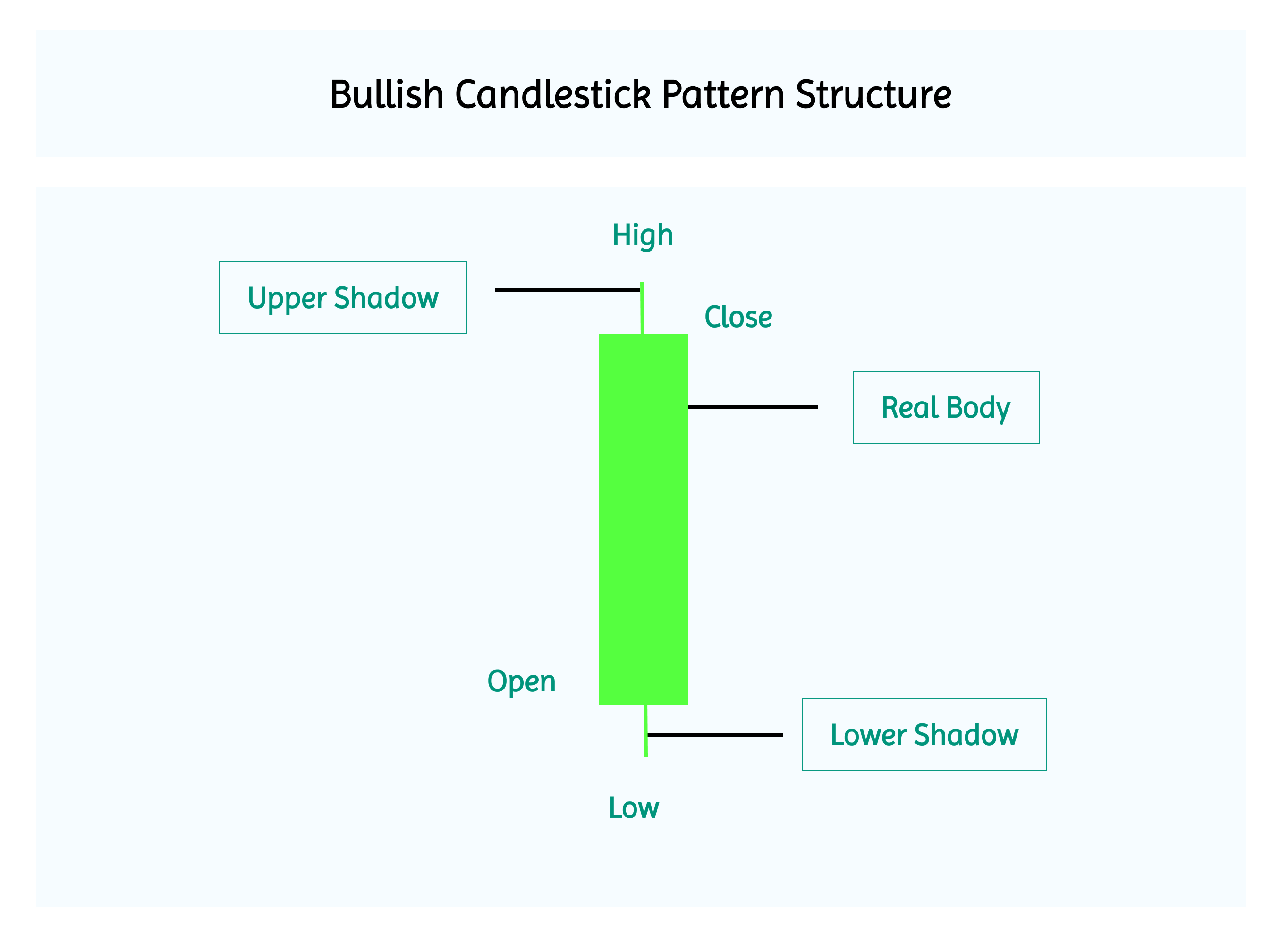
Note that the opening is at the Bottom and the closing is at the top of the rectangle
Example of Bullish candlestick pattern
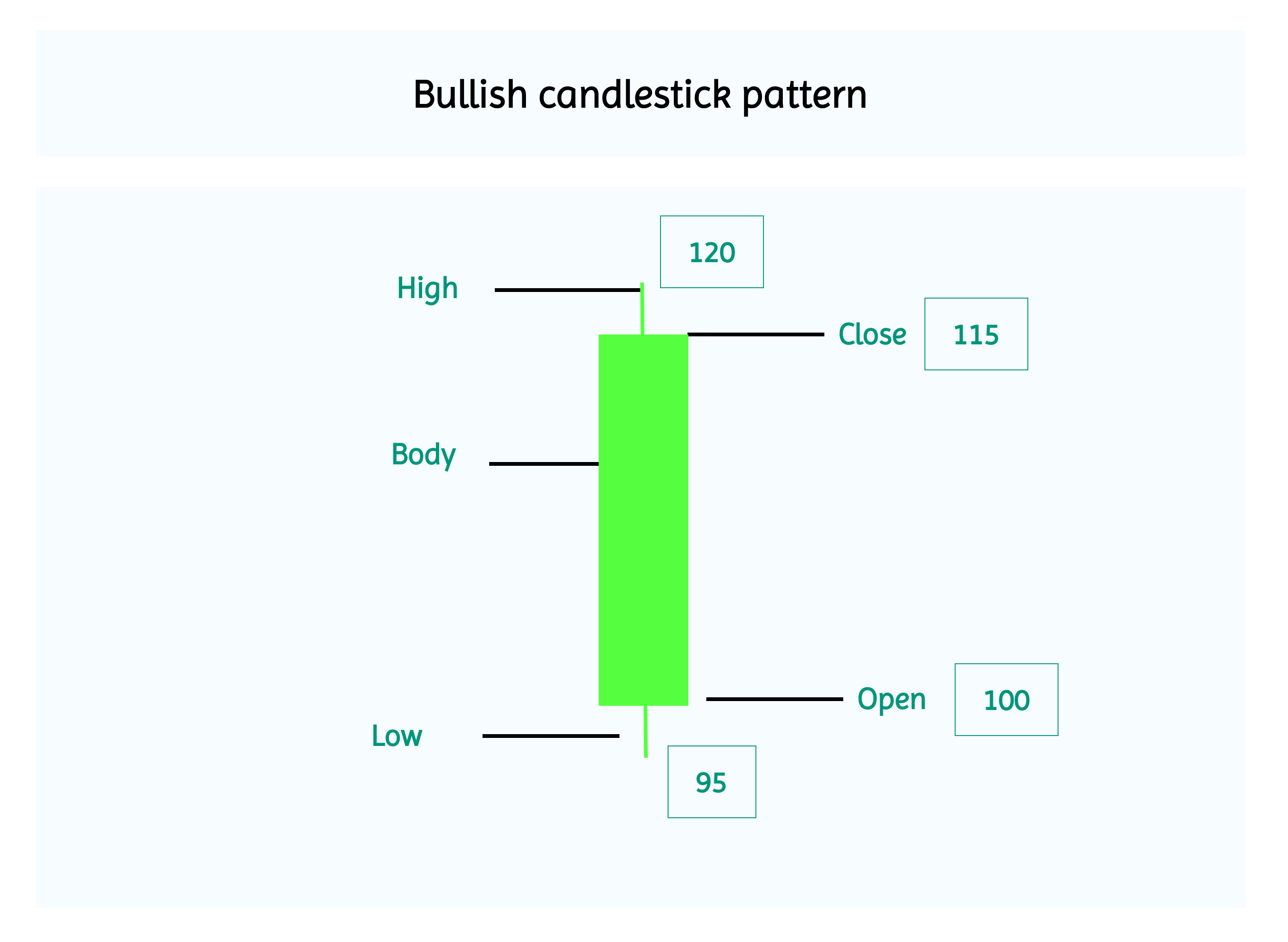
- Open:₹100
- High:₹120
- Low:₹95
- Close:₹115
Opening at ₹100, dropping to a low of ₹95, then rising to a high of ₹120 and closing strong at ₹115, the candle reflects clear bullish momentum with buyers in control.
Bearish Candlestick Pattern Structure
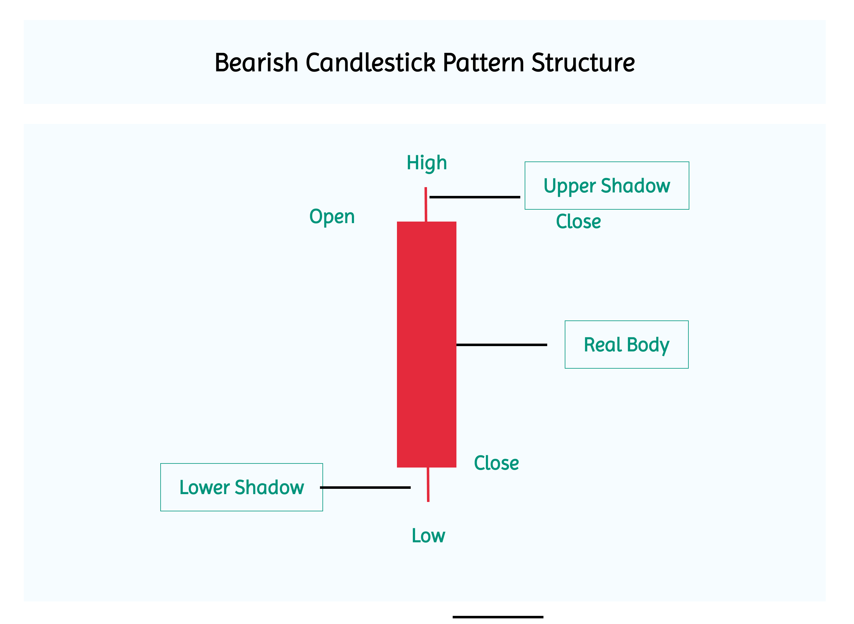
Note that the opening is at the top end and the closing is at the bottom end of the rectangle
Bearish Candlestick Example
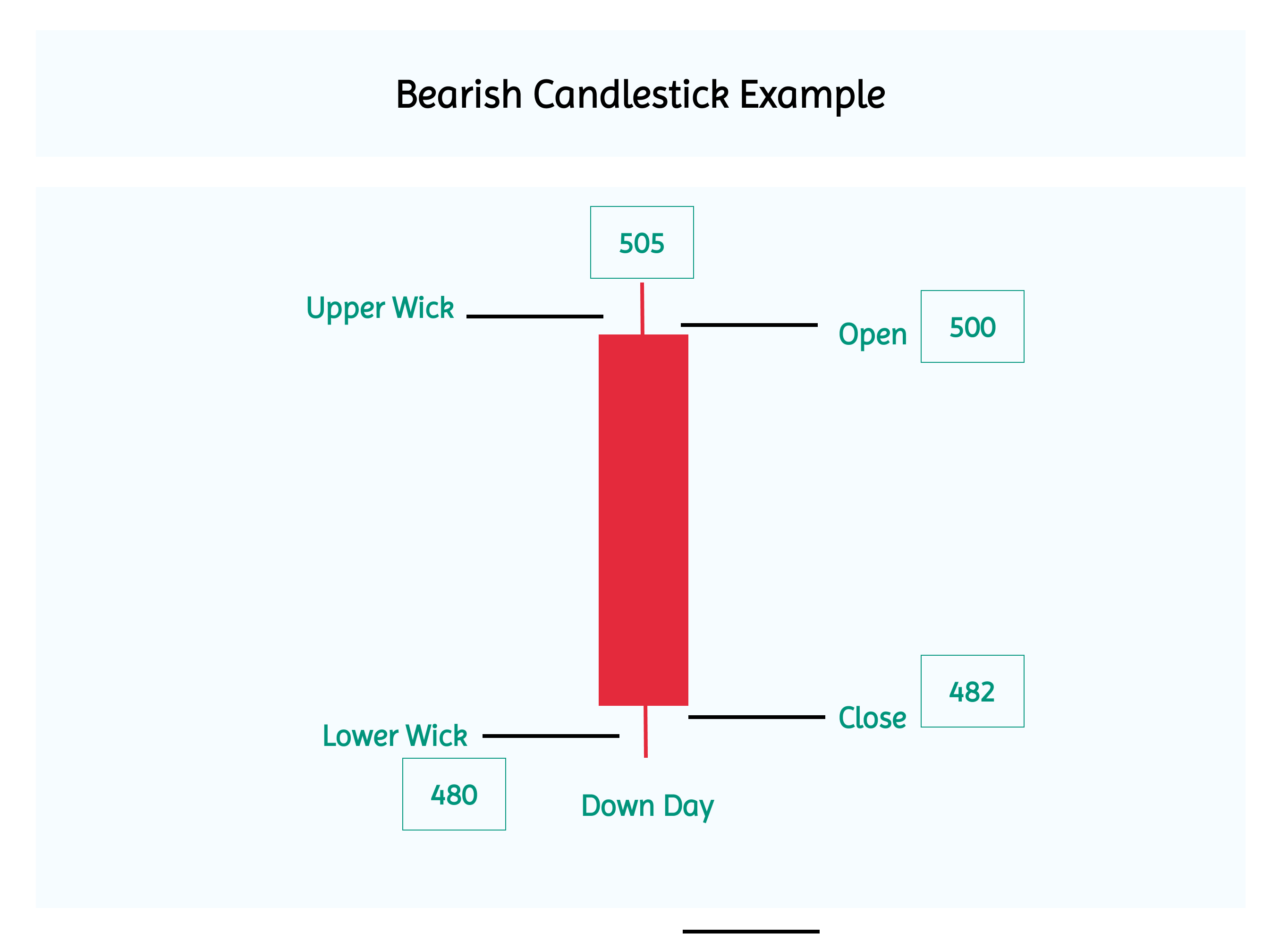
- Open:₹500
- High:₹505
- Low:₹ 480
- Close:₹482
Opening at ₹500 and closing much lower at ₹482 after a brief rise to ₹505, the candle shows strong bearish momentum with sellers firmly in control.
Candlestick Chart Example
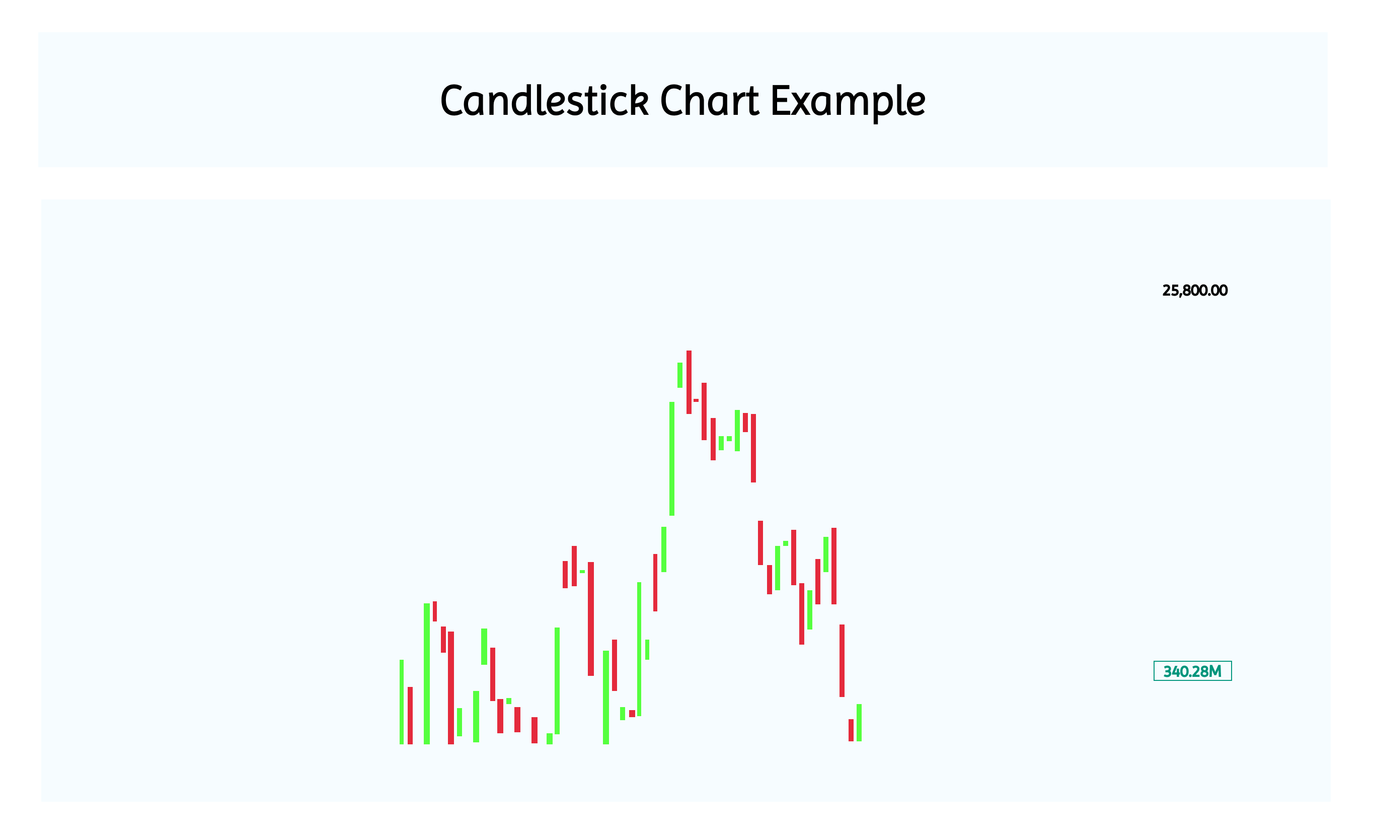
This is how a candlestick looks like when you plot them on time series. The red indicates bearishness whereas the green indicates bullishness. Compared to bar charts, candlesticks offer a more visually clear representation. You can instantly see whether buyers or sellers were in control, and how volatile the market was. The shape and color of each candle make it easy to grasp the story behind the price action without needing to crunch numbers.
3.4 Time Frames

What Are Time Frames in Trading?
In technical analysis, a time frame refers to the specific span of time that a trader chooses to analyze price movements on a chart. It’s like zooming in or out on market activity, each time frame gives a different perspective.
|
Time Frame |
Open |
High |
Low |
Close |
Candles per Year |
Who Uses It |
|
Monthly |
Price at start of the month |
Highest price reached during the month |
Lowest price reached during the month |
Price at end of the month |
12 |
Long-term investors, macro analysts |
|
Weekly |
Price on Monday morning |
Highest price during the week |
Lowest price during the week |
Price on Friday close |
52 |
Position traders, medium-term strategists |
|
Daily (EOD) |
Price at market open |
Highest price during the day |
Lowest price during the day |
Price at market close |
252 |
Swing traders, technical analysts |
|
Intraday – 30 Min |
Price at start of each 30-min block |
Highest price in that 30-minute window |
Lowest price in that 30-minute window |
Price at end of the 30-minute block |
12 per day |
Intraday swing traders, momentum traders |
|
Intraday – 15 Min |
Price at start of each 15-min block |
Highest price in that 15-minute window |
Lowest price in that 15-minute window |
Price at end of the 15-minute block |
25 per day |
Active intraday traders, breakout traders |
|
Intraday – 5 Min |
Price at start of each 5-min block |
Highest price in that 5-minute window |
Lowest price in that 5-minute window |
Price at end of the 5-minute block |
75 per day |
Scalpers, high-frequency traders |
As the time frame shortens, the number of candles increases,giving you more data but also more noise.
- Long-term traderslook at charts that show price movements over weeks or months. These help them spot big trends and make decisions for the future. They don’t worry about small daily changes.
- Intraday tradersfocus on shorter time frames like 15 or 5 minutes. They want to catch quick price changes that happen within the same day and make profits from those short moves.
- Scalpersuse very tiny time frames, like 1-minute charts. They make lots of fast trades to earn small profits from tiny price changes.
3.5 Short Activity for Your Better Understanding

Here’s a simple way to make the concepts stick, try the Chart Detective exercise. We’ve given you three chart formats, Line, Bar, and Candlestick and framed questions around each to help you decode trends, volatility, and market emotions. Don’t just read the theory open a chart of any active stock like HDFC Bank, attempt the questions, and write down your answers. It’s a great way to see how each chart tells a different story about price movement. Ready to sharpen your chart-reading instincts? Let’s go!
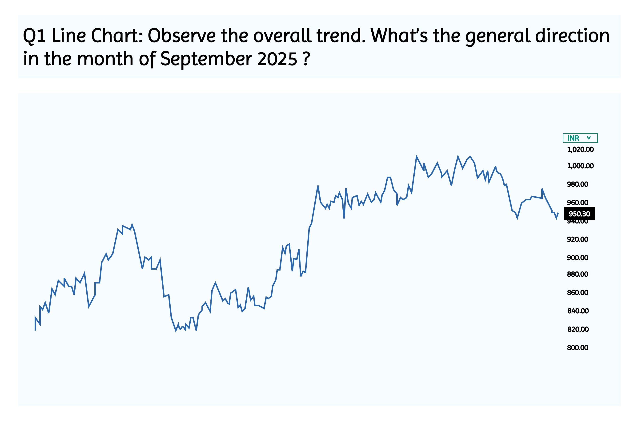
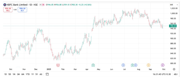
Q1 Line Chart: Observe the overall trend. What’s the general direction in the month of September 2025 ?
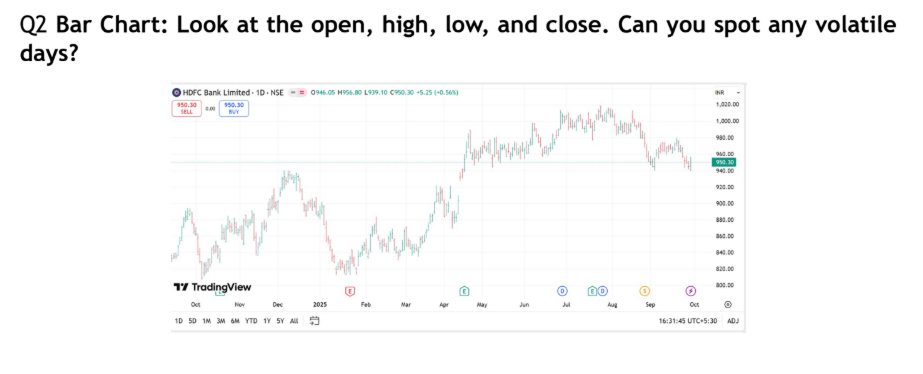
Q2 Bar Chart: Look at the open, high, low, and close. Can you spot any volatile days?
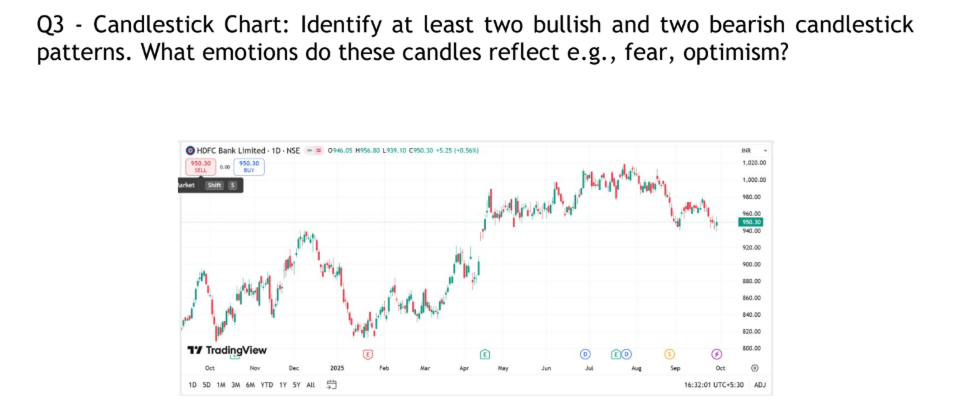
Q3 – Candlestick Chart: Identify at least two bullish and two bearish candlestick patterns. What emotions do these candles reflect e.g., fear, optimism?
Answers to the above questions
Q1 : Line Chart: Observe the overall trend. What’s the general direction in the month of September 2025 ?
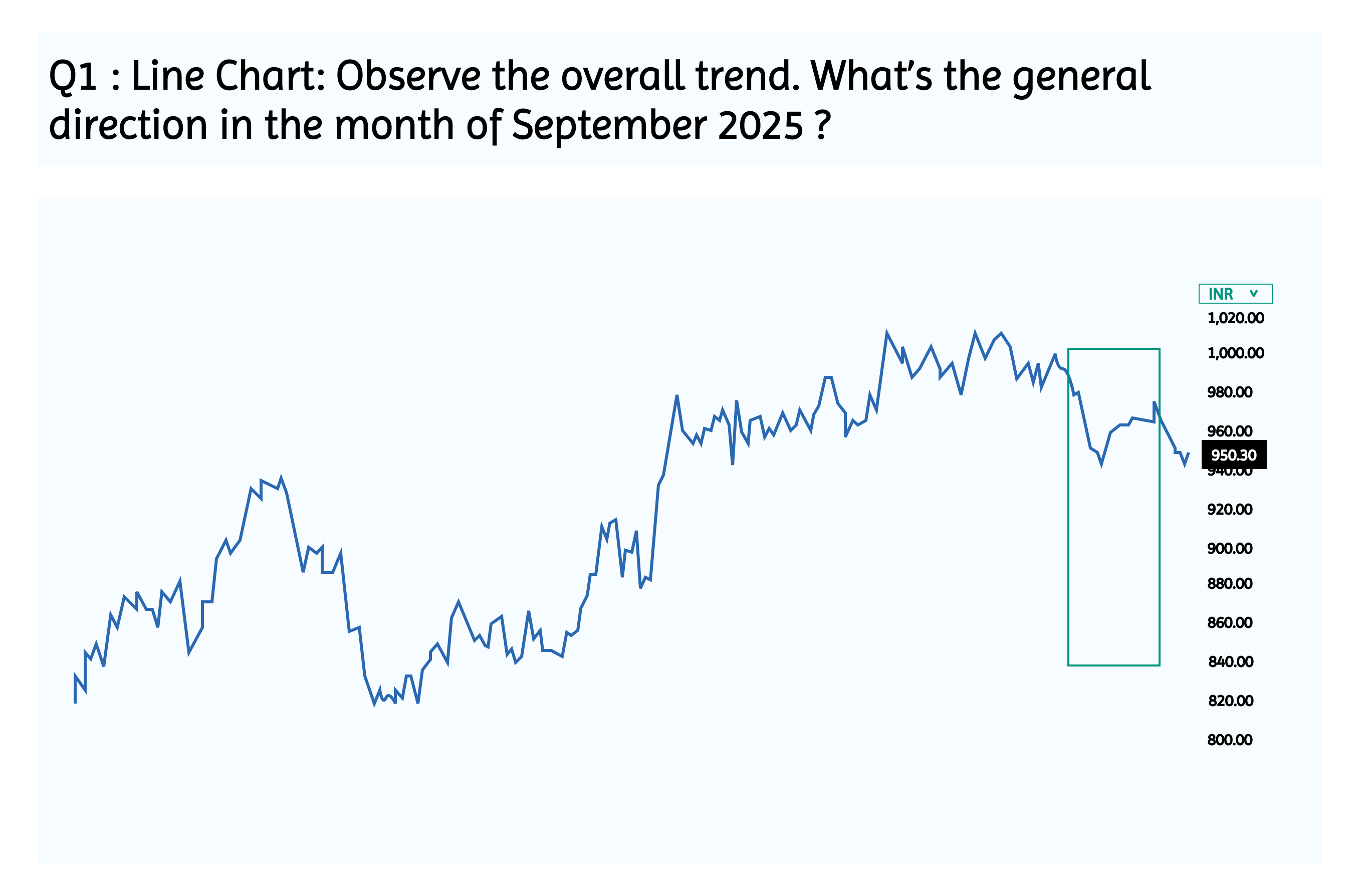
From the line chart, focusing on September 2025, the trend appears to be downward.
- The purple segment shows a gradual decline in closing prices.
- This suggests bearish sentiment or profit booking after the earlier uptrend.
- Traders might interpret this as a short-term correction or consolidation phase.
Q2 Bar Chart: Look at the open, high, low, and close. Can you spot any volatile days?
A volatile day typically has:
- A long vertical bar (large range between high and low)
- A small body (close and open are near each other), indicating indecision
- Often appears around earnings reports, macro news, or trend reversals
Example from the Chart
Likely Volatile Day: Around June 2024
- Open: ~₹980
- High: ~₹1,020
- Low: ~₹940
- Close: ~₹960
- Range: ₹80 in a single day!
Heavy intraday movement
- Possibly triggered by earnings announcement or market reaction to RBI policy
- Emotion: Uncertainty, fear, and aggressive profit booking
- Such bars are red flags for intraday traders—they signal opportunity but also risk.
- For swing traders, they may indicate trend exhaustion or entry/exit zones.
- For beginners, it’s a great visual cue to understand how news impacts price movement.
Q3 – Candlestick Chart: Identify at least two bullish and two bearish candlestick patterns. What emotions do these candles reflect e.g., fear, optimism?
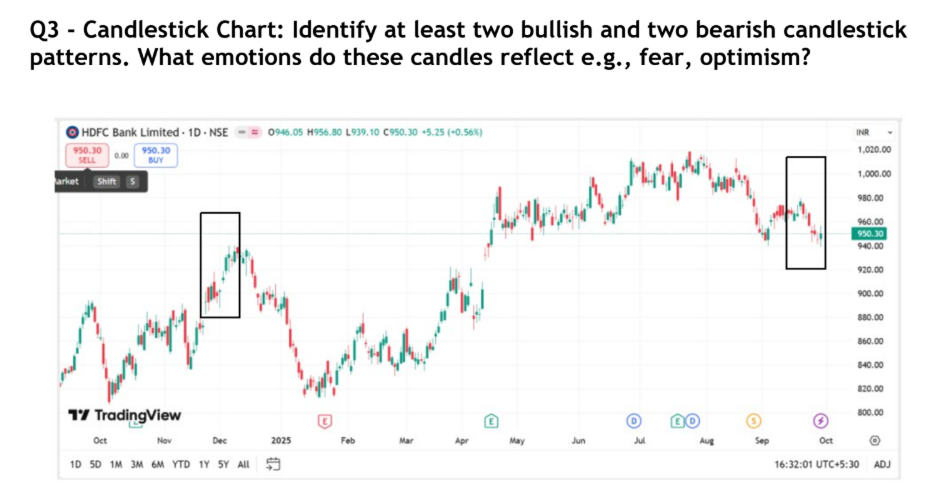
Bullish & Bearish Patterns
From the candlestick chart here are some patterns:
Bullish Candlestick Patterns
Long Green Candle (e.g., December 2024):
- Opened low, closed high.
- Emotion: Optimism, buyer confidence, possibly post-positive news.
Bearish Candlestick Patterns
Long Red Candle (e.g., early October 2025):
- Opened high, closed significantly lower.
- Emotion: Fear, panic selling, possibly triggered by negative sentiment.
Great Job! By comparing the Line, Bar, and Candlestick charts, you’ve just unlocked three unique lenses. Each chart type reveals a different layer of price behavior—whether it’s the smooth trend of a line chart, the volatility captured in bar charts, or the emotional storytelling of candlesticks. Attempting the questions and writing your own observations helps you move from passive reading to active analysis. Keep practicing with different stocks, and soon you’ll start seeing patterns, signals, and stories unfold with every chart you view.
3.6 Key Takeaways

- Charts are essential tools in Technical Analysis, offering visual representation of price movements over time.
- Line charts connect closing prices and are best for spotting long-term trends with minimal noise.
- Bar charts show open, high, low, and close (OHLC), giving a more detailed view of price action.
- Candlestick charts are the most widely used, visually capturing market sentiment through color-coded bodies and wicks.
- Each chart type serves a unique purpose—some emphasize clarity, others detail or sentiment.
- Choosing the right chart depends on your trading style, time frame, and need for precision or simplicity.
- Understanding chart types empowers traders to interpret market behavior more effectively and make informed decisions.
- Time-framessuch as intraday, daily, weekly, or monthly—determine how much data is shown and must align with your trading style. The same chart type can look very different across time-frames, so choosing the right one is key to accurate analysis.