16.1 The Dow Theory Principles
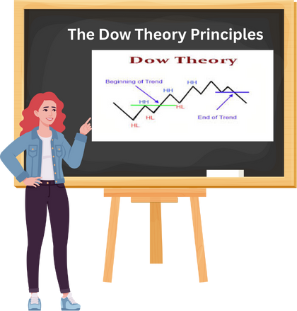
Charles H. Dow, the mastermind behind the nation’s leading financial news provider, Dow, Jones, and Company, co-owned The Wall Street Journal, serving as its editor until his passing in 1902. He authored a handful of editorials concerning stock speculation early in his career, offering the sole firsthand account of his insights into the repetitive patterns of the stock market. These insights stemmed from the everyday average prices of railroad and industrial stocks featured in the Dow Jones Averages.
The label “Dow Theory” was not something Mr. Dow used to describe his stock market observations. This was the creation of his associate, S. A. Nelson, who authored “The ABC of Stock Speculation” in 1902. Nelson was the one who endeavoured to convey Dow’s techniques in an accessible way. Numerous thriving individuals now regard the indications derived from the everyday fluctuations of the Dow Jones rail and industrial averages as the most reliable gauge of both price and economic patterns ever conceived, often alluding to conclusions drawn from these average fluctuations as “The Dow Theory. “
Numerous thriving individuals now regard the indications derived from the everyday fluctuations of the Dow-Jones Rail and industrial averages as the most reliable gauge of both price and economic patterns ever conceived, often alluding to conclusions drawn from these average fluctuations as “The Dow Theory. “
Up until 1897, Dow, Jones, and Co. maintained only one stock average; however, at the start of that year, distinct averages were introduced for both railroad and industrial stocks. During Dow’s writing period, he had access to, at most, a mere five-year history of both averages for analysis. Astonishingly, within such a brief span, he successfully laid the groundwork for a remarkably valuable theory of price fluctuations grounded in these dual averages. While some of his later conclusions proved inaccurate, the fundamental principles have demonstrated their validity when assessed against market activity for 28 years following his death.
The development of the automobile and of the Dow Theory since 1902 have certain similarities. To the automobile of 1902, our engineers later added improved motive power, demountable rims, electric lights, self starters and other needed refinements which eventually gave us a reliable and convenient means of transportation. In a similar manner, Hamilton tested and improved Dow theory between 1902 and 1929. As the record of the averages unfolded with the years he gave us a well defined and exceptionally reliable method of forecasting the trends of both stock prices and business activity.
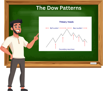
Dow Theory is foundational framework in Technical Analysis that interprets market trends based on the movements of major stock market indexes originally the Dow Jones Industrial Average and the Dow Jones Transportation Average. The theory proposes that the market moves in three trends
Primary Trend : The long-term direction of the market, lasting months or years
Secondary Trend : A temporary correction or rally that moves against the primary trend, lasting a few weeks to a few months
Minor Trend : Short-term fluctuations that are often considered market noise
The trend is confirmed only when both indexes move in the same direction. The theory also emphasize volume as a supporting indicator and suggests that markets reflect all available information moving in phases : accumulation, participation and distribution. Traders use Dow Theory to identify the direction of the broader market and align their strategies accordingly.
The Dow Theory Principles
- The market discounts everything: This principle means that all known information, economic data, political events, company earnings, and even investor psychology, is already reflected in stock prices. According to Dow Theory, price movements are not random but are shaped by collective market knowledge. Therefore, technical analysts focus on price charts rather than trying to interpret news or economic reports separately.
- The market moves in three trends: Dow Theory classifies price movement into three distinct trends. The primary trend is the long-term direction of the market, which can last for months or years and is the most important for investors. The secondary trend is a temporary correction or rally that moves against the primary trend and typically lasts from a few weeks to a few months. The minor trend consists of short-term fluctuations that occur daily or weekly and are often considered market noise. Understanding these trends helps traders align their strategies with the broader market direction.
- Each primary trend has three phases: The first phase is accumulation, where informed investors begin buying or selling quietly before the general public notices. The second phase is public participation, when the broader market joins the trend and prices move more sharply. The third phase is distribution, where early investors begin to exit their positions while the public continues to trade enthusiastically. Recognizing these phases can help traders avoid entering too late or exiting too early.
- A trend is confirmed when both indexes agree: Dow Theory originally used the Dow Jones Industrial Average and the Dow Jones Transportation Average to confirm market trends. A trend is considered valid only when both indexes move in the same direction. For example, if industrial stocks are rising but transportation stocks are falling, the trend is not confirmed. This principle emphasizes the importance of broad market participation in validating a trend.
- Volume should confirm the trend: Volume refers to the number of shares traded during a given period. In Dow Theory, rising volume during an uptrend indicates strong buying interest and confirms the trend’s strength. Conversely, declining volume during a rally may signal weakness or lack of conviction. Volume acts as a supporting indicator that helps traders assess whether a trend is likely to continue or reverse.
- A trend remains in effect until a clear reversal occurs : This principle advises traders to assume that a trend will continue unless there is clear evidence of a reversal. Temporary pullbacks or rallies do not necessarily mean the trend has ended. Only when price action breaks key support or resistance levels and is confirmed by volume and index agreement should traders consider the possibility of a trend change. This helps avoid premature decisions based on short-term volatility.
16.2 The Different Phases of Market

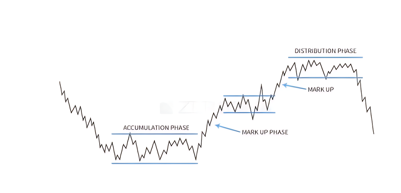
- Accumulation Phase: This phase begins when the market has bottomed out after a prolonged downtrend. Prices are low, sentiment is pessimistic, and most retail investors are either fearful or disinterested. However, informed investors and institutions quietly begin buying stocks, recognizing undervaluation and anticipating a future uptrend. Price movements during this phase are subtle and often range-bound, as the buying activity is gradual and not yet visible to the broader market. Volume may start to pick up slightly, but there is no widespread enthusiasm. This phase reflects strategic positioning by those who understand market cycles and are willing to act before the crowd.
- Mark-Up Phase : Once accumulation reaches a tipping point, prices begin to rise more noticeably. This phase is marked by growing optimism, improving economic indicators, and increasing participation from the public. As more investors recognize the uptrend, demand accelerates and prices climb steadily. Technical breakouts, higher highs and higher lows, and expanding volume are common features of this phase. Media coverage turns positive, and retail investors start entering the market, often driven by fear of missing out. This is typically the longest and most profitable phase of the cycle, where trend-following strategies perform well and momentum builds across sectors.
- Distribution Phase: In this final phase, prices have risen significantly and valuations may appear stretched. Smart money and institutional investors begin to exit their positions, selling into the strength while retail investors continue to buy. Market sentiment is optimistic, news is overwhelmingly positive, and many believe the rally will continue indefinitely. However, price action becomes volatile, volume may spike without clear direction, and signs of exhaustion begin to appear. This phase often includes false breakouts and increased volatility. Eventually, selling pressure outweighs demand, leading to a reversal and the beginning of a new downtrend. Recognizing this phase is crucial to avoid being caught in the decline that follows.
16.3 The Dow Patterns
Just as candlestick charts reveal key price patterns, Dow Theory also offers a set of recognizable formations that traders can use to spot potential trading opportunities. These patterns help interpret market behaviour and anticipate reversals or continuations in trend. Among the most commonly studied are
- The double top and double bottom: A trend reversal pattern occurs when the price tests a key support or resistance level twice but fails to break through, suggesting a possible shift in market direction.
- Triple Bottom/Top: Similar to double formations but with three price tests, making it a stronger reversal signal
- Trading Range: A period of consolidation where price moves sideways between defined support and resistance levels, often preceding a breakout.
- Flag Formation: Occurs after a sharp, almost vertical rally and represents a brief pause or pullback before the trend resumes. This can offer a second entry opportunity for traders
While support and resistance play a vital role in all these patterns, especially for setting entry, exit, and stop-loss levels—their foundational importance has already been covered in an earlier chapter dedicated to that concept.
16.4 Double Bottom and Top Pattern

Double Bottom Formation
The double bottom is a bullish reversal pattern that typically forms after a sustained downtrend. It signals that selling pressure may be exhausted and buyers are beginning to take control.
Structure and Psychology:
- First Bottom:Price declines and hits a support level, then bounces back slightly. This is often seen as a routine pullback.
- Second Bottom:Price drops again to a similar level as the first bottom but fails to break lower. This shows that sellers are losing strength.
- Neckline Breakout:After the second bottom, price rallies and breaks above the intermediate resistance (called the neckline), confirming the reversal.
This pattern reflects a shift in sentiment. Smart money may have accumulated during the first bottom, and the second bottom confirms their conviction. Once the neckline is broken with volume, traders often enter long positions, placing stop-losses below the second bottom and targeting a move equal to the height between the bottoms and the neckline.
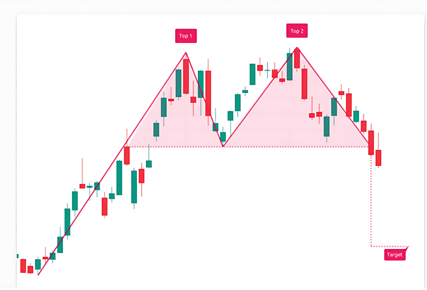
Double Top Formation
Double Top Pattern: Structure, Detection, and Interpretation
The double top is a classic bearish reversal pattern that forms when price reaches a high, pulls back, and then retests that high without breaking it. The two peaks are roughly at the same level, separated by an intermediate low. If the price fails to break above the second top and instead drops below the intermediate low, it often signals the start of a downward move. The expected decline is typically equal to the vertical distance between the tops and the low.
Structure and Psychology:
- First Top:Price rises and hits a resistance level, then pulls back slightly. This is often seen as a normal correction.
- Second Top:Price climbs again to a similar level but fails to break higher. This indicates weakening demand.
- Neckline Breakdown:After the second top, price falls and breaks below the intermediate support (neckline), confirming the reversal.
This pattern shows that the market has tested a resistance level twice and failed. Once the neckline is broken with volume, traders often initiate short positions, placing stop-losses above the second top and targeting a decline equal to the height between the tops and the neckline.
16.5 Triple Top and Bottom

Triple Top Pattern
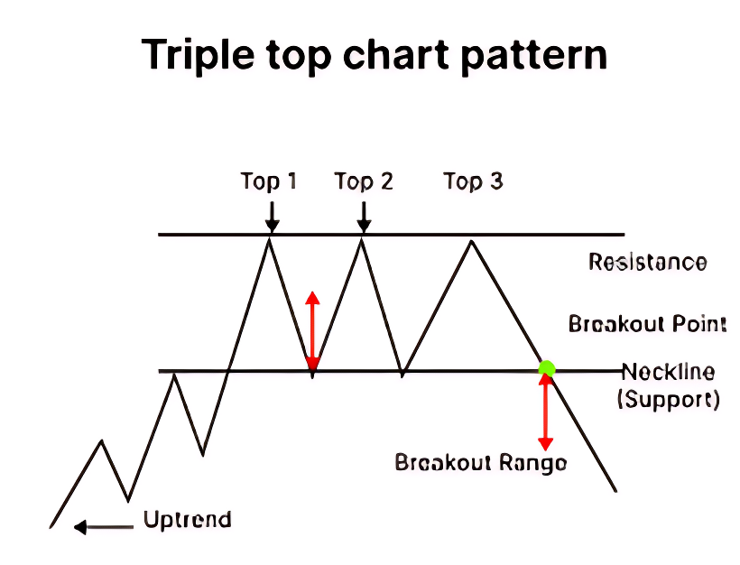
The triple top is a bearish reversal pattern that forms after an extended uptrend. It signals that the market has repeatedly failed to break through a resistance level, suggesting weakening buying pressure and a potential shift toward a downtrend.
Structure and Psychology:
- Three Peaks:Price rises to a similar high three times, each time pulling back after hitting resistance. The highs are roughly equal, with minor variations allowed.
- Intervening Lows:Between each peak, price dips to form two intermediate lows, creating a horizontal support level known as the neckline.
- Breakdown Confirmation:The pattern is confirmed when price closes below the neckline after the third peak. This breakdown indicates that sellers have gained control.
The triple top reflects persistent selling pressure at a key resistance level. Traders often wait for a decisive close below the neckline before entering short positions. The expected decline is usually equal to the vertical distance between the peaks and the neckline.
Triple Bottom Pattern
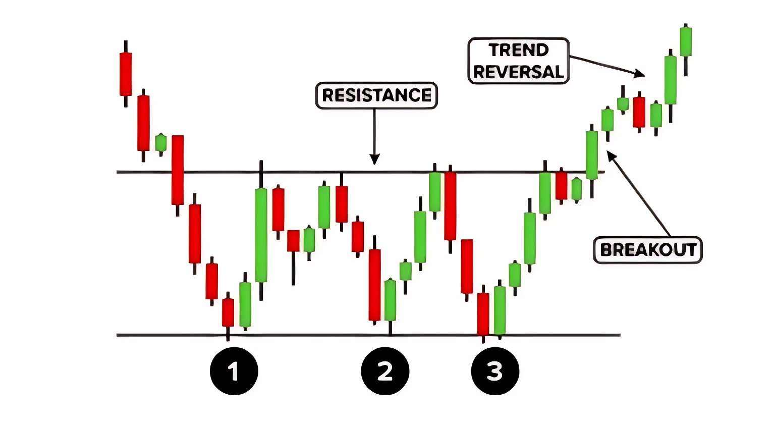
The triple bottom is a bullish reversal pattern that appears after a prolonged downtrend. It suggests that the market has tested a support level three times and failed to break below it, indicating strengthening demand and a potential upward move.
Structure and Psychology:
- Three Troughs:Price falls to a similar low three times, each time bouncing back after hitting support. These lows are nearly equal, showing strong buying interest.
- Intervening Highs:Between each trough, price rises to form two intermediate highs, creating a neckline of resistance.
- Breakout Confirmation:The pattern is confirmed when price closes above the neckline after the third trough. This breakout signals that buyers have taken control.
The triple bottom shows that sellers have repeatedly failed to push prices lower. Once the neckline is broken with volume, traders often enter long positions. The expected rise is typically equal to the vertical distance between the troughs and the neckline.
16.6 Trading Range

Understanding the Trading Range
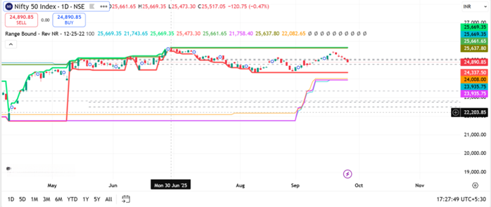
A trading range is a horizontal price channel where the market moves sideways between a defined support and resistance level. It reflects a phase of indecision or consolidation, where neither buyers nor sellers dominate. In your chart, this range is clearly visible between late June and late September.
- Upper Boundary (Resistance): Around 25,200 INR This level has been tested multiple times but failed to break convincingly. It marks the ceiling of the range where selling pressure tends to increase. Between late July and early September, the Nifty 50 index made several attempts to rise above the 25,200 INR Each time, the price reversed shortly after touching or nearing this level. These peaks are visible as candlestick tops that align horizontally, forming a natural resistance zone.
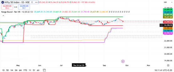
- Lower Boundary (Support): Around 24,600 INR This level has acted as a floor, preventing further decline. Buyers tend to step in here, creating a bounce.
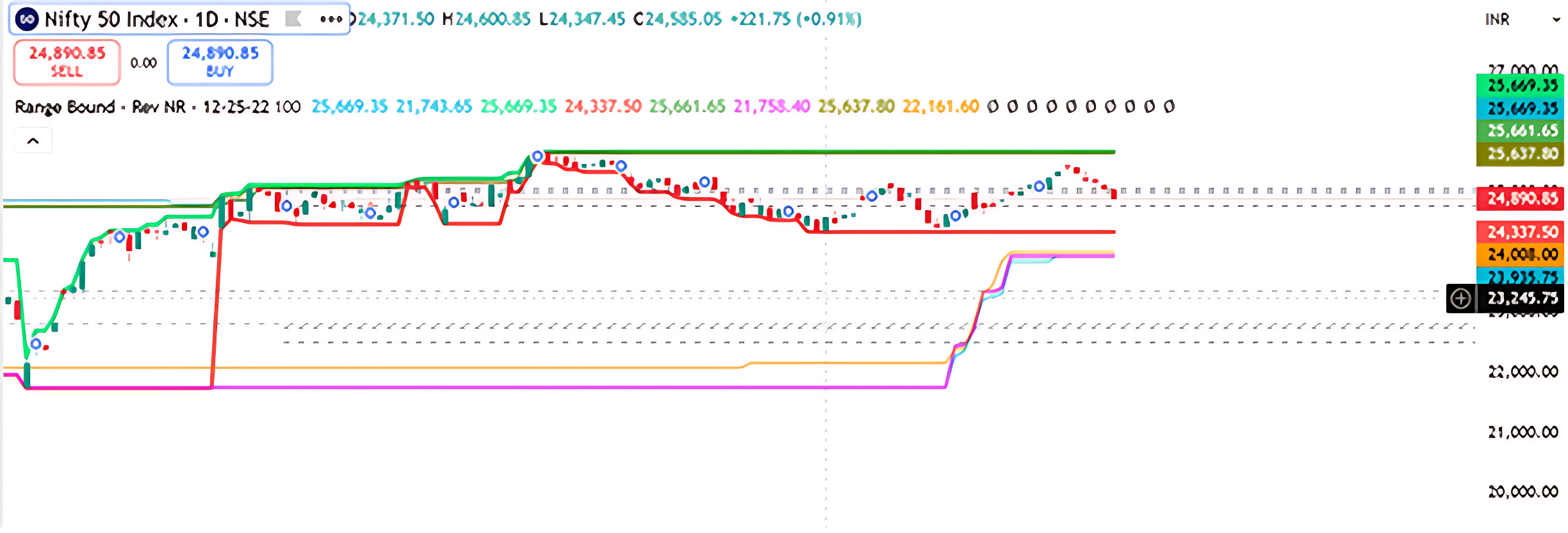
Current Price:24,890.65 INR The index is currently trading near the middle of the range, suggesting indecision. The “SELL” indicator may be based on a recent rejection from the upper band or a signal from the custom indicator.
Visual Cues from the Chart
- The horizontal linesmarking support and resistance are well-defined, indicating a textbook range-bound setup.
- The Range Bound – Rev NR – 12-25-12-12label suggests a custom indicator is identifying this consolidation zone, possibly using volatility compression or reversal logic.
- The candlestick behaviour shows repeated rejections near 25,200 and rebounds near 24,600, reinforcing the range boundaries.
- The recent downward movement suggests the index may be heading back toward support unless a breakout occurs.
Trading Implications
- Range Trading Strategy: Traders may consider buying near 24,600 and selling near 25,200, using tight stop-losses just outside the range.
- Breakout Watch: A close above 25,200 with volume could signal a bullish breakout, while a drop below 24,600 may trigger a bearish move.
- Neutral Bias: Until a breakout occurs, the market remains in consolidation, and directional trades carry higher risk.
16.7 The Range Breakout

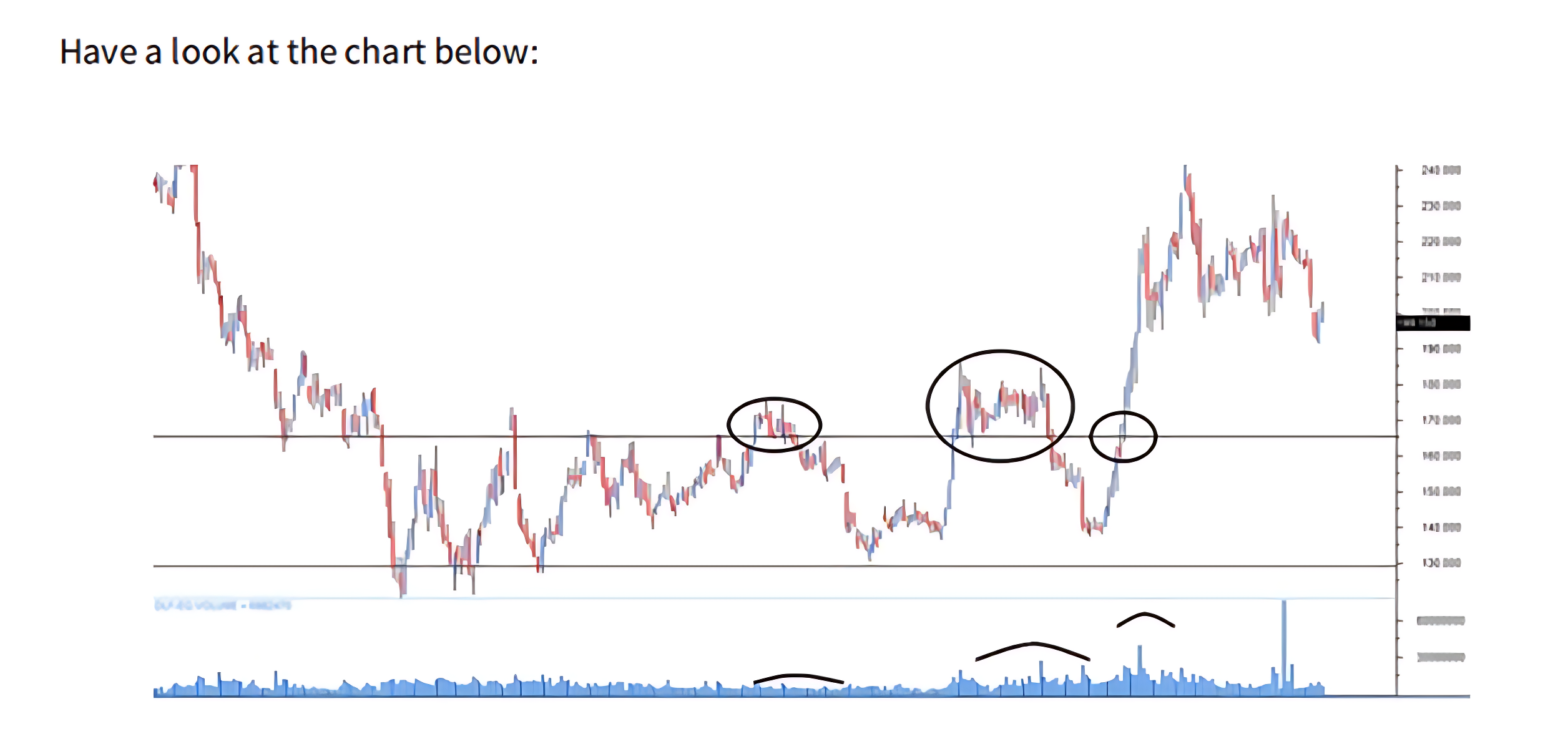
The stock made three breakout attempts from its established range, but only the third proved decisive. The first attempt, seen on the left side of the chart, lacked conviction—volume was weak and momentum was minimal, resulting in a quick reversal. The second breakout showed strong volume, yet failed to carry enough momentum to sustain the move, making it another false signal. It was the third attempt that displayed the hallmark traits of a genuine breakout: robust volume paired with strong upward momentum, confirming a clear shift in market direction.
Trading the Range Breakout
When a stock breaks out of a well-defined price range with strong volume, traders often consider it a signal to enter a trade. However, volume alone confirms only one part of the breakout equation. The second key factor, momentum is harder to predict. Since there’s no guarantee that momentum will follow through, it’s essential for traders to always use a stop-loss when trading breakouts.
Example: Suppose a stock has been trading between Rs.215 and Rs.260 for several weeks. One day, it breaks above Rs.260 and begins trading at Rs.266 with noticeable volume. A trader may choose to go long at Rs.266, placing a stop-loss just below the breakout level at Rs.260 to manage risk.
Alternatively, imagine the stock breaks down below Rs.215 and drops to Rs.208. In this case, a trader might initiate a short position at Rs.208, using Rs.215 as the stop-loss level.
Once the trade is active, if the breakout is genuine, the price is expected to move at least by the width of the previous range. In this example, the range width is Rs.260 – Rs.215 = Rs.45. So, for the upside breakout, the minimum target would be Rs.266 + Rs.45 = Rs.311. For the downside breakdown, the target would be Rs.208 – Rs.45 = Rs.163.
16.8 Flag Formation

The flag pattern typically emerges after a sharp, almost vertical rally in a stock’s price. This rally acts like the “flagpole.” Following this surge, the stock enters a brief pause or pullback phase, where prices drift lower or sideways within two parallel lines—forming the “flag” itself. This correction is usually short-lived, lasting between 5 to 15 trading sessions.
Why It Happens
After a strong rally, many retail traders begin booking profits. This selling pressure causes a temporary dip in price. However, institutional investors or “smart money” often remain invested, keeping the overall sentiment bullish. Because the correction is driven by retail selling and not a shift in fundamentals, volumes tend to be low during the flag phase.
Once the selling dries up, the stock often breaks out of the flag with renewed momentum and volume, resuming its upward journey. This breakout is typically swift, offering a second entry opportunity for traders who missed the initial rally.
Example
Imagine a stock surges from Rs.180 to Rs.230 in just a few sessions. Then it enters a mild correction, drifting between Rs.220 and Rs.230 for about 10 days. This forms the flag. Suddenly, the stock breaks above Rs.230 with strong volume and rallies to Rs.260. A trader who missed the move from Rs.180 now has a chance to enter around Rs.232–Rs.235 with a stop-loss below Rs.220.
Bull Flag chart Pattern
The Bull Flag is a classic continuation pattern observed in trending markets, particularly during strong uptrends. It begins with a sharp, impulsive rally known as the flagpole, driven by aggressive buying and high volume. This is followed by a brief consolidation phase—the flag—where price retraces slightly or moves sideways in a downward-sloping channel. This pullback typically occurs on lighter volume, indicating a pause rather than a reversal. The structure reflects a temporary equilibrium before the trend resumes. Traders monitor this pattern for a breakout above the flag’s resistance line, ideally accompanied by a volume surge, which confirms bullish momentum continuation. Entry is typically placed just above the flag’s upper boundary, with stop-losses below the flag’s low. The measured move target is often projected by adding the length of the flagpole to the breakout point. This setup is favoured for its clear risk-reward profile and reliability in momentum-driven environments.

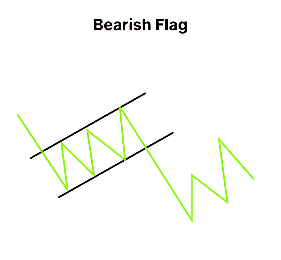
Bear Flag
The Bear Flag is a bearish continuation pattern that typically forms during strong downtrends. It begins with a steep and impulsive decline, known as the flagpole, driven by aggressive selling and high volume. This is followed by a brief consolidation phase—the flag—where price retraces slightly upward or moves sideways within a narrow, upward-sloping channel. This counter-trend move usually occurs on lower volume, indicating a temporary pause rather than a reversal. The structure reflects a market catching its breath before resuming the dominant bearish trend. Traders watch for a breakdown below the flag’s support line, ideally accompanied by a volume increase, which confirms the continuation of selling pressure. Entry is generally placed just below the flag’s lower boundary, with stop-losses above the flag’s high. The profit target is often projected by subtracting the length of the flagpole from the breakdown point. This setup is favoured for its clear structure and effectiveness in momentum-driven downtrends.
16.9 Reward to Risk Ratio : The Trade Filter

The Risk-Reward Ratio (RRR) is a key metric that helps traders assess the viability of a trade by comparing the expected profit to the potential loss. A higher RRR reflects greater trade efficiency, meaning the trader stands to earn more for every rupee risked. To maintain discipline, traders should establish a minimum Reward to Risk Ratio threshold aligned with their risk tolerance, allowing them to filter out low-quality setups and focus only on trades that justify the risk.
The Reward to Risk Ratio helps traders evaluate whether a trade is worth taking. It compares the potential profit (reward) to the potential loss (risk). A higher RRR means better trade efficiency—you’re earning more for every rupee you risk.
How to Calculate
Reward to Risk Ratio = (Target – Entry) ÷ (Entry – Stop-loss)
Example 1: A Weak Reward to Risk Ratio (Unfavourable Trade)
- Entry: 320
- Stop-loss: 310
- Target: 325
- Risk: 10
- Reward:5
- RRR: 5 ÷ 10 = 5
This means you’re risking Rs.10 to make Rs.5—not ideal. Even if the setup looks promising, the math says it’s not worth it.
Example 2: A Strong Reward to Risk Ratio (Favourable Trade)
Entry: Rs.450
- Stop-loss:440
- Target:470
- Risk:10
- Reward:20
- RRR:20 ÷ 10 = 0
Here, for every Rs.1 you risk, you stand to gain Rs.2. This is a solid trade setup.
Why Reward to Risk Ratio Matters
Even if a chart shows a perfect breakout or a textbook candlestick pattern, a poor RRR can make the trade inefficient. Traders should define their minimum RRR threshold based on their style:
- Conservative traders may prefer RRR above 2
- Moderate traders might accept RRR of 1.5
- Aggressive traders may go for RRR of 1 or even lower in fast-moving markets
Reward to Risk Ratio acts like a filter. It helps you say “no” to trades that look good but don’t offer enough reward for the risk involved. Over time, this discipline protects capital and improves consistency.
16.10 The Grand Checklist: A Trader’s Filter for Clarity

After exploring the key pillars of technical analysis, it’s time to bring everything together into a practical decision-making framework. This checklist isn’t just a formality—it’s your filter for separating high-quality trade setups from impulsive guesses. Every trade you consider should pass through this lens before execution.
- A Recognizable Candlestick Pattern
Start by ensuring the price action forms a clear and meaningful pattern. Candlestick formations are often the first visual cue, but they must be supported by context.
- Stop-Loss Placed at a Key Support or Resistance Level
Look at where the pattern is forming in relation to support and resistance zones. If the setup aligns with these levels, it adds weight to the trade idea and helps define your stop-loss placement.
- Confirmation from Volume, especially on breakouts
Volume plays a crucial role in confirming intent. A breakout or breakdown backed by strong volume suggests genuine participation, while weak volume may signal hesitation or false moves. If the volume doesn’t support the price action, it’s okay to pause and reassess.
- Validation from Dow Theory
Dow Theory adds another layer of insight. It helps you understand whether the trade aligns with the broader market trend. If the primary trend supports your direction, it’s a green light. But if you’re trading against the secondary trend, caution is warranted. Recognizing patterns like double tops, triple bottoms, or range formations can further validate your setup.
- Reinforcement from Technical Indicators
Indicators can act as reinforcements. If they align with your trade thesis, you might consider scaling up your position. If they don’t, stick to your original plan without over committing. Indicators are tools—not guarantees—but they can sharpen your edge.
- Satisfactory Reward to Risk Ratio
Finally, never ignore the reward-to-risk ratio. It’s the mathematical backbone of disciplined trading. Before entering any position, ask yourself: is the potential reward worth the risk I’m taking? If not, walk away. Over time, this habit protects your capital and improves consistency. Whether you’re a beginner or an active trader, defining your personal RRR threshold is essential.
By following this checklist with intent and discipline, you’ll avoid trades based on emotion or vague logic. It’s not just about finding opportunities—it’s about qualifying them with clarity and confidence.
Activity for You
- According to Dow Theory, what does a series of higher highs and higher lows indicate?
- A) Sideways market
- B) Downtrend
- C) Uptrend
- D) Volatility spike
Correct Answer: C) Uptrend
Why: A consistent pattern of higher highs and higher lows signals a bullish trend under Dow Theory.
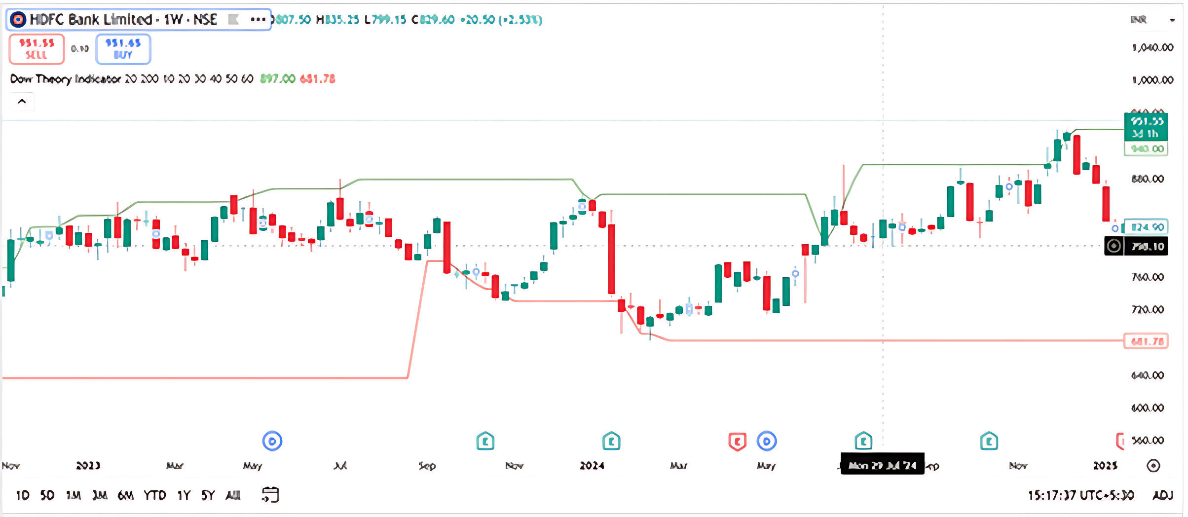
- In the chart, the support level is marked at ₹681.78. What does this level represent?
- A) A price ceiling
- B) A potential reversal zone during a decline
- C) A breakout target
- D) A moving average
Correct Answer: B) A potential reversal zone during a decline
Why: Support is where buying interest may emerge, halting or reversing a downtrend.
- If the price breaks above the resistance level of ₹991.55 with strong volume, what does Dow Theory suggest?
- A) Trend exhaustion
- B) False breakout
- C) Continuation of the uptrend
- D) Entry into a bear market
Correct Answer: C) Continuation of the uptrend
Why: A breakout above resistance confirms bullish strength and may signal trend continuation.
- What role does volume play in Dow Theory trend confirmation?
- A) Volume is ignored
- B) High volume confirms trend direction
- C) Low volume confirms reversals
- D) Volume only matters in intraday charts
Correct Answer: B) High volume confirms trend direction
Why: Volume is a key component in Dow Theory—it validates the strength of price movements.
16.11 Key Takeaways

- Origins: Dow Theory is a set of market observations developed by Charles H. Dow, the co-founder of The Wall Street Journal. The theory was not named by Dow himself but was later articulated by his associate, S. A. Nelson.
- Purpose: The theory provides a framework for analyzing the overall market trend and is regarded as a reliable gauge of price and economic patterns.
- Primary Trend: This refers to the main, long-term direction of the market, which can be either bullish (an uptrend) or bearish (a downtrend).
- Secondary Trend: These are shorter-term movements that go against the primary trend, such as a temporary pullback in an uptrend or a rally in a downtrend.
- Importance of Confirmation: Dow Theory emphasizes that a trend is confirmed when both the Industrial Average and the Railroad (now Transportation) Average move in the same direction. This principle highlights the importance of confirmation across different market sectors.
- Volume and Trends: Volume is crucial for confirming a move. A breakout or breakdown in price is considered more valid when it is backed by strong trading volume. Conversely, weak volume may suggest a false move or hesitation.
- Integrating with a Trading Checklist: Dow Theory can be used as a layer of confirmation in a trading checklist. A trade that aligns with the broader market’s primary trend is considered more credible.
- Market Psychology: The theory’s principles, like the three phases of a bull market (accumulation, public participation, and excess), are based on understanding market psychology. It suggests that prices reflect all available information and that history tends to repeat itself.
- Not a Short-Term Tool: Dow Theory is most effective for analyzing long-term market trends and is not designed for short-term trading. Its core purpose is to help traders understand the big picture of the market.
- Risk Management: The chapter emphasizes the importance of risk management, including setting stop-losses and ensuring that the potential reward outweighs the risk. This framework helps traders avoid impulsive, emotional decisions.
16.1 The Dow Theory Principles
Charles H. Dow, the mastermind behind the nation’s leading financial news provider, Dow, Jones, and Company, co-owned The Wall Street Journal, serving as its editor until his passing in 1902. He authored a handful of editorials concerning stock speculation early in his career, offering the sole firsthand account of his insights into the repetitive patterns of the stock market. These insights stemmed from the everyday average prices of railroad and industrial stocks featured in the Dow Jones Averages.
The label “Dow Theory” was not something Mr. Dow used to describe his stock market observations. This was the creation of his associate, S. A. Nelson, who authored “The ABC of Stock Speculation” in 1902. Nelson was the one who endeavoured to convey Dow’s techniques in an accessible way. Numerous thriving individuals now regard the indications derived from the everyday fluctuations of the Dow Jones rail and industrial averages as the most reliable gauge of both price and economic patterns ever conceived, often alluding to conclusions drawn from these average fluctuations as “The Dow Theory. “
Numerous thriving individuals now regard the indications derived from the everyday fluctuations of the Dow-Jones Rail and industrial averages as the most reliable gauge of both price and economic patterns ever conceived, often alluding to conclusions drawn from these average fluctuations as “The Dow Theory. “
Up until 1897, Dow, Jones, and Co. maintained only one stock average; however, at the start of that year, distinct averages were introduced for both railroad and industrial stocks. During Dow’s writing period, he had access to, at most, a mere five-year history of both averages for analysis. Astonishingly, within such a brief span, he successfully laid the groundwork for a remarkably valuable theory of price fluctuations grounded in these dual averages. While some of his later conclusions proved inaccurate, the fundamental principles have demonstrated their validity when assessed against market activity for 28 years following his death.
The development of the automobile and of the Dow Theory since 1902 have certain similarities. To the automobile of 1902, our engineers later added improved motive power, demountable rims, electric lights, self starters and other needed refinements which eventually gave us a reliable and convenient means of transportation. In a similar manner, Hamilton tested and improved Dow theory between 1902 and 1929. As the record of the averages unfolded with the years he gave us a well defined and exceptionally reliable method of forecasting the trends of both stock prices and business activity.
Dow Theory is foundational framework in Technical Analysis that interprets market trends based on the movements of major stock market indexes originally the Dow Jones Industrial Average and the Dow Jones Transportation Average. The theory proposes that the market moves in three trends
Primary Trend : The long-term direction of the market, lasting months or years
Secondary Trend : A temporary correction or rally that moves against the primary trend, lasting a few weeks to a few months
Minor Trend : Short-term fluctuations that are often considered market noise
The trend is confirmed only when both indexes move in the same direction. The theory also emphasize volume as a supporting indicator and suggests that markets reflect all available information moving in phases : accumulation, participation and distribution. Traders use Dow Theory to identify the direction of the broader market and align their strategies accordingly.
The Dow Theory Principles
- The market discounts everything: This principle means that all known information, economic data, political events, company earnings, and even investor psychology, is already reflected in stock prices. According to Dow Theory, price movements are not random but are shaped by collective market knowledge. Therefore, technical analysts focus on price charts rather than trying to interpret news or economic reports separately.
- The market moves in three trends: Dow Theory classifies price movement into three distinct trends. The primary trend is the long-term direction of the market, which can last for months or years and is the most important for investors. The secondary trend is a temporary correction or rally that moves against the primary trend and typically lasts from a few weeks to a few months. The minor trend consists of short-term fluctuations that occur daily or weekly and are often considered market noise. Understanding these trends helps traders align their strategies with the broader market direction.
- Each primary trend has three phases: The first phase is accumulation, where informed investors begin buying or selling quietly before the general public notices. The second phase is public participation, when the broader market joins the trend and prices move more sharply. The third phase is distribution, where early investors begin to exit their positions while the public continues to trade enthusiastically. Recognizing these phases can help traders avoid entering too late or exiting too early.
- A trend is confirmed when both indexes agree: Dow Theory originally used the Dow Jones Industrial Average and the Dow Jones Transportation Average to confirm market trends. A trend is considered valid only when both indexes move in the same direction. For example, if industrial stocks are rising but transportation stocks are falling, the trend is not confirmed. This principle emphasizes the importance of broad market participation in validating a trend.
- Volume should confirm the trend: Volume refers to the number of shares traded during a given period. In Dow Theory, rising volume during an uptrend indicates strong buying interest and confirms the trend’s strength. Conversely, declining volume during a rally may signal weakness or lack of conviction. Volume acts as a supporting indicator that helps traders assess whether a trend is likely to continue or reverse.
- A trend remains in effect until a clear reversal occurs : This principle advises traders to assume that a trend will continue unless there is clear evidence of a reversal. Temporary pullbacks or rallies do not necessarily mean the trend has ended. Only when price action breaks key support or resistance levels and is confirmed by volume and index agreement should traders consider the possibility of a trend change. This helps avoid premature decisions based on short-term volatility.
16.2 The Different Phases of Market
- Accumulation Phase: This phase begins when the market has bottomed out after a prolonged downtrend. Prices are low, sentiment is pessimistic, and most retail investors are either fearful or disinterested. However, informed investors and institutions quietly begin buying stocks, recognizing undervaluation and anticipating a future uptrend. Price movements during this phase are subtle and often range-bound, as the buying activity is gradual and not yet visible to the broader market. Volume may start to pick up slightly, but there is no widespread enthusiasm. This phase reflects strategic positioning by those who understand market cycles and are willing to act before the crowd.
- Mark-Up Phase : Once accumulation reaches a tipping point, prices begin to rise more noticeably. This phase is marked by growing optimism, improving economic indicators, and increasing participation from the public. As more investors recognize the uptrend, demand accelerates and prices climb steadily. Technical breakouts, higher highs and higher lows, and expanding volume are common features of this phase. Media coverage turns positive, and retail investors start entering the market, often driven by fear of missing out. This is typically the longest and most profitable phase of the cycle, where trend-following strategies perform well and momentum builds across sectors.
- Distribution Phase: In this final phase, prices have risen significantly and valuations may appear stretched. Smart money and institutional investors begin to exit their positions, selling into the strength while retail investors continue to buy. Market sentiment is optimistic, news is overwhelmingly positive, and many believe the rally will continue indefinitely. However, price action becomes volatile, volume may spike without clear direction, and signs of exhaustion begin to appear. This phase often includes false breakouts and increased volatility. Eventually, selling pressure outweighs demand, leading to a reversal and the beginning of a new downtrend. Recognizing this phase is crucial to avoid being caught in the decline that follows.
16.3 The Dow Patterns
Just as candlestick charts reveal key price patterns, Dow Theory also offers a set of recognizable formations that traders can use to spot potential trading opportunities. These patterns help interpret market behaviour and anticipate reversals or continuations in trend. Among the most commonly studied are
- The double top and double bottom: A trend reversal pattern occurs when the price tests a key support or resistance level twice but fails to break through, suggesting a possible shift in market direction.
- Triple Bottom/Top: Similar to double formations but with three price tests, making it a stronger reversal signal
- Trading Range: A period of consolidation where price moves sideways between defined support and resistance levels, often preceding a breakout.
- Flag Formation: Occurs after a sharp, almost vertical rally and represents a brief pause or pullback before the trend resumes. This can offer a second entry opportunity for traders
While support and resistance play a vital role in all these patterns, especially for setting entry, exit, and stop-loss levels—their foundational importance has already been covered in an earlier chapter dedicated to that concept.
16.4 Double Bottom and Top Pattern
Double Bottom Formation
The double bottom is a bullish reversal pattern that typically forms after a sustained downtrend. It signals that selling pressure may be exhausted and buyers are beginning to take control.
Structure and Psychology:
- First Bottom:Price declines and hits a support level, then bounces back slightly. This is often seen as a routine pullback.
- Second Bottom:Price drops again to a similar level as the first bottom but fails to break lower. This shows that sellers are losing strength.
- Neckline Breakout:After the second bottom, price rallies and breaks above the intermediate resistance (called the neckline), confirming the reversal.
This pattern reflects a shift in sentiment. Smart money may have accumulated during the first bottom, and the second bottom confirms their conviction. Once the neckline is broken with volume, traders often enter long positions, placing stop-losses below the second bottom and targeting a move equal to the height between the bottoms and the neckline.
Double Top Formation
Double Top Pattern: Structure, Detection, and Interpretation
The double top is a classic bearish reversal pattern that forms when price reaches a high, pulls back, and then retests that high without breaking it. The two peaks are roughly at the same level, separated by an intermediate low. If the price fails to break above the second top and instead drops below the intermediate low, it often signals the start of a downward move. The expected decline is typically equal to the vertical distance between the tops and the low.
Structure and Psychology:
- First Top:Price rises and hits a resistance level, then pulls back slightly. This is often seen as a normal correction.
- Second Top:Price climbs again to a similar level but fails to break higher. This indicates weakening demand.
- Neckline Breakdown:After the second top, price falls and breaks below the intermediate support (neckline), confirming the reversal.
This pattern shows that the market has tested a resistance level twice and failed. Once the neckline is broken with volume, traders often initiate short positions, placing stop-losses above the second top and targeting a decline equal to the height between the tops and the neckline.
16.5 Triple Top and Bottom
Triple Top Pattern
The triple top is a bearish reversal pattern that forms after an extended uptrend. It signals that the market has repeatedly failed to break through a resistance level, suggesting weakening buying pressure and a potential shift toward a downtrend.
Structure and Psychology:
- Three Peaks:Price rises to a similar high three times, each time pulling back after hitting resistance. The highs are roughly equal, with minor variations allowed.
- Intervening Lows:Between each peak, price dips to form two intermediate lows, creating a horizontal support level known as the neckline.
- Breakdown Confirmation:The pattern is confirmed when price closes below the neckline after the third peak. This breakdown indicates that sellers have gained control.
The triple top reflects persistent selling pressure at a key resistance level. Traders often wait for a decisive close below the neckline before entering short positions. The expected decline is usually equal to the vertical distance between the peaks and the neckline.
Triple Bottom Pattern
The triple bottom is a bullish reversal pattern that appears after a prolonged downtrend. It suggests that the market has tested a support level three times and failed to break below it, indicating strengthening demand and a potential upward move.
Structure and Psychology:
- Three Troughs:Price falls to a similar low three times, each time bouncing back after hitting support. These lows are nearly equal, showing strong buying interest.
- Intervening Highs:Between each trough, price rises to form two intermediate highs, creating a neckline of resistance.
- Breakout Confirmation:The pattern is confirmed when price closes above the neckline after the third trough. This breakout signals that buyers have taken control.
The triple bottom shows that sellers have repeatedly failed to push prices lower. Once the neckline is broken with volume, traders often enter long positions. The expected rise is typically equal to the vertical distance between the troughs and the neckline.
16.6 Trading Range
Understanding the Trading Range
A trading range is a horizontal price channel where the market moves sideways between a defined support and resistance level. It reflects a phase of indecision or consolidation, where neither buyers nor sellers dominate. In your chart, this range is clearly visible between late June and late September.
- Upper Boundary (Resistance): Around 25,200 INR This level has been tested multiple times but failed to break convincingly. It marks the ceiling of the range where selling pressure tends to increase. Between late July and early September, the Nifty 50 index made several attempts to rise above the 25,200 INR Each time, the price reversed shortly after touching or nearing this level. These peaks are visible as candlestick tops that align horizontally, forming a natural resistance zone.
- Lower Boundary (Support): Around 24,600 INR This level has acted as a floor, preventing further decline. Buyers tend to step in here, creating a bounce.
Current Price:24,890.65 INR The index is currently trading near the middle of the range, suggesting indecision. The “SELL” indicator may be based on a recent rejection from the upper band or a signal from the custom indicator.
Visual Cues from the Chart
- The horizontal linesmarking support and resistance are well-defined, indicating a textbook range-bound setup.
- The Range Bound – Rev NR – 12-25-12-12label suggests a custom indicator is identifying this consolidation zone, possibly using volatility compression or reversal logic.
- The candlestick behaviour shows repeated rejections near 25,200 and rebounds near 24,600, reinforcing the range boundaries.
- The recent downward movement suggests the index may be heading back toward support unless a breakout occurs.
Trading Implications
- Range Trading Strategy: Traders may consider buying near 24,600 and selling near 25,200, using tight stop-losses just outside the range.
- Breakout Watch: A close above 25,200 with volume could signal a bullish breakout, while a drop below 24,600 may trigger a bearish move.
- Neutral Bias: Until a breakout occurs, the market remains in consolidation, and directional trades carry higher risk.
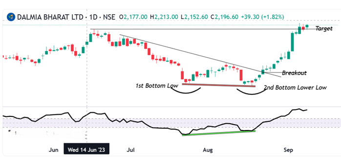
16.7 The Range Breakout
The stock made three breakout attempts from its established range, but only the third proved decisive. The first attempt, seen on the left side of the chart, lacked conviction—volume was weak and momentum was minimal, resulting in a quick reversal. The second breakout showed strong volume, yet failed to carry enough momentum to sustain the move, making it another false signal. It was the third attempt that displayed the hallmark traits of a genuine breakout: robust volume paired with strong upward momentum, confirming a clear shift in market direction.
Trading the Range Breakout
When a stock breaks out of a well-defined price range with strong volume, traders often consider it a signal to enter a trade. However, volume alone confirms only one part of the breakout equation. The second key factor, momentum is harder to predict. Since there’s no guarantee that momentum will follow through, it’s essential for traders to always use a stop-loss when trading breakouts.
Example: Suppose a stock has been trading between Rs.215 and Rs.260 for several weeks. One day, it breaks above Rs.260 and begins trading at Rs.266 with noticeable volume. A trader may choose to go long at Rs.266, placing a stop-loss just below the breakout level at Rs.260 to manage risk.
Alternatively, imagine the stock breaks down below Rs.215 and drops to Rs.208. In this case, a trader might initiate a short position at Rs.208, using Rs.215 as the stop-loss level.
Once the trade is active, if the breakout is genuine, the price is expected to move at least by the width of the previous range. In this example, the range width is Rs.260 – Rs.215 = Rs.45. So, for the upside breakout, the minimum target would be Rs.266 + Rs.45 = Rs.311. For the downside breakdown, the target would be Rs.208 – Rs.45 = Rs.163.
16.8 Flag Formation
The flag pattern typically emerges after a sharp, almost vertical rally in a stock’s price. This rally acts like the “flagpole.” Following this surge, the stock enters a brief pause or pullback phase, where prices drift lower or sideways within two parallel lines—forming the “flag” itself. This correction is usually short-lived, lasting between 5 to 15 trading sessions.
Why It Happens
After a strong rally, many retail traders begin booking profits. This selling pressure causes a temporary dip in price. However, institutional investors or “smart money” often remain invested, keeping the overall sentiment bullish. Because the correction is driven by retail selling and not a shift in fundamentals, volumes tend to be low during the flag phase.
Once the selling dries up, the stock often breaks out of the flag with renewed momentum and volume, resuming its upward journey. This breakout is typically swift, offering a second entry opportunity for traders who missed the initial rally.
Example
Imagine a stock surges from Rs.180 to Rs.230 in just a few sessions. Then it enters a mild correction, drifting between Rs.220 and Rs.230 for about 10 days. This forms the flag. Suddenly, the stock breaks above Rs.230 with strong volume and rallies to Rs.260. A trader who missed the move from Rs.180 now has a chance to enter around Rs.232–Rs.235 with a stop-loss below Rs.220.
Bull Flag chart Pattern
The Bull Flag is a classic continuation pattern observed in trending markets, particularly during strong uptrends. It begins with a sharp, impulsive rally known as the flagpole, driven by aggressive buying and high volume. This is followed by a brief consolidation phase—the flag—where price retraces slightly or moves sideways in a downward-sloping channel. This pullback typically occurs on lighter volume, indicating a pause rather than a reversal. The structure reflects a temporary equilibrium before the trend resumes. Traders monitor this pattern for a breakout above the flag’s resistance line, ideally accompanied by a volume surge, which confirms bullish momentum continuation. Entry is typically placed just above the flag’s upper boundary, with stop-losses below the flag’s low. The measured move target is often projected by adding the length of the flagpole to the breakout point. This setup is favoured for its clear risk-reward profile and reliability in momentum-driven environments.
Bear Flag
The Bear Flag is a bearish continuation pattern that typically forms during strong downtrends. It begins with a steep and impulsive decline, known as the flagpole, driven by aggressive selling and high volume. This is followed by a brief consolidation phase—the flag—where price retraces slightly upward or moves sideways within a narrow, upward-sloping channel. This counter-trend move usually occurs on lower volume, indicating a temporary pause rather than a reversal. The structure reflects a market catching its breath before resuming the dominant bearish trend. Traders watch for a breakdown below the flag’s support line, ideally accompanied by a volume increase, which confirms the continuation of selling pressure. Entry is generally placed just below the flag’s lower boundary, with stop-losses above the flag’s high. The profit target is often projected by subtracting the length of the flagpole from the breakdown point. This setup is favoured for its clear structure and effectiveness in momentum-driven downtrends.
16.9 Reward to Risk Ratio : The Trade Filter
The Risk-Reward Ratio (RRR) is a key metric that helps traders assess the viability of a trade by comparing the expected profit to the potential loss. A higher RRR reflects greater trade efficiency, meaning the trader stands to earn more for every rupee risked. To maintain discipline, traders should establish a minimum Reward to Risk Ratio threshold aligned with their risk tolerance, allowing them to filter out low-quality setups and focus only on trades that justify the risk.
The Reward to Risk Ratio helps traders evaluate whether a trade is worth taking. It compares the potential profit (reward) to the potential loss (risk). A higher RRR means better trade efficiency—you’re earning more for every rupee you risk.
How to Calculate
Reward to Risk Ratio = (Target – Entry) ÷ (Entry – Stop-loss)
Example 1: A Weak Reward to Risk Ratio (Unfavourable Trade)
- Entry: 320
- Stop-loss: 310
- Target: 325
- Risk: 10
- Reward:5
- RRR: 5 ÷ 10 = 5
This means you’re risking Rs.10 to make Rs.5—not ideal. Even if the setup looks promising, the math says it’s not worth it.
Example 2: A Strong Reward to Risk Ratio (Favourable Trade)
Entry: Rs.450
- Stop-loss:440
- Target:470
- Risk:10
- Reward:20
- RRR:20 ÷ 10 = 0
Here, for every Rs.1 you risk, you stand to gain Rs.2. This is a solid trade setup.
Why Reward to Risk Ratio Matters
Even if a chart shows a perfect breakout or a textbook candlestick pattern, a poor RRR can make the trade inefficient. Traders should define their minimum RRR threshold based on their style:
- Conservative traders may prefer RRR above 2
- Moderate traders might accept RRR of 1.5
- Aggressive traders may go for RRR of 1 or even lower in fast-moving markets
Reward to Risk Ratio acts like a filter. It helps you say “no” to trades that look good but don’t offer enough reward for the risk involved. Over time, this discipline protects capital and improves consistency.
16.10 The Grand Checklist: A Trader’s Filter for Clarity
After exploring the key pillars of technical analysis, it’s time to bring everything together into a practical decision-making framework. This checklist isn’t just a formality—it’s your filter for separating high-quality trade setups from impulsive guesses. Every trade you consider should pass through this lens before execution.
- A Recognizable Candlestick Pattern
Start by ensuring the price action forms a clear and meaningful pattern. Candlestick formations are often the first visual cue, but they must be supported by context.
- Stop-Loss Placed at a Key Support or Resistance Level
Look at where the pattern is forming in relation to support and resistance zones. If the setup aligns with these levels, it adds weight to the trade idea and helps define your stop-loss placement.
- Confirmation from Volume, especially on breakouts
Volume plays a crucial role in confirming intent. A breakout or breakdown backed by strong volume suggests genuine participation, while weak volume may signal hesitation or false moves. If the volume doesn’t support the price action, it’s okay to pause and reassess.
- Validation from Dow Theory
Dow Theory adds another layer of insight. It helps you understand whether the trade aligns with the broader market trend. If the primary trend supports your direction, it’s a green light. But if you’re trading against the secondary trend, caution is warranted. Recognizing patterns like double tops, triple bottoms, or range formations can further validate your setup.
- Reinforcement from Technical Indicators
Indicators can act as reinforcements. If they align with your trade thesis, you might consider scaling up your position. If they don’t, stick to your original plan without over committing. Indicators are tools—not guarantees—but they can sharpen your edge.
- Satisfactory Reward to Risk Ratio
Finally, never ignore the reward-to-risk ratio. It’s the mathematical backbone of disciplined trading. Before entering any position, ask yourself: is the potential reward worth the risk I’m taking? If not, walk away. Over time, this habit protects your capital and improves consistency. Whether you’re a beginner or an active trader, defining your personal RRR threshold is essential.
By following this checklist with intent and discipline, you’ll avoid trades based on emotion or vague logic. It’s not just about finding opportunities—it’s about qualifying them with clarity and confidence.
Activity for You
- According to Dow Theory, what does a series of higher highs and higher lows indicate?
- A) Sideways market
- B) Downtrend
- C) Uptrend
- D) Volatility spike
Correct Answer: C) Uptrend
Why: A consistent pattern of higher highs and higher lows signals a bullish trend under Dow Theory.
- In the chart, the support level is marked at ₹681.78. What does this level represent?
- A) A price ceiling
- B) A potential reversal zone during a decline
- C) A breakout target
- D) A moving average
Correct Answer: B) A potential reversal zone during a decline
Why: Support is where buying interest may emerge, halting or reversing a downtrend.
- If the price breaks above the resistance level of ₹991.55 with strong volume, what does Dow Theory suggest?
- A) Trend exhaustion
- B) False breakout
- C) Continuation of the uptrend
- D) Entry into a bear market
Correct Answer: C) Continuation of the uptrend
Why: A breakout above resistance confirms bullish strength and may signal trend continuation.
- What role does volume play in Dow Theory trend confirmation?
- A) Volume is ignored
- B) High volume confirms trend direction
- C) Low volume confirms reversals
- D) Volume only matters in intraday charts
Correct Answer: B) High volume confirms trend direction
Why: Volume is a key component in Dow Theory—it validates the strength of price movements.
16.11 Key Takeaways
- Origins: Dow Theory is a set of market observations developed by Charles H. Dow, the co-founder of The Wall Street Journal. The theory was not named by Dow himself but was later articulated by his associate, S. A. Nelson.
- Purpose: The theory provides a framework for analyzing the overall market trend and is regarded as a reliable gauge of price and economic patterns.
- Primary Trend: This refers to the main, long-term direction of the market, which can be either bullish (an uptrend) or bearish (a downtrend).
- Secondary Trend: These are shorter-term movements that go against the primary trend, such as a temporary pullback in an uptrend or a rally in a downtrend.
- Importance of Confirmation: Dow Theory emphasizes that a trend is confirmed when both the Industrial Average and the Railroad (now Transportation) Average move in the same direction. This principle highlights the importance of confirmation across different market sectors.
- Volume and Trends: Volume is crucial for confirming a move. A breakout or breakdown in price is considered more valid when it is backed by strong trading volume. Conversely, weak volume may suggest a false move or hesitation.
- Integrating with a Trading Checklist: Dow Theory can be used as a layer of confirmation in a trading checklist. A trade that aligns with the broader market’s primary trend is considered more credible.
- Market Psychology: The theory’s principles, like the three phases of a bull market (accumulation, public participation, and excess), are based on understanding market psychology. It suggests that prices reflect all available information and that history tends to repeat itself.
- Not a Short-Term Tool: Dow Theory is most effective for analyzing long-term market trends and is not designed for short-term trading. Its core purpose is to help traders understand the big picture of the market.
- Risk Management: The chapter emphasizes the importance of risk management, including setting stop-losses and ensuring that the potential reward outweighs the risk. This framework helps traders avoid impulsive, emotional decisions.
16.1 The Dow Theory Principles
Charles H. Dow, the mastermind behind the nation’s leading financial news provider, Dow, Jones, and Company, co-owned The Wall Street Journal, serving as its editor until his passing in 1902. He authored a handful of editorials concerning stock speculation early in his career, offering the sole firsthand account of his insights into the repetitive patterns of the stock market. These insights stemmed from the everyday average prices of railroad and industrial stocks featured in the Dow Jones Averages.
The label “Dow Theory” was not something Mr. Dow used to describe his stock market observations. This was the creation of his associate, S. A. Nelson, who authored “The ABC of Stock Speculation” in 1902. Nelson was the one who endeavoured to convey Dow’s techniques in an accessible way. Numerous thriving individuals now regard the indications derived from the everyday fluctuations of the Dow Jones rail and industrial averages as the most reliable gauge of both price and economic patterns ever conceived, often alluding to conclusions drawn from these average fluctuations as “The Dow Theory. “
Numerous thriving individuals now regard the indications derived from the everyday fluctuations of the Dow-Jones Rail and industrial averages as the most reliable gauge of both price and economic patterns ever conceived, often alluding to conclusions drawn from these average fluctuations as “The Dow Theory. “
Up until 1897, Dow, Jones, and Co. maintained only one stock average; however, at the start of that year, distinct averages were introduced for both railroad and industrial stocks. During Dow’s writing period, he had access to, at most, a mere five-year history of both averages for analysis. Astonishingly, within such a brief span, he successfully laid the groundwork for a remarkably valuable theory of price fluctuations grounded in these dual averages. While some of his later conclusions proved inaccurate, the fundamental principles have demonstrated their validity when assessed against market activity for 28 years following his death.
The development of the automobile and of the Dow Theory since 1902 have certain similarities. To the automobile of 1902, our engineers later added improved motive power, demountable rims, electric lights, self starters and other needed refinements which eventually gave us a reliable and convenient means of transportation. In a similar manner, Hamilton tested and improved Dow theory between 1902 and 1929. As the record of the averages unfolded with the years he gave us a well defined and exceptionally reliable method of forecasting the trends of both stock prices and business activity.
Dow Theory is foundational framework in Technical Analysis that interprets market trends based on the movements of major stock market indexes originally the Dow Jones Industrial Average and the Dow Jones Transportation Average. The theory proposes that the market moves in three trends
Primary Trend : The long-term direction of the market, lasting months or years
Secondary Trend : A temporary correction or rally that moves against the primary trend, lasting a few weeks to a few months
Minor Trend : Short-term fluctuations that are often considered market noise
The trend is confirmed only when both indexes move in the same direction. The theory also emphasize volume as a supporting indicator and suggests that markets reflect all available information moving in phases : accumulation, participation and distribution. Traders use Dow Theory to identify the direction of the broader market and align their strategies accordingly.
The Dow Theory Principles
- The market discounts everything: This principle means that all known information, economic data, political events, company earnings, and even investor psychology, is already reflected in stock prices. According to Dow Theory, price movements are not random but are shaped by collective market knowledge. Therefore, technical analysts focus on price charts rather than trying to interpret news or economic reports separately.
- The market moves in three trends: Dow Theory classifies price movement into three distinct trends. The primary trend is the long-term direction of the market, which can last for months or years and is the most important for investors. The secondary trend is a temporary correction or rally that moves against the primary trend and typically lasts from a few weeks to a few months. The minor trend consists of short-term fluctuations that occur daily or weekly and are often considered market noise. Understanding these trends helps traders align their strategies with the broader market direction.
- Each primary trend has three phases: The first phase is accumulation, where informed investors begin buying or selling quietly before the general public notices. The second phase is public participation, when the broader market joins the trend and prices move more sharply. The third phase is distribution, where early investors begin to exit their positions while the public continues to trade enthusiastically. Recognizing these phases can help traders avoid entering too late or exiting too early.
- A trend is confirmed when both indexes agree: Dow Theory originally used the Dow Jones Industrial Average and the Dow Jones Transportation Average to confirm market trends. A trend is considered valid only when both indexes move in the same direction. For example, if industrial stocks are rising but transportation stocks are falling, the trend is not confirmed. This principle emphasizes the importance of broad market participation in validating a trend.
- Volume should confirm the trend: Volume refers to the number of shares traded during a given period. In Dow Theory, rising volume during an uptrend indicates strong buying interest and confirms the trend’s strength. Conversely, declining volume during a rally may signal weakness or lack of conviction. Volume acts as a supporting indicator that helps traders assess whether a trend is likely to continue or reverse.
- A trend remains in effect until a clear reversal occurs : This principle advises traders to assume that a trend will continue unless there is clear evidence of a reversal. Temporary pullbacks or rallies do not necessarily mean the trend has ended. Only when price action breaks key support or resistance levels and is confirmed by volume and index agreement should traders consider the possibility of a trend change. This helps avoid premature decisions based on short-term volatility.
16.2 The Different Phases of Market
- Accumulation Phase: This phase begins when the market has bottomed out after a prolonged downtrend. Prices are low, sentiment is pessimistic, and most retail investors are either fearful or disinterested. However, informed investors and institutions quietly begin buying stocks, recognizing undervaluation and anticipating a future uptrend. Price movements during this phase are subtle and often range-bound, as the buying activity is gradual and not yet visible to the broader market. Volume may start to pick up slightly, but there is no widespread enthusiasm. This phase reflects strategic positioning by those who understand market cycles and are willing to act before the crowd.
- Mark-Up Phase : Once accumulation reaches a tipping point, prices begin to rise more noticeably. This phase is marked by growing optimism, improving economic indicators, and increasing participation from the public. As more investors recognize the uptrend, demand accelerates and prices climb steadily. Technical breakouts, higher highs and higher lows, and expanding volume are common features of this phase. Media coverage turns positive, and retail investors start entering the market, often driven by fear of missing out. This is typically the longest and most profitable phase of the cycle, where trend-following strategies perform well and momentum builds across sectors.
- Distribution Phase: In this final phase, prices have risen significantly and valuations may appear stretched. Smart money and institutional investors begin to exit their positions, selling into the strength while retail investors continue to buy. Market sentiment is optimistic, news is overwhelmingly positive, and many believe the rally will continue indefinitely. However, price action becomes volatile, volume may spike without clear direction, and signs of exhaustion begin to appear. This phase often includes false breakouts and increased volatility. Eventually, selling pressure outweighs demand, leading to a reversal and the beginning of a new downtrend. Recognizing this phase is crucial to avoid being caught in the decline that follows.
16.3 The Dow Patterns
Just as candlestick charts reveal key price patterns, Dow Theory also offers a set of recognizable formations that traders can use to spot potential trading opportunities. These patterns help interpret market behaviour and anticipate reversals or continuations in trend. Among the most commonly studied are
- The double top and double bottom: A trend reversal pattern occurs when the price tests a key support or resistance level twice but fails to break through, suggesting a possible shift in market direction.
- Triple Bottom/Top: Similar to double formations but with three price tests, making it a stronger reversal signal
- Trading Range: A period of consolidation where price moves sideways between defined support and resistance levels, often preceding a breakout.
- Flag Formation: Occurs after a sharp, almost vertical rally and represents a brief pause or pullback before the trend resumes. This can offer a second entry opportunity for traders
While support and resistance play a vital role in all these patterns, especially for setting entry, exit, and stop-loss levels—their foundational importance has already been covered in an earlier chapter dedicated to that concept.
16.4 Double Bottom and Top Pattern
Double Bottom Formation
The double bottom is a bullish reversal pattern that typically forms after a sustained downtrend. It signals that selling pressure may be exhausted and buyers are beginning to take control.
Structure and Psychology:
- First Bottom:Price declines and hits a support level, then bounces back slightly. This is often seen as a routine pullback.
- Second Bottom:Price drops again to a similar level as the first bottom but fails to break lower. This shows that sellers are losing strength.
- Neckline Breakout:After the second bottom, price rallies and breaks above the intermediate resistance (called the neckline), confirming the reversal.
This pattern reflects a shift in sentiment. Smart money may have accumulated during the first bottom, and the second bottom confirms their conviction. Once the neckline is broken with volume, traders often enter long positions, placing stop-losses below the second bottom and targeting a move equal to the height between the bottoms and the neckline.
Double Top Formation
Double Top Pattern: Structure, Detection, and Interpretation
The double top is a classic bearish reversal pattern that forms when price reaches a high, pulls back, and then retests that high without breaking it. The two peaks are roughly at the same level, separated by an intermediate low. If the price fails to break above the second top and instead drops below the intermediate low, it often signals the start of a downward move. The expected decline is typically equal to the vertical distance between the tops and the low.
Structure and Psychology:
- First Top:Price rises and hits a resistance level, then pulls back slightly. This is often seen as a normal correction.
- Second Top:Price climbs again to a similar level but fails to break higher. This indicates weakening demand.
- Neckline Breakdown:After the second top, price falls and breaks below the intermediate support (neckline), confirming the reversal.
This pattern shows that the market has tested a resistance level twice and failed. Once the neckline is broken with volume, traders often initiate short positions, placing stop-losses above the second top and targeting a decline equal to the height between the tops and the neckline.
16.5 Triple Top and Bottom
Triple Top Pattern
The triple top is a bearish reversal pattern that forms after an extended uptrend. It signals that the market has repeatedly failed to break through a resistance level, suggesting weakening buying pressure and a potential shift toward a downtrend.
Structure and Psychology:
- Three Peaks:Price rises to a similar high three times, each time pulling back after hitting resistance. The highs are roughly equal, with minor variations allowed.
- Intervening Lows:Between each peak, price dips to form two intermediate lows, creating a horizontal support level known as the neckline.
- Breakdown Confirmation:The pattern is confirmed when price closes below the neckline after the third peak. This breakdown indicates that sellers have gained control.
The triple top reflects persistent selling pressure at a key resistance level. Traders often wait for a decisive close below the neckline before entering short positions. The expected decline is usually equal to the vertical distance between the peaks and the neckline.
Triple Bottom Pattern
The triple bottom is a bullish reversal pattern that appears after a prolonged downtrend. It suggests that the market has tested a support level three times and failed to break below it, indicating strengthening demand and a potential upward move.
Structure and Psychology:
- Three Troughs:Price falls to a similar low three times, each time bouncing back after hitting support. These lows are nearly equal, showing strong buying interest.
- Intervening Highs:Between each trough, price rises to form two intermediate highs, creating a neckline of resistance.
- Breakout Confirmation:The pattern is confirmed when price closes above the neckline after the third trough. This breakout signals that buyers have taken control.
The triple bottom shows that sellers have repeatedly failed to push prices lower. Once the neckline is broken with volume, traders often enter long positions. The expected rise is typically equal to the vertical distance between the troughs and the neckline.
16.6 Trading Range
Understanding the Trading Range
A trading range is a horizontal price channel where the market moves sideways between a defined support and resistance level. It reflects a phase of indecision or consolidation, where neither buyers nor sellers dominate. In your chart, this range is clearly visible between late June and late September.
- Upper Boundary (Resistance): Around 25,200 INR This level has been tested multiple times but failed to break convincingly. It marks the ceiling of the range where selling pressure tends to increase. Between late July and early September, the Nifty 50 index made several attempts to rise above the 25,200 INR Each time, the price reversed shortly after touching or nearing this level. These peaks are visible as candlestick tops that align horizontally, forming a natural resistance zone.
- Lower Boundary (Support): Around 24,600 INR This level has acted as a floor, preventing further decline. Buyers tend to step in here, creating a bounce.
Current Price:24,890.65 INR The index is currently trading near the middle of the range, suggesting indecision. The “SELL” indicator may be based on a recent rejection from the upper band or a signal from the custom indicator.
Visual Cues from the Chart
- The horizontal linesmarking support and resistance are well-defined, indicating a textbook range-bound setup.
- The Range Bound – Rev NR – 12-25-12-12label suggests a custom indicator is identifying this consolidation zone, possibly using volatility compression or reversal logic.
- The candlestick behaviour shows repeated rejections near 25,200 and rebounds near 24,600, reinforcing the range boundaries.
- The recent downward movement suggests the index may be heading back toward support unless a breakout occurs.
Trading Implications
- Range Trading Strategy: Traders may consider buying near 24,600 and selling near 25,200, using tight stop-losses just outside the range.
- Breakout Watch: A close above 25,200 with volume could signal a bullish breakout, while a drop below 24,600 may trigger a bearish move.
- Neutral Bias: Until a breakout occurs, the market remains in consolidation, and directional trades carry higher risk.
16.7 The Range Breakout
The stock made three breakout attempts from its established range, but only the third proved decisive. The first attempt, seen on the left side of the chart, lacked conviction—volume was weak and momentum was minimal, resulting in a quick reversal. The second breakout showed strong volume, yet failed to carry enough momentum to sustain the move, making it another false signal. It was the third attempt that displayed the hallmark traits of a genuine breakout: robust volume paired with strong upward momentum, confirming a clear shift in market direction.
Trading the Range Breakout
When a stock breaks out of a well-defined price range with strong volume, traders often consider it a signal to enter a trade. However, volume alone confirms only one part of the breakout equation. The second key factor, momentum is harder to predict. Since there’s no guarantee that momentum will follow through, it’s essential for traders to always use a stop-loss when trading breakouts.
Example: Suppose a stock has been trading between Rs.215 and Rs.260 for several weeks. One day, it breaks above Rs.260 and begins trading at Rs.266 with noticeable volume. A trader may choose to go long at Rs.266, placing a stop-loss just below the breakout level at Rs.260 to manage risk.
Alternatively, imagine the stock breaks down below Rs.215 and drops to Rs.208. In this case, a trader might initiate a short position at Rs.208, using Rs.215 as the stop-loss level.
Once the trade is active, if the breakout is genuine, the price is expected to move at least by the width of the previous range. In this example, the range width is Rs.260 – Rs.215 = Rs.45. So, for the upside breakout, the minimum target would be Rs.266 + Rs.45 = Rs.311. For the downside breakdown, the target would be Rs.208 – Rs.45 = Rs.163.
16.8 Flag Formation
The flag pattern typically emerges after a sharp, almost vertical rally in a stock’s price. This rally acts like the “flagpole.” Following this surge, the stock enters a brief pause or pullback phase, where prices drift lower or sideways within two parallel lines—forming the “flag” itself. This correction is usually short-lived, lasting between 5 to 15 trading sessions.
Why It Happens
After a strong rally, many retail traders begin booking profits. This selling pressure causes a temporary dip in price. However, institutional investors or “smart money” often remain invested, keeping the overall sentiment bullish. Because the correction is driven by retail selling and not a shift in fundamentals, volumes tend to be low during the flag phase.
Once the selling dries up, the stock often breaks out of the flag with renewed momentum and volume, resuming its upward journey. This breakout is typically swift, offering a second entry opportunity for traders who missed the initial rally.
Example
Imagine a stock surges from Rs.180 to Rs.230 in just a few sessions. Then it enters a mild correction, drifting between Rs.220 and Rs.230 for about 10 days. This forms the flag. Suddenly, the stock breaks above Rs.230 with strong volume and rallies to Rs.260. A trader who missed the move from Rs.180 now has a chance to enter around Rs.232–Rs.235 with a stop-loss below Rs.220.
Bull Flag chart Pattern
The Bull Flag is a classic continuation pattern observed in trending markets, particularly during strong uptrends. It begins with a sharp, impulsive rally known as the flagpole, driven by aggressive buying and high volume. This is followed by a brief consolidation phase—the flag—where price retraces slightly or moves sideways in a downward-sloping channel. This pullback typically occurs on lighter volume, indicating a pause rather than a reversal. The structure reflects a temporary equilibrium before the trend resumes. Traders monitor this pattern for a breakout above the flag’s resistance line, ideally accompanied by a volume surge, which confirms bullish momentum continuation. Entry is typically placed just above the flag’s upper boundary, with stop-losses below the flag’s low. The measured move target is often projected by adding the length of the flagpole to the breakout point. This setup is favoured for its clear risk-reward profile and reliability in momentum-driven environments.
Bear Flag
The Bear Flag is a bearish continuation pattern that typically forms during strong downtrends. It begins with a steep and impulsive decline, known as the flagpole, driven by aggressive selling and high volume. This is followed by a brief consolidation phase—the flag—where price retraces slightly upward or moves sideways within a narrow, upward-sloping channel. This counter-trend move usually occurs on lower volume, indicating a temporary pause rather than a reversal. The structure reflects a market catching its breath before resuming the dominant bearish trend. Traders watch for a breakdown below the flag’s support line, ideally accompanied by a volume increase, which confirms the continuation of selling pressure. Entry is generally placed just below the flag’s lower boundary, with stop-losses above the flag’s high. The profit target is often projected by subtracting the length of the flagpole from the breakdown point. This setup is favoured for its clear structure and effectiveness in momentum-driven downtrends.
16.9 Reward to Risk Ratio : The Trade Filter
The Risk-Reward Ratio (RRR) is a key metric that helps traders assess the viability of a trade by comparing the expected profit to the potential loss. A higher RRR reflects greater trade efficiency, meaning the trader stands to earn more for every rupee risked. To maintain discipline, traders should establish a minimum Reward to Risk Ratio threshold aligned with their risk tolerance, allowing them to filter out low-quality setups and focus only on trades that justify the risk.
The Reward to Risk Ratio helps traders evaluate whether a trade is worth taking. It compares the potential profit (reward) to the potential loss (risk). A higher RRR means better trade efficiency—you’re earning more for every rupee you risk.
How to Calculate
Reward to Risk Ratio = (Target – Entry) ÷ (Entry – Stop-loss)
Example 1: A Weak Reward to Risk Ratio (Unfavourable Trade)
- Entry: 320
- Stop-loss: 310
- Target: 325
- Risk: 10
- Reward:5
- RRR: 5 ÷ 10 = 5
This means you’re risking Rs.10 to make Rs.5—not ideal. Even if the setup looks promising, the math says it’s not worth it.
Example 2: A Strong Reward to Risk Ratio (Favourable Trade)
Entry: Rs.450
- Stop-loss:440
- Target:470
- Risk:10
- Reward:20
- RRR:20 ÷ 10 = 0
Here, for every Rs.1 you risk, you stand to gain Rs.2. This is a solid trade setup.
Why Reward to Risk Ratio Matters
Even if a chart shows a perfect breakout or a textbook candlestick pattern, a poor RRR can make the trade inefficient. Traders should define their minimum RRR threshold based on their style:
- Conservative traders may prefer RRR above 2
- Moderate traders might accept RRR of 1.5
- Aggressive traders may go for RRR of 1 or even lower in fast-moving markets
Reward to Risk Ratio acts like a filter. It helps you say “no” to trades that look good but don’t offer enough reward for the risk involved. Over time, this discipline protects capital and improves consistency.
16.10 The Grand Checklist: A Trader’s Filter for Clarity
After exploring the key pillars of technical analysis, it’s time to bring everything together into a practical decision-making framework. This checklist isn’t just a formality—it’s your filter for separating high-quality trade setups from impulsive guesses. Every trade you consider should pass through this lens before execution.
- A Recognizable Candlestick Pattern
Start by ensuring the price action forms a clear and meaningful pattern. Candlestick formations are often the first visual cue, but they must be supported by context.
- Stop-Loss Placed at a Key Support or Resistance Level
Look at where the pattern is forming in relation to support and resistance zones. If the setup aligns with these levels, it adds weight to the trade idea and helps define your stop-loss placement.
- Confirmation from Volume, especially on breakouts
Volume plays a crucial role in confirming intent. A breakout or breakdown backed by strong volume suggests genuine participation, while weak volume may signal hesitation or false moves. If the volume doesn’t support the price action, it’s okay to pause and reassess.
- Validation from Dow Theory
Dow Theory adds another layer of insight. It helps you understand whether the trade aligns with the broader market trend. If the primary trend supports your direction, it’s a green light. But if you’re trading against the secondary trend, caution is warranted. Recognizing patterns like double tops, triple bottoms, or range formations can further validate your setup.
- Reinforcement from Technical Indicators
Indicators can act as reinforcements. If they align with your trade thesis, you might consider scaling up your position. If they don’t, stick to your original plan without over committing. Indicators are tools—not guarantees—but they can sharpen your edge.
- Satisfactory Reward to Risk Ratio
Finally, never ignore the reward-to-risk ratio. It’s the mathematical backbone of disciplined trading. Before entering any position, ask yourself: is the potential reward worth the risk I’m taking? If not, walk away. Over time, this habit protects your capital and improves consistency. Whether you’re a beginner or an active trader, defining your personal RRR threshold is essential.
By following this checklist with intent and discipline, you’ll avoid trades based on emotion or vague logic. It’s not just about finding opportunities—it’s about qualifying them with clarity and confidence.
Activity for You
- According to Dow Theory, what does a series of higher highs and higher lows indicate?
- A) Sideways market
- B) Downtrend
- C) Uptrend
- D) Volatility spike
Correct Answer: C) Uptrend
Why: A consistent pattern of higher highs and higher lows signals a bullish trend under Dow Theory.
- In the chart, the support level is marked at ₹681.78. What does this level represent?
- A) A price ceiling
- B) A potential reversal zone during a decline
- C) A breakout target
- D) A moving average
Correct Answer: B) A potential reversal zone during a decline
Why: Support is where buying interest may emerge, halting or reversing a downtrend.
- If the price breaks above the resistance level of ₹991.55 with strong volume, what does Dow Theory suggest?
- A) Trend exhaustion
- B) False breakout
- C) Continuation of the uptrend
- D) Entry into a bear market
Correct Answer: C) Continuation of the uptrend
Why: A breakout above resistance confirms bullish strength and may signal trend continuation.
- What role does volume play in Dow Theory trend confirmation?
- A) Volume is ignored
- B) High volume confirms trend direction
- C) Low volume confirms reversals
- D) Volume only matters in intraday charts
Correct Answer: B) High volume confirms trend direction
Why: Volume is a key component in Dow Theory—it validates the strength of price movements.
16.11 Key Takeaways
- Origins: Dow Theory is a set of market observations developed by Charles H. Dow, the co-founder of The Wall Street Journal. The theory was not named by Dow himself but was later articulated by his associate, S. A. Nelson.
- Purpose: The theory provides a framework for analyzing the overall market trend and is regarded as a reliable gauge of price and economic patterns.
- Primary Trend: This refers to the main, long-term direction of the market, which can be either bullish (an uptrend) or bearish (a downtrend).
- Secondary Trend: These are shorter-term movements that go against the primary trend, such as a temporary pullback in an uptrend or a rally in a downtrend.
- Importance of Confirmation: Dow Theory emphasizes that a trend is confirmed when both the Industrial Average and the Railroad (now Transportation) Average move in the same direction. This principle highlights the importance of confirmation across different market sectors.
- Volume and Trends: Volume is crucial for confirming a move. A breakout or breakdown in price is considered more valid when it is backed by strong trading volume. Conversely, weak volume may suggest a false move or hesitation.
- Integrating with a Trading Checklist: Dow Theory can be used as a layer of confirmation in a trading checklist. A trade that aligns with the broader market’s primary trend is considered more credible.
- Market Psychology: The theory’s principles, like the three phases of a bull market (accumulation, public participation, and excess), are based on understanding market psychology. It suggests that prices reflect all available information and that history tends to repeat itself.
- Not a Short-Term Tool: Dow Theory is most effective for analyzing long-term market trends and is not designed for short-term trading. Its core purpose is to help traders understand the big picture of the market.
- Risk Management: The chapter emphasizes the importance of risk management, including setting stop-losses and ensuring that the potential reward outweighs the risk. This framework helps traders avoid impulsive, emotional decisions.