14.1 Introduction to Technical Indicators

When you look at a stock chart on a trader’s terminal, you’ll often notice lines running across the chart. These are called technical indicators. They help traders analyze price movements and make informed decisions.
Technical indicators are mathematical calculations based on a stock’s price, volume or volatility. As supplementary instruments they support other types of analysis by validating or confirming signals displayed on a chart. Indicators may be either leading or lagging.
Indicators are independent trading systems created by successful traders. Built on preset logic, they supplement traditional technical analysis tools like candlesticks, volume, and support-resistance levels. Traders use indicators to identify buying and selling opportunities, confirm trends, and sometimes predict reversals.
Types of Indicators: Leading vs Lagging
|
Type of Indicator |
Description |
Timing |
Common Use |
|
Leading |
Signals a trend or reversal before it happens |
Predictive |
Entry/exit points |
|
Lagging |
Confirms a trend after it has started |
Reactive |
Trend confirmation |
Leading Indicators (Predictive)
Leading indicators attempt to forecast price movements in advance. While they can be powerful, they are also prone to false signals. Most leading indicators are oscillators, which move within a fixed range (e.g., 0 to 100). Their readings help interpret market conditions—such as whether a stock is overbought or oversold.
Lagging Indicators (Confirming)
Lagging indicators follow price movements and confirm trends after they begin. Though they react slowly, they help reduce noise and validate signals. Moving averages are a classic example and are used within many other indicators like RSI, MACD, and Stochastic.
Understanding Momentum
Momentum refers to the rate at which price changes. For example:
- If a stock moves from ₹100 to ₹115 in 3 days, momentum is high.
- If the same move happens over 3 months, momentum is low.
High momentum indicates strong price movement, while low momentum suggests a slower pace.
14.2 Relative Strength Index (RSI)
The Relative Strength Index (RSI), developed by J. Welles Wilder, is one of the most widely used momentum indicators in technical analysis. Despite its name, RSI doesn’t compare two different securities. Instead, it measures the internal strength of a single asset by evaluating its recent price movements.
RSI is a leading indicator that helps traders anticipate potential trend reversals. It oscillates between 0 and 100, offering insights into whether a stock or market is overbought or oversold. Traders use these readings to set expectations and make informed decisions.
Interestingly, RSI tends to be most effective during sideways or non-trending markets, where it can generate strong reversal signals and highlight shifts in momentum before they become visible on price charts.
RSI Characteristics
- Oscillates between 0 and 100 ( Here Oscillates means to keep moving from one position to another and back again)
- Above 70: Overbought(possible correction)
An RSI reading above 70 suggests that a stock may have been overbought and is due for a pullback.
- Below 30: Oversold(possible bounce)
An RSI reading below 30 signals that a stock may be oversold and could be due for a bounce or reversal.
RSI Formula
RSI= 100-100/1+RS
RS= Average Gain/Average Loss
RSI Calculation Example:
Let’s say Stock XYZ starts at ₹150. Over the next 14 days, its closing prices and daily changes are as follows:
|
Day |
Closing Price |
Points Gained |
Points Lost |
|
1 |
₹152 |
152-150=2 |
0 |
|
2 |
₹155 |
3 |
0 |
|
3 |
₹153 |
0 |
2 |
|
4 |
₹151 |
0 |
2 |
|
5 |
₹150 |
0 |
1 |
|
6 |
₹149 |
0 |
1 |
|
7 |
₹151 |
2 |
0 |
|
8 |
₹154 |
3 |
0 |
|
9 |
₹156 |
2 |
0 |
|
10 |
₹158 |
2 |
0 |
|
11 |
₹157 |
0 |
1 |
|
12 |
₹159 |
2 |
0 |
|
13 |
₹160 |
1 |
0 |
|
14 |
₹162 |
2 |
0 |
Step-by-step Calculation:
- Total Gains= 2 + 3 + 2 + 3 + 2 + 2 + 2 + 1 + 2 = 19
- Total Losses= 2 + 2 + 1 + 1 + 1 = 7
Now compute:
- Average Gain= 19 / 14 = 36
- Average Loss= 7 / 14 = 50
- RS (Relative Strength)= 1.36 / 0.50 = 72
- RSI= 100 – [100 / (1 + RS)] = 100 – [100 / (1 + 2.72)] = 100 – [100 / 3.72] = 100 – 26.88 = 12
An RSI of 73.12 indicates that Stock XYZ is approaching overbought territory, which could signal a potential pullback or consolidation phase.
Once you understand the steps, calculating RSI becomes quite straightforward. The main purpose of RSI is to help traders spot zones where a stock might be overbought or oversold. An overbought reading suggests that the stock has experienced strong upward momentum, possibly too fast or too far, making it vulnerable to a pullback or short-term correction. On the other hand, an oversold reading signals intense downward pressure, which might be overdone, hinting at a potential bounce or reversal.
In essence, RSI acts like a pressure gauge, alerting traders when price movements may be stretched and due for a change in direction.
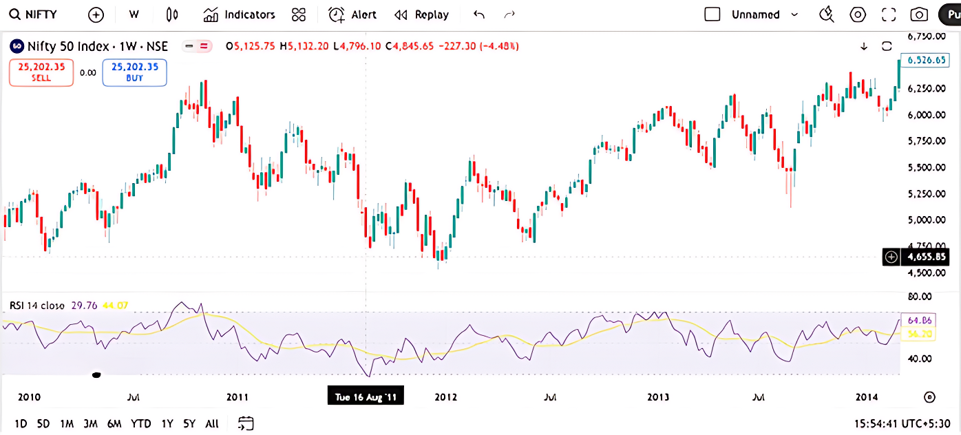
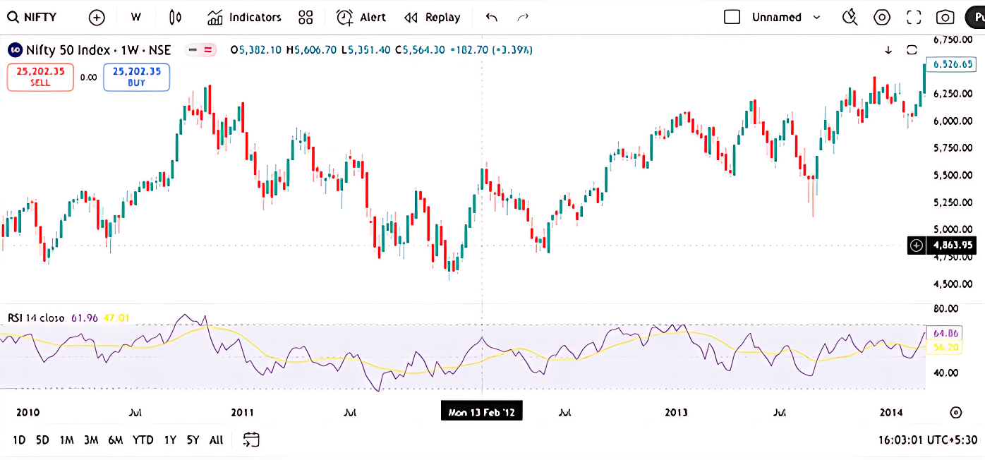
RSI Interpretation Using Nifty 50 Weekly Charts
At the bottom of both charts, the RSI (14) is plotted as a coloured line, red in one, yellow and purple in the other. As always, RSI oscillates between 0 and 100, though the extremes aren’t visible on the screen. The key levels to watch are 30 and 70, which act as thresholds for oversold and overbought zones respectively.
Oversold Zone: RSI Near 30
In the earlier part of the chart (around mid-2011), RSI dips close to 30, with one reading around 29.76 This suggests that the index was approaching oversold territory, hinting at a possible bottoming out. If you observe the candlesticks around this period, you’ll notice a series of long lower wicks and smaller-bodied candles, classic signs of selling exhaustion.
If this RSI dip coincides with a bullish candlestick pattern (like a hammer or bullish engulfing), and is supported by volume and a nearby support zone, it strengthens the case for a long entry. Traders often look for such confluences to build conviction.
Overbought Zone: RSI Near 70
Toward the right side of the chart, RSI climbs to levels like 64.88, 66.96, and even above 70 in some stretches. This signals that the index is nearing or entering overbought territory. However, instead of immediately shorting, traders should pause and assess the broader trend.
If the price is in a strong uptrend, RSI can remain elevated for weeks. In such cases, a high RSI doesn’t necessarily mean reversal, it could reflect sustained bullish momentum. But if a bearish candlestick pattern (like a shooting star or bearish engulfing) appears near this RSI peak, it may be a cue to book profits or consider shorting, especially if volume confirms the shift.
Beyond Classical RSI
Let’s go deeper with two practical setups:
Scenario 1: RSI Stuck in Overbought Zone
Imagine Nifty is in a multi-month rally. RSI hovers above 70, but price keeps climbing. Traders waiting for a reversal might miss the move entirely. Don’t short just because RSI is high. Instead, look and then decide.
Now picture a prolonged downtrend, RSI stays below 30, but price continues to fall. Traders trying to catch the bottom may get trapped. Don’t buy just because RSI is low. Momentum may still be negative.
Alternative RSI Interpretations
Here’s a more nuanced way to use RSI:
|
RSI Behaviour |
What It Suggests |
Trading Bias |
|
RSI stays above 70 for long |
Strong bullish momentum |
Look for buying setups |
|
RSI stays below 30 for long |
Strong bearish momentum |
Look for selling setups |
|
RSI rises above 30 after long time |
Possible bottoming out |
Consider going long |
|
RSI falls below 70 after long time |
Possible topping out |
Consider shorting |
14.3 Customize RSI to Your Style

Remember, RSI settings aren’t fixed. Wilder chose 14 periods and 30–70 zones based on 1970s market behaviour. You can experiment with:
- Shorter periods (5–10)for more sensitivity
- Longer periods (20–100)for smoother signals
- Tighter zones (20–80 or 25–75)for sharper entries
Customize RSI to Your Style
The Relative Strength Index (RSI) is not a one-size-fits-all tool. While J. Welles Wilder originally proposed a 14-period RSI with 30–70 thresholds, these settings were based on market conditions in the late 1970s. Today’s markets are faster, more volatile, and often influenced by algorithmic trading, making it essential for traders to adapt RSI parameters to their own strategies and time frames.
Let’s break down the three key ways you can customize RSI:
- Shorter Periods (5–10): For More Sensitivity
Using a shorter lookback period (e.g., 5 or 7 days) makes the RSI more responsive to recent price movements. It reacts quickly to momentum shifts, which can be useful for short-term traders or intraday setups.
Pros:
- Captures quick reversals and breakout signals
- Ideal for scalping or swing trading
- Helps identify short-lived overbought/oversold conditions
Cons:
- More prone to false signals due to market noise
- Requires confirmation from other indicators or price action
Example: A trader using a 5-period RSI on a 15-minute chart may catch early signs of a reversal, but should validate it with candlestick patterns or volume spikes before acting.
- Longer Periods (20–100): For Smoother Signals
Extending the RSI period (e.g., 21, 50, or even 100 days) smooths out short-term fluctuations and focuses on broader momentum trends. This is more suitable for positional or long-term investors.
Pros:
- Reduces noise and false signals
- Better suited for trend-following strategies
- Helps confirm the strength of sustained moves
Cons:
- May lag in identifying early reversals
- Less effective in volatile or range-bound markets
Example: An investor tracking Nifty on a weekly chart might use a 50-period RSI to confirm long-term bullish momentum before allocating capital.
- Tighter Zones (20–80 or 25–75): For Sharper Entries
Adjusting the overbought/oversold thresholds makes RSI more selective. Instead of using the standard 30–70 range, traders may opt for 20–80 or 25–75 to filter out weaker signals and focus on extreme conditions.
Pros:
- Reduces premature entries
- Highlights stronger momentum extremes
- Enhances accuracy in trending markets
Cons:
- May miss early signals
- Requires patience and discipline
Example: If RSI crosses above 80, it may indicate a truly overheated rally, prompting a trader to look for reversal signs. Similarly, a dip below 20 could signal deep selling pressure and a potential bottom.
|
RSI Setting |
Use Case |
Trader Profile |
|
5–10 periods |
Quick entries, high sensitivity |
Intraday or swing traders |
|
20–100 periods |
Trend confirmation, low noise |
Positional or long-term investors |
|
20–80 zones |
Extreme momentum detection |
Conservative traders |
|
25–75 zones |
Balanced filtering |
Moderate-risk traders |
Putting It All Together
Customizing RSI is not just about tweaking numbers, it’s about aligning the indicator with your trading style, time frame, and risk tolerance. Back test different combinations, observe how they behave across market conditions, and refine your approach accordingly. This process is how you build your trading edge and move from textbook theory to real-world application.
Activity for You
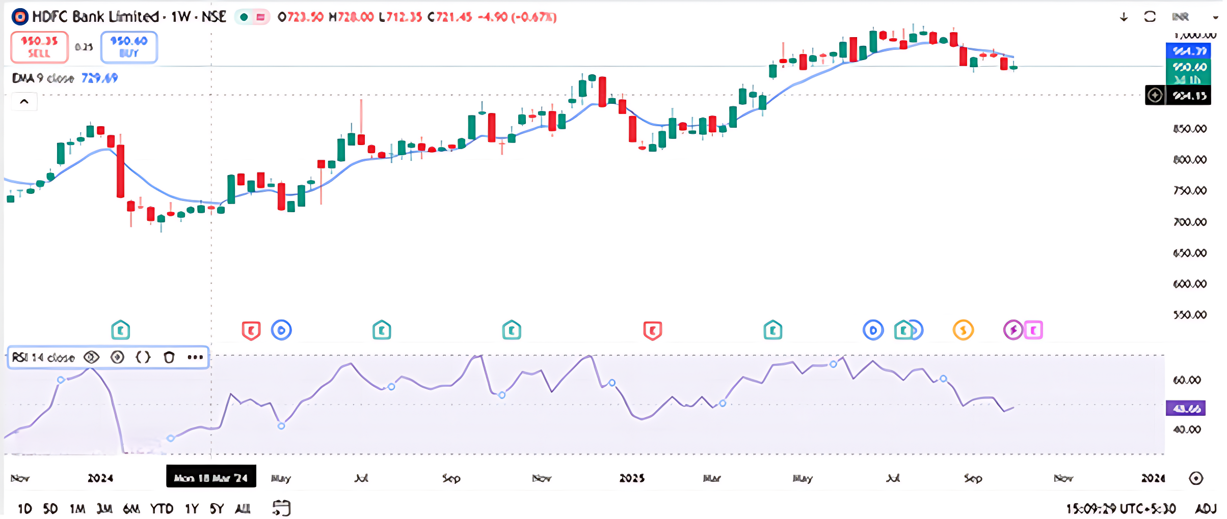
The price is ₹721.50, trading below the EMA 9, and the RSI is hovering around 40. Volume has slightly increased over the last two weeks.
Question: If you’re a trader and you notice this setup, what could be a strategic approach before making a trade?
- A) Wait for RSI to drop below 30 for a potential oversold bounce
- B) Enter a long position immediately
- C) Ignore RSI and focus only on price
- D) Short the stock without confirmation
Correct Answer: A) Wait for RSI to drop below 30 for a potential oversold bounce Why: RSI near 40 suggests weakening momentum but not yet oversold. Waiting for RSI to reach oversold territory (below 30) may offer a better risk-reward entry point if a reversal is expected.
14.4 Moving Average Convergence and Divergence (MACD)

The Moving Average Convergence and Divergence (MACD) is one of the most respected momentum indicators in technical analysis. Developed by Gerald Appel in the late 1970s, MACD has stood the test of time and continues to be a go-to tool for traders seeking clarity in trend strength and direction.
At its core, MACD is about understanding how two moving averages behave in relation to each other:
- Convergence happens when the two averages move closer together, signaling a potential slowdown or pause in momentum.
- Divergence occurs when they move apart, often indicating a strengthening trend or a possible breakout.
The standard MACD setup uses two Exponential Moving Averages (EMAs):
- A 12-day EMA (short-term)
- A 26-day EMA (long-term)
To calculate the MACD line, you subtract the 26-day EMA from the 12-day EMA:
MACD Line = 12-day EMA – 26-day EMA
Signal Line: A 9-day EMA of the MACD line itself, used to generate buy and sell signals.
A bullish signal is indicated when the MACD line moves above the signal line, whereas a bearish signal emerges when it dips below.
This difference captures the momentum shift between short-term and long-term price movements. Both EMAs are calculated using closing prices, making MACD a dynamic, price-sensitive indicator.
Before diving into how MACD is used in real-world trading such as spotting crossovers, divergences, and trend confirmations, it’s important to understand the math behind it. Once the calculation is clear, the applications become much easier to grasp.
|
Date |
Close |
12 Day EMA |
26 Day EMA |
MACD Line |
|
01-Jan-14 |
5302 |
|
|
|
|
02-Jan-14 |
5221 |
|
|
|
|
03-Jan-14 |
5211 |
|
|
|
|
06-Jan-14 |
5191 |
|
|
|
|
07-Jan-14 |
5162 |
|
|
|
|
08-Jan-14 |
6175 |
|
|
|
|
09-Jan-14 |
6168 |
|
|
|
|
10-Jan-14 |
6171 |
|
|
|
|
13-Jan-14 |
6273 |
|
|
|
|
14-Jan-14 |
6242 |
|
|
|
|
15-Jan-14 |
6321 |
|
|
|
|
16-Jan-14 |
6319 |
|
|
|
|
17-Jan-14 |
6262 |
5,813 |
|
|
|
20-Jan-14 |
6304 |
5,893 |
|
|
|
21-Jan-14 |
6314 |
5,983 |
|
|
|
22-Jan-14 |
6339 |
6,075 |
|
|
|
23-Jan-14 |
6346 |
6,171 |
|
|
|
24-Jan-14 |
6267 |
6,270 |
|
|
|
27-Jan-14 |
6136 |
6,277 |
|
|
|
28-Jan-14 |
6126 |
6,275 |
|
|
|
29-Jan-14 |
6120 |
6,271 |
|
|
|
30-Jan-14 |
6074 |
6,258 |
|
|
|
31-Jan-14 |
6090 |
6,244 |
|
|
|
03-Feb-14 |
6002 |
6,225 |
|
|
|
04-Feb-14 |
6001 |
6,198 |
|
|
|
05-Feb-14 |
6022 |
6,177 |
|
|
|
06-02-2014 |
6036 |
6,153 |
6,006 |
147 |
|
07-Feb-14 |
6063 |
6,130 |
6,034 |
96 |
|
10-Feb-14 |
6053 |
6,107 |
6,067 |
40 |
|
11-Feb-14 |
6063 |
6,083 |
6,099 |
-17 |
|
12-Feb-14 |
6084 |
6,066 |
6,133 |
-67 |
|
13-Feb-14 |
6001 |
6,061 |
6,168 |
-107 |
|
14-Feb-14 |
6048 |
6,051 |
6,161 |
-111 |
|
17-Feb-14 |
6073 |
6,045 |
6,157 |
-112 |
|
18-Feb-14 |
6127 |
6,045 |
6,153 |
-108 |
|
19-Feb-14 |
6153 |
6,048 |
6,147 |
-100 |
|
20-Feb-14 |
6091 |
6,060 |
6,144 |
-84 |
|
21-Feb-14 |
6155 |
6,068 |
6,135 |
-67 |
|
24-Feb-14 |
6186 |
6,079 |
6,129 |
-50 |
|
25-Feb-14 |
6200 |
6,091 |
6,126 |
-35 |
- Date Column: The data-set begins with daily closing prices of the Nifty index starting from 1st January 2014.
- Closing Prices: Each row contains the closing price for that specific trading day.
- 12-Day EMA Calculation: To compute the 12-day Exponential Moving Average (EMA), we need at least 12 closing prices. Therefore, the first 12 entries are used solely to establish the initial EMA value. The 12-day EMA begins appearing from the 13th dat a point onward.
- 26-Day EMA Calculation: Similarly, the 26-day EMA requires 26 closing prices. Hence, it starts appearing from the 27th data point.
- MACD Line Calculation: Once both EMAs are available—starting from 6th February 2014—we calculate the MACD value by subtracting the 26-day EMA from the 12-day EMA:
MACD= 12-day EMA− 26-day EMA
For instance, on 6th February 2014, the 12-day EMA was 6153 and the 26-day EMA was 6006. The MACD value is:
6153-6006= 147
MACD Line Visualization: By calculating the MACD values across multiple days and plotting them on a chart, we generate the MACD line. This line fluctuates above and below a central zero line, reflecting shifts in market momentum. A positive MACD indicates bullish momentum, while a negative
What Does the MACD Value Tell Us?
- Positive MACD Values
When the MACD is positive, the 12-day EMA is greater than the 26-day EMA. This implies that recent prices are rising faster than the longer-term average, indicating bullish momentum.
From 6-Feb to 10-Feb, MACD values are positive (ranging from +147 to +40), confirming that the market is in an upward phase. The higher the MACD value, the stronger the momentum. For instance:
- On 6-Feb: MACD = +147 → Strong bullish momentum
- On 10-Feb: MACD = +40 → Mild bullish momentum
- Negative MACD Values
When the MACD turns negative, the 12-day EMA falls below the 26-day EMA. This signals bearish momentum—recent prices are declining relative to the longer-term trend.
From 11-Feb onward, MACD values become negative:
- On 13-Feb: MACD = -107 → Strong bearish momentum
- On 25-Feb: MACD = -35 → Weak bearish momentum
This shift reflects a loss of upward momentum and the beginning of a downward phase.
- Magnitude of MACD
The magnitude of the MACD value reflects the strength of the trend:
|
MACD Value |
Interpretation |
|
+147 |
Strong bullish momentum |
|
+40 |
Mild bullish momentum |
|
-107 |
Strong bearish momentum |
|
-35 |
Weak bearish momentum |
However, magnitude must be interpreted in context. A MACD of +147 is significant for a stock trading around 6000. For a lower-priced stock, even +30 might be meaningful. The higher the underlying price, the larger the MACD values tend to be.
MACD Spread and Line Behavior
The MACD spread is the difference between the two EMAs expands when momentum strengthens and contracts when momentum weakens. This spread is what we plot as the MACD line, which oscillates above and below a central zero line.
- When the MACD line rises above zero, it reflects bullish convergence.
- When it dips below zero, it reflects bearish divergence.
This visual representation helps traders identify trend shifts and momentum changes more intuitively.
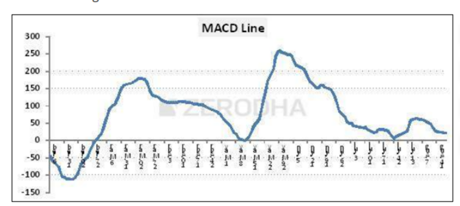
Interpreting the MACD Line and the Center Line
The MACD line is plotted on a chart and moves above and below a horizontal reference point known as the zero line or center line. This line acts as a neutral threshold between bullish and bearish momentum.
When analyzing MACD, the key is to observe how it behaves relative to this center line:
- MACD Crossing Above the Zero Line
When the MACD line moves from below zero to above it, it signals that the short-term momentum (12-day EMA) has overtaken the long-term momentum (26-day EMA). This shift indicates that buying pressure is increasing. Traders often interpret this as the beginning of a bullish phase and may consider entering long positions.
In your dataset, this transition is visible around 27th February, where the MACD value moves from negative to near-zero and then turns positive. This reflects a strengthening upward trend.
- MACD Crossing Below the Zero Line
Conversely, when the MACD line drops from positive territory into negative, it suggests that selling pressure is gaining dominance. The short-term EMA has fallen below the long-term EMA, indicating weakening momentum. This is typically viewed as a bearish signal, prompting traders to consider short positions or exit longs.
There are instances, like 8th May and 24th July, where the MACD approached the zero line but didn’t cross it. Instead, it reversed direction and resumed its prior trend. These moments are often seen as failed breakdowns or temporary pauses in momentum.
Limitations of Waiting for Zero Line Crossovers
While zero line crossovers are reliable, they often occur after a significant portion of the move has already played out. By the time the MACD confirms a trend shift, early entry opportunities may be gone. This delay is a common concern among active traders.
To address this, technical analysts introduced a refinement: the signal line.

Introducing the Signal Line: A Faster Trigger
The signal line is a 9-day EMA of the MACD line itself. It smooths out MACD fluctuations and provides a more responsive trigger for trade decisions.
Now, instead of relying solely on the MACD’s position relative to the zero line, traders monitor how the MACD interacts with its signal line. This creates a two-line system:
- MACD Line– reflects the difference between the 12-day and 26-day EMAs.
- Signal Line– a 9-day EMA of the MACD line.
Two-Line Crossover Strategy
This crossover method is more agile and often provides earlier signals:
Bullish Setup
When the MACD line crosses above the signal line, it suggests that momentum is accelerating upward. This is considered a buy signal.
Bearish Setup
When the MACD line crosses below the signal line, it indicates that momentum is turning downward. This is viewed as a sell signal.
This approach allows traders to act earlier than they would by waiting for a center line crossover, making it especially useful in fast-moving markets.
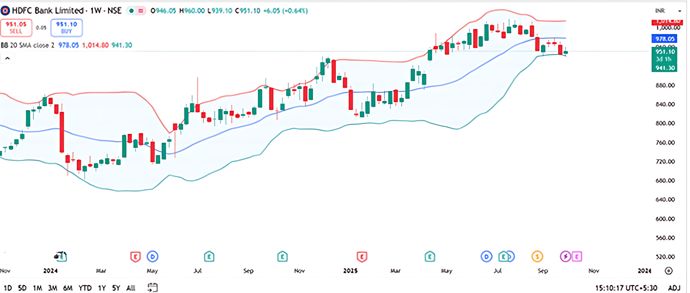
MACD Indicator: Structure and Interpretation
The MACD indicator is built on a foundation of exponential moving averages and uses a standard configuration:
- A 12-day EMA of closing prices, which captures short-term momentum.
- A 26-day EMA of closing prices, representing longer-term trend behavior.
- The MACD line, calculated as the difference between the 12-day and 26-day EMAs. This is typically plotted as a black line.
- A 9-day EMA of the MACD line, known as the signal line, usually shown in red.
These two lines—the MACD and the signal line—form the basis of a crossover strategy. On a MACD chart, vertical markers are often used to highlight key crossover points where trading signals emerge.
Reading Crossovers on the Chart
- When the MACD line crosses below the signal line, it suggests that short-term momentum is weakening relative to the longer-term trend. This is interpreted as a bearish signal, and traders may consider initiating short positions. The first vertical line on the chart typically marks such a crossover.
- When the MACD line crosses above the signal line, it indicates that short-term momentum is gaining strength. This is a bullish signal, prompting traders to look for buying opportunities. The second vertical line on the chart often highlights this setup.
These crossover points are used to time entries and exits, especially in trending markets.
Strengths and Limitations
At its core, MACD is a moving average-based system. As such, it performs best in strongly trending environments, where price moves are directional and sustained. However, in sideways or range-bound markets, MACD signals can be less reliable and prone to whipsaws. This is evident in the early part of the chart, where the first two vertical lines show limited follow-through due to lack of trend strength.
Customization and Preferences
While the 12-26-9 configuration is widely accepted and forms the original version introduced by Gerald Appel, these parameters are not fixed. Traders may adjust the EMA periods to suit different time frames or asset classes. For example, shorter EMAs may be used for intraday trading, while longer ones may suit positional strategies.
Activity for You
The current price is ₹915.15, slightly below the 20-week SMA of ₹917.04, and near the lower Bollinger Band.
Question: If you’re a trader and you observe the price nearing the lower Bollinger Band while staying close to the SMA, what could be a cautious interpretation?
- A) Price is likely to break out upward immediately
- B) Market is extremely bullish
- C) Price may be oversold and could revert toward the mean
- D) Bollinger Bands are irrelevant in weekly charts
Correct Answer: C) Price may be oversold and could revert toward the mean Why: When price approaches the lower Bollinger Band, it may indicate oversold conditions. Traders often expect a bounce back toward the SMA (mean) unless strong bearish momentum continues.
14.5 Bollinger Bands
Bollinger Bands are a volatility-based indicator composed of three lines: a middle band, which is a 20-day simple moving average (SMA), and two outer bands positioned two standard deviations above and below the middle band. These bands help traders identify potential overbought or oversold conditions. When the price touches the upper band, it may suggest an overbought scenario and a possible shorting opportunity. Conversely, a touch of the lower band could indicate an oversold condition and a potential buying setup.
Bollinger Bands are particularly effective in sideways or range-bound markets, where price tends to oscillate between support and resistance.
However, in strongly trending markets, the bands expand—a phenomenon known as envelope expansion—which can reduce the reliability of reversal signals.
Bollinger Bands are a widely used technical analysis tool developed by John Bollinger in the early 1980s. They help traders assess market volatility and identify potential overbought or oversold conditions. Unlike static indicators, Bollinger Bands dynamically adjust to price movements, making them particularly useful in trending and consolidating markets.
At their core, Bollinger Bands consist of three lines plotted over a price chart:
- Middle Band– a simple moving average (typically 20-day SMA)
- Upper Band– middle band plus two standard deviations
- Lower Band– middle band minus two standard deviations
These bands form a channel around price, expanding and contracting based on volatility. When prices are volatile, the bands widen. When volatility is low, the bands narrow.
- Upper and Lower Bands
Once the SMA and SD are calculated:
- Upper Band= SMA + (2 × SD)
- Lower Band= SMA − (2 × SD)
The multiplier “2” is standard but can be adjusted based on strategy.
. Upper and Lower Bands
Once the SMA and SD are calculated:
- Upper Band= SMA + (2 × SD)
- Lower Band= SMA − (2 × SD)
The multiplier “2” is standard but can be adjusted based on strategy.
Let’s assume we have 20 days of closing prices for a stock. Here are the last 5 days for illustration:
Step 1: 20-Day Closing Prices
Here are 20 consecutive closing prices (in ₹) for a hypothetical stock:
|
Day |
Closing Price |
|
1 |
1480 |
|
2 |
1495 |
|
3 |
1502 |
|
4 |
1510 |
|
5 |
1525 |
|
6 |
1508 |
|
7 |
1492 |
|
8 |
1500 |
|
9 |
1515 |
|
10 |
1498 |
|
11 |
1503 |
|
12 |
1512 |
|
13 |
1490 |
|
14 |
1506 |
|
15 |
1518 |
|
16 |
1496 |
|
17 |
1501 |
|
18 |
1509 |
|
19 |
1511 |
|
20 |
1504 |
Step 2: Calculate the 20-Day SMA
Step 2: Calculate the 20-Day SMA
SMA20=Sum of 20 closing prices/20
Sum=1480+1495+1502+1510+1525+1508+1492+1500+1515+1498+1503+1512+1490+1506+1518+1496+1501+1509+1511+1504=30,065
SMA20 =30,065/20=1503.25
Step 3: Calculate the Standard Deviation
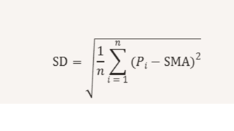
Standard deviation measures how much each price deviates from the average. The formula is:
Let’s compute the squared deviations:
|
Day |
Price |
Deviation |
Squared Deviation |
|
1 |
1480 |
-23.25 |
540.56 |
|
2 |
1495 |
-8.25 |
68.06 |
|
3 |
1502 |
-1.25 |
1.56 |
|
4 |
1510 |
6.75 |
45.56 |
|
5 |
1525 |
21.75 |
473.06 |
|
6 |
1508 |
4.75 |
22.56 |
|
7 |
1492 |
-11.25 |
126.56 |
|
8 |
1500 |
-3.25 |
10.56 |
|
9 |
1515 |
11.75 |
138.06 |
|
10 |
1498 |
-5.25 |
27.56 |
|
11 |
1503 |
-0.25 |
0.06 |
|
12 |
1512 |
8.75 |
76.56 |
|
13 |
1490 |
-13.25 |
175.56 |
|
14 |
1506 |
2.75 |
7.56 |
|
15 |
1518 |
14.75 |
217.56 |
|
16 |
1496 |
-7.25 |
52.56 |
|
17 |
1501 |
-2.25 |
5.06 |
|
18 |
1509 |
5.75 |
33.06 |
|
19 |
1511 |
7.75 |
60.06 |
|
20 |
1504 |
0.75 |
0.56 |
Sum of squared deviations = 2,112.00
SD= (√2,112.00/20)= √105.6≈10.28
Step 4: Calculate Bollinger Bands
Now we apply the standard Bollinger Band formula:
- Upper Band = SMA + (2 × SD) = 1503.25 + (2 × 10.28) = 1503.25 + 20.56 = 1523.81
- Lower Band = SMA − (2 × SD) = 1503.25 − 20.56 = 1482.69
Final Output
|
Metric |
Value |
|
20-Day SMA |
1503.25 |
|
Standard Dev. |
10.28 |
|
Upper Band |
1523.81 |
|
Lower Band |
1482.69 |
This means that under current volatility, the price is expected to fluctuate within the range of ₹1482.69 to ₹1523.81. If the price moves outside this band, it may signal overbought or oversold conditions, depending on direction.

The central line plotted on a Bollinger Band chart typically shown in Blue is the 20-day Simple Moving Average (SMA). Flanking this line are two bands, usually drawn in red: the upper band represents two standard deviations above the SMA, and the lower band in green represents two standard deviations below it. These bands form a dynamic price envelope that adjusts to volatility.
The core idea behind Bollinger Bands is mean reversion. When the price touches or exceeds the upper band, it suggests that the asset may be overextended to the upside. Traders often interpret this as a potential shorting opportunity, anticipating that the price will revert back toward the average. Conversely, when the price dips to the lower band, it may be oversold, prompting long trades with the expectation of a bounce back toward the SMA.
Envelope expansion occurs when the price trends strongly in one direction, causing the bands to widen. This reflects increasing volatility and sustained momentum. In such cases, the typical Bollinger Band reversal signal becomes unreliable. Instead of reverting to the mean, the price continues to drift further in the direction of the trend.
This observation leads to a key insight: Bollinger Bands tend to be effective in sideways or range-bound markets, where price oscillates between support and resistance. However, in trending markets, especially those with strong directional momentum, Bollinger Band signals can fail or lag.
Activity for You
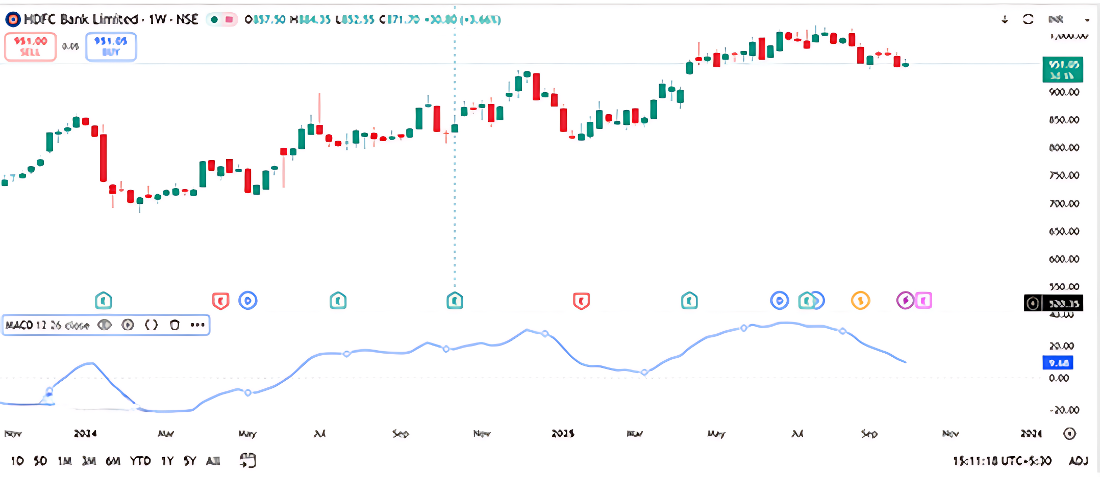
The chart shows the MACD line crossing above the signal line while the price rises to ₹951.65 with a gain of +3.44%.
Question: If you’re a trader and you observe this MACD crossover during a price rally, what could be a reasonable interpretation?
- A) Bearish divergence
- B) Potential bullish momentum
- C) Market indecision
- D) No relevance to trend
Correct Answer: B) Potential bullish momentum Why: A MACD line crossing above the signal line typically indicates increasing bullish momentum, especially when supported by rising price action.
14.6 Key Takeaways

- Technical indicators are lines on a stock chart that help traders analyze price movements based on preset logic.
- They supplement other tools like candlesticks, volume, and support/resistance levels.
- Leading indicators are predictive, attempting to signal a trend or reversal before it happens, and are often oscillators.
- Lagging indicators are reactive, confirming a trend after it has started, and a classic example is a moving average.
- Momentum refers to the rate at which a price changes, with high momentum indicating a strong, fast price move and low momentum suggesting a slower pace.
- The Relative Strength Index (RSI) is a leading momentum indicator that measures the internal strength of an asset.
- An RSI reading above 70 suggests that a stock may be overbought and due for a pullback.
- An RSI reading below 30 signals that a stock may be oversold, which could hint at a potential bounce or reversal.
- RSI is often most effective in non-trending or sideways markets, where it can provide strong reversal signals.
- RSI serves as a pressure gauge that alerts traders when a price move may be stretched and a change in direction is likely.
14.1 Introduction to Technical Indicators
When you look at a stock chart on a trader’s terminal, you’ll often notice lines running across the chart. These are called technical indicators. They help traders analyze price movements and make informed decisions.
Technical indicators are mathematical calculations based on a stock’s price, volume or volatility. As supplementary instruments they support other types of analysis by validating or confirming signals displayed on a chart. Indicators may be either leading or lagging.
Indicators are independent trading systems created by successful traders. Built on preset logic, they supplement traditional technical analysis tools like candlesticks, volume, and support-resistance levels. Traders use indicators to identify buying and selling opportunities, confirm trends, and sometimes predict reversals.
Types of Indicators: Leading vs Lagging
|
Type of Indicator |
Description |
Timing |
Common Use |
|
Leading |
Signals a trend or reversal before it happens |
Predictive |
Entry/exit points |
|
Lagging |
Confirms a trend after it has started |
Reactive |
Trend confirmation |
Leading Indicators (Predictive)
Leading indicators attempt to forecast price movements in advance. While they can be powerful, they are also prone to false signals. Most leading indicators are oscillators, which move within a fixed range (e.g., 0 to 100). Their readings help interpret market conditions—such as whether a stock is overbought or oversold.
Lagging Indicators (Confirming)
Lagging indicators follow price movements and confirm trends after they begin. Though they react slowly, they help reduce noise and validate signals. Moving averages are a classic example and are used within many other indicators like RSI, MACD, and Stochastic.
Understanding Momentum
Momentum refers to the rate at which price changes. For example:
- If a stock moves from ₹100 to ₹115 in 3 days, momentum is high.
- If the same move happens over 3 months, momentum is low.
High momentum indicates strong price movement, while low momentum suggests a slower pace.
14.2 Relative Strength Index (RSI)
The Relative Strength Index (RSI), developed by J. Welles Wilder, is one of the most widely used momentum indicators in technical analysis. Despite its name, RSI doesn’t compare two different securities. Instead, it measures the internal strength of a single asset by evaluating its recent price movements.
RSI is a leading indicator that helps traders anticipate potential trend reversals. It oscillates between 0 and 100, offering insights into whether a stock or market is overbought or oversold. Traders use these readings to set expectations and make informed decisions.
Interestingly, RSI tends to be most effective during sideways or non-trending markets, where it can generate strong reversal signals and highlight shifts in momentum before they become visible on price charts.
RSI Characteristics
- Oscillates between 0 and 100 ( Here Oscillates means to keep moving from one position to another and back again)
- Above 70: Overbought(possible correction)
An RSI reading above 70 suggests that a stock may have been overbought and is due for a pullback.
- Below 30: Oversold(possible bounce)
An RSI reading below 30 signals that a stock may be oversold and could be due for a bounce or reversal.
RSI Formula
RSI= 100-100/1+RS
RS= Average Gain/Average Loss
RSI Calculation Example:
Let’s say Stock XYZ starts at ₹150. Over the next 14 days, its closing prices and daily changes are as follows:
|
Day |
Closing Price |
Points Gained |
Points Lost |
|
1 |
₹152 |
152-150=2 |
0 |
|
2 |
₹155 |
3 |
0 |
|
3 |
₹153 |
0 |
2 |
|
4 |
₹151 |
0 |
2 |
|
5 |
₹150 |
0 |
1 |
|
6 |
₹149 |
0 |
1 |
|
7 |
₹151 |
2 |
0 |
|
8 |
₹154 |
3 |
0 |
|
9 |
₹156 |
2 |
0 |
|
10 |
₹158 |
2 |
0 |
|
11 |
₹157 |
0 |
1 |
|
12 |
₹159 |
2 |
0 |
|
13 |
₹160 |
1 |
0 |
|
14 |
₹162 |
2 |
0 |
Step-by-step Calculation:
- Total Gains= 2 + 3 + 2 + 3 + 2 + 2 + 2 + 1 + 2 = 19
- Total Losses= 2 + 2 + 1 + 1 + 1 = 7
Now compute:
- Average Gain= 19 / 14 = 36
- Average Loss= 7 / 14 = 50
- RS (Relative Strength)= 1.36 / 0.50 = 72
- RSI= 100 – [100 / (1 + RS)] = 100 – [100 / (1 + 2.72)] = 100 – [100 / 3.72] = 100 – 26.88 = 12
An RSI of 73.12 indicates that Stock XYZ is approaching overbought territory, which could signal a potential pullback or consolidation phase.
Once you understand the steps, calculating RSI becomes quite straightforward. The main purpose of RSI is to help traders spot zones where a stock might be overbought or oversold. An overbought reading suggests that the stock has experienced strong upward momentum, possibly too fast or too far, making it vulnerable to a pullback or short-term correction. On the other hand, an oversold reading signals intense downward pressure, which might be overdone, hinting at a potential bounce or reversal.
In essence, RSI acts like a pressure gauge, alerting traders when price movements may be stretched and due for a change in direction.
RSI Interpretation Using Nifty 50 Weekly Charts
At the bottom of both charts, the RSI (14) is plotted as a coloured line, red in one, yellow and purple in the other. As always, RSI oscillates between 0 and 100, though the extremes aren’t visible on the screen. The key levels to watch are 30 and 70, which act as thresholds for oversold and overbought zones respectively.
Oversold Zone: RSI Near 30
In the earlier part of the chart (around mid-2011), RSI dips close to 30, with one reading around 29.76 This suggests that the index was approaching oversold territory, hinting at a possible bottoming out. If you observe the candlesticks around this period, you’ll notice a series of long lower wicks and smaller-bodied candles, classic signs of selling exhaustion.
If this RSI dip coincides with a bullish candlestick pattern (like a hammer or bullish engulfing), and is supported by volume and a nearby support zone, it strengthens the case for a long entry. Traders often look for such confluences to build conviction.
Overbought Zone: RSI Near 70
Toward the right side of the chart, RSI climbs to levels like 64.88, 66.96, and even above 70 in some stretches. This signals that the index is nearing or entering overbought territory. However, instead of immediately shorting, traders should pause and assess the broader trend.
If the price is in a strong uptrend, RSI can remain elevated for weeks. In such cases, a high RSI doesn’t necessarily mean reversal, it could reflect sustained bullish momentum. But if a bearish candlestick pattern (like a shooting star or bearish engulfing) appears near this RSI peak, it may be a cue to book profits or consider shorting, especially if volume confirms the shift.
Beyond Classical RSI
Let’s go deeper with two practical setups:
Scenario 1: RSI Stuck in Overbought Zone
Imagine Nifty is in a multi-month rally. RSI hovers above 70, but price keeps climbing. Traders waiting for a reversal might miss the move entirely. Don’t short just because RSI is high. Instead, look and then decide.
Now picture a prolonged downtrend, RSI stays below 30, but price continues to fall. Traders trying to catch the bottom may get trapped. Don’t buy just because RSI is low. Momentum may still be negative.
Alternative RSI Interpretations
Here’s a more nuanced way to use RSI:
|
RSI Behaviour |
What It Suggests |
Trading Bias |
|
RSI stays above 70 for long |
Strong bullish momentum |
Look for buying setups |
|
RSI stays below 30 for long |
Strong bearish momentum |
Look for selling setups |
|
RSI rises above 30 after long time |
Possible bottoming out |
Consider going long |
|
RSI falls below 70 after long time |
Possible topping out |
Consider shorting |
14.3 Customize RSI to Your Style
Remember, RSI settings aren’t fixed. Wilder chose 14 periods and 30–70 zones based on 1970s market behaviour. You can experiment with:
- Shorter periods (5–10)for more sensitivity
- Longer periods (20–100)for smoother signals
- Tighter zones (20–80 or 25–75)for sharper entries
Customize RSI to Your Style
The Relative Strength Index (RSI) is not a one-size-fits-all tool. While J. Welles Wilder originally proposed a 14-period RSI with 30–70 thresholds, these settings were based on market conditions in the late 1970s. Today’s markets are faster, more volatile, and often influenced by algorithmic trading, making it essential for traders to adapt RSI parameters to their own strategies and time frames.
Let’s break down the three key ways you can customize RSI:
- Shorter Periods (5–10): For More Sensitivity
Using a shorter lookback period (e.g., 5 or 7 days) makes the RSI more responsive to recent price movements. It reacts quickly to momentum shifts, which can be useful for short-term traders or intraday setups.
Pros:
- Captures quick reversals and breakout signals
- Ideal for scalping or swing trading
- Helps identify short-lived overbought/oversold conditions
Cons:
- More prone to false signals due to market noise
- Requires confirmation from other indicators or price action
Example: A trader using a 5-period RSI on a 15-minute chart may catch early signs of a reversal, but should validate it with candlestick patterns or volume spikes before acting.
- Longer Periods (20–100): For Smoother Signals
Extending the RSI period (e.g., 21, 50, or even 100 days) smooths out short-term fluctuations and focuses on broader momentum trends. This is more suitable for positional or long-term investors.
Pros:
- Reduces noise and false signals
- Better suited for trend-following strategies
- Helps confirm the strength of sustained moves
Cons:
- May lag in identifying early reversals
- Less effective in volatile or range-bound markets
Example: An investor tracking Nifty on a weekly chart might use a 50-period RSI to confirm long-term bullish momentum before allocating capital.
- Tighter Zones (20–80 or 25–75): For Sharper Entries
Adjusting the overbought/oversold thresholds makes RSI more selective. Instead of using the standard 30–70 range, traders may opt for 20–80 or 25–75 to filter out weaker signals and focus on extreme conditions.
Pros:
- Reduces premature entries
- Highlights stronger momentum extremes
- Enhances accuracy in trending markets
Cons:
- May miss early signals
- Requires patience and discipline
Example: If RSI crosses above 80, it may indicate a truly overheated rally, prompting a trader to look for reversal signs. Similarly, a dip below 20 could signal deep selling pressure and a potential bottom.
|
RSI Setting |
Use Case |
Trader Profile |
|
5–10 periods |
Quick entries, high sensitivity |
Intraday or swing traders |
|
20–100 periods |
Trend confirmation, low noise |
Positional or long-term investors |
|
20–80 zones |
Extreme momentum detection |
Conservative traders |
|
25–75 zones |
Balanced filtering |
Moderate-risk traders |
Putting It All Together
Customizing RSI is not just about tweaking numbers, it’s about aligning the indicator with your trading style, time frame, and risk tolerance. Back test different combinations, observe how they behave across market conditions, and refine your approach accordingly. This process is how you build your trading edge and move from textbook theory to real-world application.
Activity for You
The price is ₹721.50, trading below the EMA 9, and the RSI is hovering around 40. Volume has slightly increased over the last two weeks.
Question: If you’re a trader and you notice this setup, what could be a strategic approach before making a trade?
- A) Wait for RSI to drop below 30 for a potential oversold bounce
- B) Enter a long position immediately
- C) Ignore RSI and focus only on price
- D) Short the stock without confirmation
Correct Answer: A) Wait for RSI to drop below 30 for a potential oversold bounce Why: RSI near 40 suggests weakening momentum but not yet oversold. Waiting for RSI to reach oversold territory (below 30) may offer a better risk-reward entry point if a reversal is expected.
14.4 Moving Average Convergence and Divergence (MACD)
The Moving Average Convergence and Divergence (MACD) is one of the most respected momentum indicators in technical analysis. Developed by Gerald Appel in the late 1970s, MACD has stood the test of time and continues to be a go-to tool for traders seeking clarity in trend strength and direction.
At its core, MACD is about understanding how two moving averages behave in relation to each other:
- Convergence happens when the two averages move closer together, signaling a potential slowdown or pause in momentum.
- Divergence occurs when they move apart, often indicating a strengthening trend or a possible breakout.
The standard MACD setup uses two Exponential Moving Averages (EMAs):
- A 12-day EMA (short-term)
- A 26-day EMA (long-term)
To calculate the MACD line, you subtract the 26-day EMA from the 12-day EMA:
MACD Line = 12-day EMA – 26-day EMA
Signal Line: A 9-day EMA of the MACD line itself, used to generate buy and sell signals.
A bullish signal is indicated when the MACD line moves above the signal line, whereas a bearish signal emerges when it dips below.
This difference captures the momentum shift between short-term and long-term price movements. Both EMAs are calculated using closing prices, making MACD a dynamic, price-sensitive indicator.
Before diving into how MACD is used in real-world trading such as spotting crossovers, divergences, and trend confirmations, it’s important to understand the math behind it. Once the calculation is clear, the applications become much easier to grasp.
|
Date |
Close |
12 Day EMA |
26 Day EMA |
MACD Line |
|
01-Jan-14 |
5302 |
|
|
|
|
02-Jan-14 |
5221 |
|
|
|
|
03-Jan-14 |
5211 |
|
|
|
|
06-Jan-14 |
5191 |
|
|
|
|
07-Jan-14 |
5162 |
|
|
|
|
08-Jan-14 |
6175 |
|
|
|
|
09-Jan-14 |
6168 |
|
|
|
|
10-Jan-14 |
6171 |
|
|
|
|
13-Jan-14 |
6273 |
|
|
|
|
14-Jan-14 |
6242 |
|
|
|
|
15-Jan-14 |
6321 |
|
|
|
|
16-Jan-14 |
6319 |
|
|
|
|
17-Jan-14 |
6262 |
5,813 |
|
|
|
20-Jan-14 |
6304 |
5,893 |
|
|
|
21-Jan-14 |
6314 |
5,983 |
|
|
|
22-Jan-14 |
6339 |
6,075 |
|
|
|
23-Jan-14 |
6346 |
6,171 |
|
|
|
24-Jan-14 |
6267 |
6,270 |
|
|
|
27-Jan-14 |
6136 |
6,277 |
|
|
|
28-Jan-14 |
6126 |
6,275 |
|
|
|
29-Jan-14 |
6120 |
6,271 |
|
|
|
30-Jan-14 |
6074 |
6,258 |
|
|
|
31-Jan-14 |
6090 |
6,244 |
|
|
|
03-Feb-14 |
6002 |
6,225 |
|
|
|
04-Feb-14 |
6001 |
6,198 |
|
|
|
05-Feb-14 |
6022 |
6,177 |
|
|
|
06-02-2014 |
6036 |
6,153 |
6,006 |
147 |
|
07-Feb-14 |
6063 |
6,130 |
6,034 |
96 |
|
10-Feb-14 |
6053 |
6,107 |
6,067 |
40 |
|
11-Feb-14 |
6063 |
6,083 |
6,099 |
-17 |
|
12-Feb-14 |
6084 |
6,066 |
6,133 |
-67 |
|
13-Feb-14 |
6001 |
6,061 |
6,168 |
-107 |
|
14-Feb-14 |
6048 |
6,051 |
6,161 |
-111 |
|
17-Feb-14 |
6073 |
6,045 |
6,157 |
-112 |
|
18-Feb-14 |
6127 |
6,045 |
6,153 |
-108 |
|
19-Feb-14 |
6153 |
6,048 |
6,147 |
-100 |
|
20-Feb-14 |
6091 |
6,060 |
6,144 |
-84 |
|
21-Feb-14 |
6155 |
6,068 |
6,135 |
-67 |
|
24-Feb-14 |
6186 |
6,079 |
6,129 |
-50 |
|
25-Feb-14 |
6200 |
6,091 |
6,126 |
-35 |
- Date Column: The data-set begins with daily closing prices of the Nifty index starting from 1st January 2014.
- Closing Prices: Each row contains the closing price for that specific trading day.
- 12-Day EMA Calculation: To compute the 12-day Exponential Moving Average (EMA), we need at least 12 closing prices. Therefore, the first 12 entries are used solely to establish the initial EMA value. The 12-day EMA begins appearing from the 13th dat a point onward.
- 26-Day EMA Calculation: Similarly, the 26-day EMA requires 26 closing prices. Hence, it starts appearing from the 27th data point.
- MACD Line Calculation: Once both EMAs are available—starting from 6th February 2014—we calculate the MACD value by subtracting the 26-day EMA from the 12-day EMA:
MACD= 12-day EMA− 26-day EMA
For instance, on 6th February 2014, the 12-day EMA was 6153 and the 26-day EMA was 6006. The MACD value is:
6153-6006= 147
MACD Line Visualization: By calculating the MACD values across multiple days and plotting them on a chart, we generate the MACD line. This line fluctuates above and below a central zero line, reflecting shifts in market momentum. A positive MACD indicates bullish momentum, while a negative
What Does the MACD Value Tell Us?
- Positive MACD Values
When the MACD is positive, the 12-day EMA is greater than the 26-day EMA. This implies that recent prices are rising faster than the longer-term average, indicating bullish momentum.
From 6-Feb to 10-Feb, MACD values are positive (ranging from +147 to +40), confirming that the market is in an upward phase. The higher the MACD value, the stronger the momentum. For instance:
- On 6-Feb: MACD = +147 → Strong bullish momentum
- On 10-Feb: MACD = +40 → Mild bullish momentum
- Negative MACD Values
When the MACD turns negative, the 12-day EMA falls below the 26-day EMA. This signals bearish momentum—recent prices are declining relative to the longer-term trend.
From 11-Feb onward, MACD values become negative:
- On 13-Feb: MACD = -107 → Strong bearish momentum
- On 25-Feb: MACD = -35 → Weak bearish momentum
This shift reflects a loss of upward momentum and the beginning of a downward phase.
- Magnitude of MACD
The magnitude of the MACD value reflects the strength of the trend:
|
MACD Value |
Interpretation |
|
+147 |
Strong bullish momentum |
|
+40 |
Mild bullish momentum |
|
-107 |
Strong bearish momentum |
|
-35 |
Weak bearish momentum |
However, magnitude must be interpreted in context. A MACD of +147 is significant for a stock trading around 6000. For a lower-priced stock, even +30 might be meaningful. The higher the underlying price, the larger the MACD values tend to be.
MACD Spread and Line Behavior
The MACD spread is the difference between the two EMAs expands when momentum strengthens and contracts when momentum weakens. This spread is what we plot as the MACD line, which oscillates above and below a central zero line.
- When the MACD line rises above zero, it reflects bullish convergence.
- When it dips below zero, it reflects bearish divergence.
This visual representation helps traders identify trend shifts and momentum changes more intuitively.
Interpreting the MACD Line and the Center Line
The MACD line is plotted on a chart and moves above and below a horizontal reference point known as the zero line or center line. This line acts as a neutral threshold between bullish and bearish momentum.
When analyzing MACD, the key is to observe how it behaves relative to this center line:
- MACD Crossing Above the Zero Line
When the MACD line moves from below zero to above it, it signals that the short-term momentum (12-day EMA) has overtaken the long-term momentum (26-day EMA). This shift indicates that buying pressure is increasing. Traders often interpret this as the beginning of a bullish phase and may consider entering long positions.
In your dataset, this transition is visible around 27th February, where the MACD value moves from negative to near-zero and then turns positive. This reflects a strengthening upward trend.
- MACD Crossing Below the Zero Line
Conversely, when the MACD line drops from positive territory into negative, it suggests that selling pressure is gaining dominance. The short-term EMA has fallen below the long-term EMA, indicating weakening momentum. This is typically viewed as a bearish signal, prompting traders to consider short positions or exit longs.
There are instances, like 8th May and 24th July, where the MACD approached the zero line but didn’t cross it. Instead, it reversed direction and resumed its prior trend. These moments are often seen as failed breakdowns or temporary pauses in momentum.
Limitations of Waiting for Zero Line Crossovers
While zero line crossovers are reliable, they often occur after a significant portion of the move has already played out. By the time the MACD confirms a trend shift, early entry opportunities may be gone. This delay is a common concern among active traders.
To address this, technical analysts introduced a refinement: the signal line.
Introducing the Signal Line: A Faster Trigger
The signal line is a 9-day EMA of the MACD line itself. It smooths out MACD fluctuations and provides a more responsive trigger for trade decisions.
Now, instead of relying solely on the MACD’s position relative to the zero line, traders monitor how the MACD interacts with its signal line. This creates a two-line system:
- MACD Line– reflects the difference between the 12-day and 26-day EMAs.
- Signal Line– a 9-day EMA of the MACD line.
Two-Line Crossover Strategy
This crossover method is more agile and often provides earlier signals:
Bullish Setup
When the MACD line crosses above the signal line, it suggests that momentum is accelerating upward. This is considered a buy signal.
Bearish Setup
When the MACD line crosses below the signal line, it indicates that momentum is turning downward. This is viewed as a sell signal.
This approach allows traders to act earlier than they would by waiting for a center line crossover, making it especially useful in fast-moving markets.
MACD Indicator: Structure and Interpretation
The MACD indicator is built on a foundation of exponential moving averages and uses a standard configuration:
- A 12-day EMA of closing prices, which captures short-term momentum.
- A 26-day EMA of closing prices, representing longer-term trend behavior.
- The MACD line, calculated as the difference between the 12-day and 26-day EMAs. This is typically plotted as a black line.
- A 9-day EMA of the MACD line, known as the signal line, usually shown in red.
These two lines—the MACD and the signal line—form the basis of a crossover strategy. On a MACD chart, vertical markers are often used to highlight key crossover points where trading signals emerge.
Reading Crossovers on the Chart
- When the MACD line crosses below the signal line, it suggests that short-term momentum is weakening relative to the longer-term trend. This is interpreted as a bearish signal, and traders may consider initiating short positions. The first vertical line on the chart typically marks such a crossover.
- When the MACD line crosses above the signal line, it indicates that short-term momentum is gaining strength. This is a bullish signal, prompting traders to look for buying opportunities. The second vertical line on the chart often highlights this setup.
These crossover points are used to time entries and exits, especially in trending markets.
Strengths and Limitations
At its core, MACD is a moving average-based system. As such, it performs best in strongly trending environments, where price moves are directional and sustained. However, in sideways or range-bound markets, MACD signals can be less reliable and prone to whipsaws. This is evident in the early part of the chart, where the first two vertical lines show limited follow-through due to lack of trend strength.
Customization and Preferences
While the 12-26-9 configuration is widely accepted and forms the original version introduced by Gerald Appel, these parameters are not fixed. Traders may adjust the EMA periods to suit different time frames or asset classes. For example, shorter EMAs may be used for intraday trading, while longer ones may suit positional strategies.
Activity for You
The current price is ₹915.15, slightly below the 20-week SMA of ₹917.04, and near the lower Bollinger Band.
Question: If you’re a trader and you observe the price nearing the lower Bollinger Band while staying close to the SMA, what could be a cautious interpretation?
- A) Price is likely to break out upward immediately
- B) Market is extremely bullish
- C) Price may be oversold and could revert toward the mean
- D) Bollinger Bands are irrelevant in weekly charts
Correct Answer: C) Price may be oversold and could revert toward the mean Why: When price approaches the lower Bollinger Band, it may indicate oversold conditions. Traders often expect a bounce back toward the SMA (mean) unless strong bearish momentum continues.
14.5 Bollinger Bands
Bollinger Bands are a volatility-based indicator composed of three lines: a middle band, which is a 20-day simple moving average (SMA), and two outer bands positioned two standard deviations above and below the middle band. These bands help traders identify potential overbought or oversold conditions. When the price touches the upper band, it may suggest an overbought scenario and a possible shorting opportunity. Conversely, a touch of the lower band could indicate an oversold condition and a potential buying setup.
Bollinger Bands are particularly effective in sideways or range-bound markets, where price tends to oscillate between support and resistance.
However, in strongly trending markets, the bands expand—a phenomenon known as envelope expansion—which can reduce the reliability of reversal signals.
Bollinger Bands are a widely used technical analysis tool developed by John Bollinger in the early 1980s. They help traders assess market volatility and identify potential overbought or oversold conditions. Unlike static indicators, Bollinger Bands dynamically adjust to price movements, making them particularly useful in trending and consolidating markets.
At their core, Bollinger Bands consist of three lines plotted over a price chart:
- Middle Band– a simple moving average (typically 20-day SMA)
- Upper Band– middle band plus two standard deviations
- Lower Band– middle band minus two standard deviations
These bands form a channel around price, expanding and contracting based on volatility. When prices are volatile, the bands widen. When volatility is low, the bands narrow.
- Upper and Lower Bands
Once the SMA and SD are calculated:
- Upper Band= SMA + (2 × SD)
- Lower Band= SMA − (2 × SD)
The multiplier “2” is standard but can be adjusted based on strategy.
. Upper and Lower Bands
Once the SMA and SD are calculated:
- Upper Band= SMA + (2 × SD)
- Lower Band= SMA − (2 × SD)
The multiplier “2” is standard but can be adjusted based on strategy.
Let’s assume we have 20 days of closing prices for a stock. Here are the last 5 days for illustration:
Step 1: 20-Day Closing Prices
Here are 20 consecutive closing prices (in ₹) for a hypothetical stock:
|
Day |
Closing Price |
|
1 |
1480 |
|
2 |
1495 |
|
3 |
1502 |
|
4 |
1510 |
|
5 |
1525 |
|
6 |
1508 |
|
7 |
1492 |
|
8 |
1500 |
|
9 |
1515 |
|
10 |
1498 |
|
11 |
1503 |
|
12 |
1512 |
|
13 |
1490 |
|
14 |
1506 |
|
15 |
1518 |
|
16 |
1496 |
|
17 |
1501 |
|
18 |
1509 |
|
19 |
1511 |
|
20 |
1504 |
Step 2: Calculate the 20-Day SMA
Step 2: Calculate the 20-Day SMA
SMA20=Sum of 20 closing prices/20
Sum=1480+1495+1502+1510+1525+1508+1492+1500+1515+1498+1503+1512+1490+1506+1518+1496+1501+1509+1511+1504=30,065
SMA20 =30,065/20=1503.25
Step 3: Calculate the Standard Deviation
Standard deviation measures how much each price deviates from the average. The formula is:
Let’s compute the squared deviations:
|
Day |
Price |
Deviation |
Squared Deviation |
|
1 |
1480 |
-23.25 |
540.56 |
|
2 |
1495 |
-8.25 |
68.06 |
|
3 |
1502 |
-1.25 |
1.56 |
|
4 |
1510 |
6.75 |
45.56 |
|
5 |
1525 |
21.75 |
473.06 |
|
6 |
1508 |
4.75 |
22.56 |
|
7 |
1492 |
-11.25 |
126.56 |
|
8 |
1500 |
-3.25 |
10.56 |
|
9 |
1515 |
11.75 |
138.06 |
|
10 |
1498 |
-5.25 |
27.56 |
|
11 |
1503 |
-0.25 |
0.06 |
|
12 |
1512 |
8.75 |
76.56 |
|
13 |
1490 |
-13.25 |
175.56 |
|
14 |
1506 |
2.75 |
7.56 |
|
15 |
1518 |
14.75 |
217.56 |
|
16 |
1496 |
-7.25 |
52.56 |
|
17 |
1501 |
-2.25 |
5.06 |
|
18 |
1509 |
5.75 |
33.06 |
|
19 |
1511 |
7.75 |
60.06 |
|
20 |
1504 |
0.75 |
0.56 |
Sum of squared deviations = 2,112.00
SD= (√2,112.00/20)= √105.6≈10.28
Step 4: Calculate Bollinger Bands
Now we apply the standard Bollinger Band formula:
- Upper Band = SMA + (2 × SD) = 1503.25 + (2 × 10.28) = 1503.25 + 20.56 = 1523.81
- Lower Band = SMA − (2 × SD) = 1503.25 − 20.56 = 1482.69
Final Output
|
Metric |
Value |
|
20-Day SMA |
1503.25 |
|
Standard Dev. |
10.28 |
|
Upper Band |
1523.81 |
|
Lower Band |
1482.69 |
This means that under current volatility, the price is expected to fluctuate within the range of ₹1482.69 to ₹1523.81. If the price moves outside this band, it may signal overbought or oversold conditions, depending on direction.
The central line plotted on a Bollinger Band chart typically shown in Blue is the 20-day Simple Moving Average (SMA). Flanking this line are two bands, usually drawn in red: the upper band represents two standard deviations above the SMA, and the lower band in green represents two standard deviations below it. These bands form a dynamic price envelope that adjusts to volatility.
The core idea behind Bollinger Bands is mean reversion. When the price touches or exceeds the upper band, it suggests that the asset may be overextended to the upside. Traders often interpret this as a potential shorting opportunity, anticipating that the price will revert back toward the average. Conversely, when the price dips to the lower band, it may be oversold, prompting long trades with the expectation of a bounce back toward the SMA.
Envelope expansion occurs when the price trends strongly in one direction, causing the bands to widen. This reflects increasing volatility and sustained momentum. In such cases, the typical Bollinger Band reversal signal becomes unreliable. Instead of reverting to the mean, the price continues to drift further in the direction of the trend.
This observation leads to a key insight: Bollinger Bands tend to be effective in sideways or range-bound markets, where price oscillates between support and resistance. However, in trending markets, especially those with strong directional momentum, Bollinger Band signals can fail or lag.
Activity for You
The chart shows the MACD line crossing above the signal line while the price rises to ₹951.65 with a gain of +3.44%.
Question: If you’re a trader and you observe this MACD crossover during a price rally, what could be a reasonable interpretation?
- A) Bearish divergence
- B) Potential bullish momentum
- C) Market indecision
- D) No relevance to trend
Correct Answer: B) Potential bullish momentum Why: A MACD line crossing above the signal line typically indicates increasing bullish momentum, especially when supported by rising price action.
14.6 Key Takeaways
- Technical indicators are lines on a stock chart that help traders analyze price movements based on preset logic.
- They supplement other tools like candlesticks, volume, and support/resistance levels.
- Leading indicators are predictive, attempting to signal a trend or reversal before it happens, and are often oscillators.
- Lagging indicators are reactive, confirming a trend after it has started, and a classic example is a moving average.
- Momentum refers to the rate at which a price changes, with high momentum indicating a strong, fast price move and low momentum suggesting a slower pace.
- The Relative Strength Index (RSI) is a leading momentum indicator that measures the internal strength of an asset.
- An RSI reading above 70 suggests that a stock may be overbought and due for a pullback.
- An RSI reading below 30 signals that a stock may be oversold, which could hint at a potential bounce or reversal.
- RSI is often most effective in non-trending or sideways markets, where it can provide strong reversal signals.
- RSI serves as a pressure gauge that alerts traders when a price move may be stretched and a change in direction is likely.