11.1. What are chart patterns??
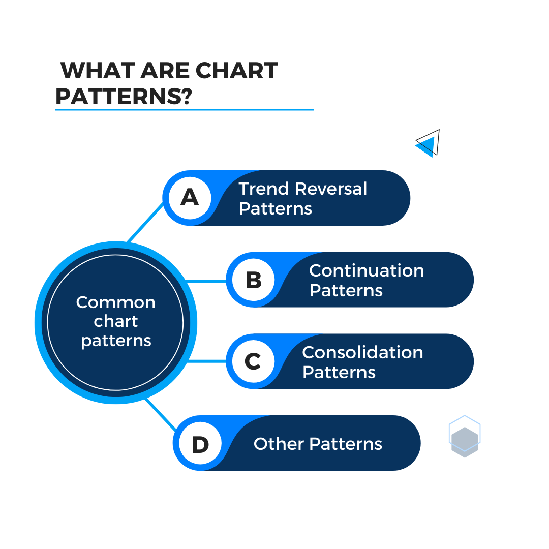
Chart patterns are recurring formations or configurations that appear on price charts of financial assets, such as stocks, currencies, commodities, and indices. These patterns are formed by the price movements of the asset over time and are used by technical analysts to identify potential future price movements. There are various types of chart patterns, each with its own characteristics and implications for future price action. Some common chart patterns include:
Chart patterns can be incredibly useful in options scalping for several reasons:
- Predictive Power:
Chart patterns can help traders predict the direction of price movements, which is crucial for making quick decisions in options scalping. Identifying reversal patterns (like head and shoulders, double tops/bottoms) and continuation patterns (like flags, pennants) can indicate when to enter or exit a trade.
- Timing:
Patterns can provide clear entry and exit points, which is essential in the fast-paced environment of scalping. Some patterns indicate periods of high volatility which scalpers can exploit for quick gains.
- Risk Management:
Patterns often suggest logical levels for stop-loss orders, helping manage risk effectively. They also provide targets for taking profits, ensuring a disciplined approach to trading.
- Market Sentiment:
Patterns reflect the underlying supply and demand dynamics, providing insight into market sentiment. Understanding common patterns can give insight into the psychology of other traders, allowing scalpers to anticipate market movements.
- Technical Indicators:
Chart patterns can be used alongside technical indicators (like moving averages, RSI, MACD) to confirm trading signals and increase the accuracy of trades.
- Flexibility:
Patterns can be applied across various time frames, making them versatile for scalping strategies that often rely on shorter time frames.
There are various types of chart patterns, each with its own characteristics and implications for future price action. Some common chart patterns include:
- Trend Reversal Patterns:
Trend reversal patterns are particularly useful in options scalping for several key reasons
- Reversal patterns help scalpers identify potential turning points in the market, allowing for early entry into a new trend. This can be crucial for capturing quick gains.
- Recognizing these patterns can also help avoid false breakouts and other traps that can lead to losses. Entering a trade at the start of a new trend can result in significant profits, especially in the short time frames that scalpers operate in.
- Reversal patterns often provide clear entry and exit points, allowing scalpers to maximize their reward-to-risk ratio. Reversal patterns offer logical points for setting stop-loss orders, typically just beyond the pattern’s boundaries, which helps in managing risk effectively.
- These patterns also provide predefined price targets based on the pattern’s height or depth, aiding in systematic profit-taking. Reversal patterns reflect shifts in market sentiment. Understanding these shifts can help scalpers anticipate and react to market changes swiftly.
- Recognizing changes in supply and demand through these patterns helps in making informed trading decisions. In volatile markets, trend reversal patterns can provide quick signals for scalping opportunities.
Types of Trend Reversal Patterns
- Head and Shoulders: Consists of three peaks, with the middle peak (the head) higher than the other two (the shoulders). It indicates a potential trend reversal from bullish to bearish.
- Inverse Head and Shoulders: Similar to the head and shoulders pattern but appears at the bottom of a downtrend, signaling a potential reversal from bearish to bullish.
- Double Top and Double Bottom: Two consecutive peaks or troughs, respectively, indicating a potential trend reversal.
- Continuation Patterns:
- Continuation patterns are highly valuable in options scalping because they signal that the current trend is likely to continue, allowing traders to capitalize on the momentum.
- Continuation patterns indicate that the prevailing trend is still strong and likely to persist, giving scalpers confidence to enter trades in the direction of the trend.
- By confirming the trend, these patterns reduce uncertainty and help avoid counter-trend trades, which can be riskier. They provide clear entry points, usually as the price breaks out of the pattern. This helps scalpers enter trades at optimal moments to maximize potential profits.
- Defined exit points can be established based on the pattern’s characteristics, aiding in disciplined profit-taking.
- Continuation patterns offer logical areas for placing stop-loss orders, typically below the pattern in an uptrend or above it in a downtrend, helping to manage risk effectively.
- Trading in the direction of the established trend reduces the likelihood of being caught in false breakouts or fakeouts.
- Continuation patterns often form over shorter time frames, allowing scalpers to make quick, informed decisions. These patterns align with the short holding periods typical of scalping, as they indicate immediate trend continuation.
- Continuation patterns reflect market participants’ confidence in the ongoing trend, providing insight into market sentiment. They indicate ongoing supply and demand dynamics, helping scalpers understand the market context better.
Types of Continuation Patterns
- Flags and Pennants: Consist of a short-term consolidation period after a strong price move. Flags are rectangular-shaped, while pennants are triangular. These patterns suggest that the previous trend is likely to continue after the consolidation.
- Symmetrical Triangle: Formed by converging trend lines, indicating a period of indecision in the market before a potential continuation of the previous trend.
- Ascending and Descending Triangles: Triangular patterns with horizontal and ascending or descending trend lines, respectively. They suggest potential bullish or bearish continuations.
- Consolidation Patterns:
- Consolidation patterns are periods where the price of an asset moves within a narrow range, reflecting a balance between buyers and sellers.
- Consolidation periods often precede significant breakouts, either upward or downward. Scalpers can prepare to enter trades in the direction of the breakout to capitalize on the subsequent movement. Breakouts from consolidation patterns usually come with increased momentum, providing quick and substantial price moves ideal for scalping.
- Consolidation patterns offer clear support and resistance levels, allowing scalpers to place tight stop-losses just outside these boundaries, minimizing risk. The well-defined range helps in setting precise entry and exit points, making risk management more straightforward.
- Post-consolidation, the market often experiences a surge in volatility. Scalpers can exploit this volatility for quick profits. Scalping the consolidation range itself can also be profitable if the price repeatedly bounces between support and resistance levels.
- Consolidation indicates market indecision, where neither buyers nor sellers have the upper hand. Understanding this sentiment helps scalpers anticipate significant moves once a breakout occurs.
- These patterns often signify transitions between market phases, giving scalpers insights into potential trend changes or continuations.
Types of Consolidation Pattern
- Rectangles: Formed by parallel horizontal trend lines, indicating a period of consolidation or indecision in the market.
- Wedges: Similar to triangles but with trend lines that are not parallel. Rising wedges have narrowing price ranges, while falling wedges have widening price ranges.
- Other Patterns:
- Cup and Handle: Consists of a rounded bottom (cup) followed by a smaller consolidation (handle), indicating a potential bullish continuation.
- Rounding Bottom and Top: Rounded price formations that indicate potential trend reversals.
Chart patterns are subjective to some extent, and their interpretation can vary among traders. They are often used in conjunction with other technical analysis tools, such as indicators and volume analysis, to confirm signals and make informed trading decisions.
11.2.What are candlestick chart patterns??
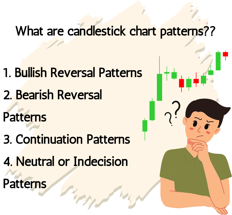
Candlestick chart patterns are specific formations of candlestick shapes and arrangements that appear on price charts. Candlestick charts provide visual representations of price movements over a specific time period (such as minutes, hours, days, or weeks). Each candlestick represents the open, high, low, and close prices for that period.

Here are some common candlestick chart patterns:
- Bullish Reversal Patterns:
- Bullish Engulfing: Occurs when a large bullish candlestick completely engulfs the previous bearish candlestick, suggesting a potential reversal from bearish to bullish sentiment.
- Hammer: Characterized by a small body with a long lower shadow and little to no upper shadow, indicating a potential reversal from a downtrend to an uptrend.
- Bullish Harami: Consists of a small bearish candlestick contained within the previous larger bullish candlestick, indicating a potential reversal.
- Bearish Reversal Patterns:
Bearish reversal patterns are crucial for options scalpers as they signal the potential end of an uptrend and the beginning of a downtrend. Recognizing these patterns allows scalpers to capitalize on downward price movements.
- Bearish Engulfing: The opposite of bullish engulfing, where a large bearish candlestick completely engulfs the previous bullish candlestick, signaling a potential reversal from bullish to bearish sentiment.
- Shooting Star: Similar to a hammer but occurs at the top of an uptrend, indicating potential exhaustion and a reversal to a downtrend.
- Bearish Harami: The opposite of bullish harami, consisting of a small bullish candlestick contained within the previous larger bearish candlestick, suggesting a potential reversal.
- Continuation Patterns:
Continuation patterns are crucial in options scalping because they signal that the current trend is likely to persist. This helps scalpers take advantage of ongoing momentum.
- Bullish/Bearish Flags: Consist of a short-term consolidation phase after a strong price move, forming a rectangular-shaped pattern. A bullish flag occurs during an uptrend, while a bearish flag appears in a downtrend.
- Bullish/Bearish Pennants: Similar to flags but with converging trend lines, forming a triangular shape.
- Neutral or Indecision Patterns:
Neutral or indecision patterns are essential in options scalping as they signal periods of market indecision where the direction of the next move is uncertain. These patterns indicate a balance between buyers and sellers and often precede significant price moves. Recognizing these patterns can help scalpers avoid entering trades prematurely and prepare for potential breakouts.
- Doji: Occurs when the open and close prices are virtually the same, resulting in a small body with upper and lower shadows. Doji candles suggest indecision in the market and can signal potential reversals or continuations depending on their context.
5. Other Patterns:
- Morning Star: Consists of three candlesticks – a large bearish candlestick, followed by a small-bodied candlestick (or a doji) indicating indecision, and finally, a large bullish candlestick. It signals a potential reversal from bearish to bullish.
- Evening Star: The opposite of the morning star pattern, indicating a potential reversal from bullish to bearish sentiment
11.3. Key Indicators of Chart patterns
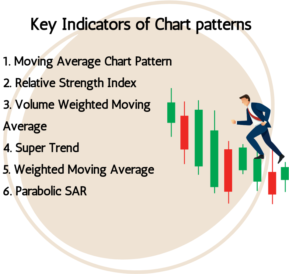
1. Moving Average Chart Pattern

Moving averages are not typically considered chart patterns in the same way that candlestick formations are. Instead, moving averages are technical indicators used to smooth out price data over a specified period and help identify trends.
However, moving averages can be part of certain chart patterns or used in conjunction with them to confirm signals. Here are some examples:
- Trend Confirmation:
- Moving Average Crossovers: When a short-term moving average crosses above a long-term moving average (e.g., a 50-day crossing above a 200-day moving average), it can signal the beginning of an uptrend. Conversely, when the short-term moving average crosses below the long-term moving average, it can indicate the start of a downtrend.
- Support and Resistance:
- Bounce Off Moving Averages: Prices often bounce off moving averages, especially those with significant psychological or technical significance, such as the 50-day or 200-day moving averages. When prices approach these moving averages, traders may look for signs of support or resistance to anticipate potential reversals or continuations.
- Trend Strength:
- Slope of Moving Averages: The slope of a moving average can provide insights into the strength of the trend. A steeply rising moving average indicates a strong uptrend, while a steeply declining moving average suggests a strong downtrend. Conversely, a flat or sideways-moving average may indicate consolidation or a weakening trend.
While moving averages themselves are not chart patterns, they are versatile tools that can complement various chart patterns by providing additional confirmation or context. Traders often use moving averages in conjunction with other technical analysis techniques to make more informed trading decisions.
2. Relative Strength Index

The Relative Strength Index (RSI) is a popular momentum oscillator used in technical analysis to measure the speed and change of price movements. Developed by J. Welles Wilder, the RSI is calculated using the average gain and average loss over a specified period (usually 14 periods), and it oscillates between 0 and 100.
Here’s how the RSI is typically interpreted and used:
Overbought and Oversold Conditions:
- When the RSI value exceeds 70, it is considered overbought, suggesting that the asset may be due for a pullback or reversal.
- Conversely, when the RSI falls below 30, it is considered oversold, indicating that the asset may be undervalued and due for a bounce or reversal.
Trend Confirmation:
- RSI Divergence: Divergence between the RSI and price movements can signal potential trend reversals. Bullish divergence occurs when the price makes lower lows, but the RSI makes higher lows, suggesting weakening bearish momentum. Conversely, bearish divergence occurs when the price makes higher highs, but the RSI makes lower highs, indicating weakening bullish momentum.
Trend Strength:
- RSI Range: The RSI’s position within its range can provide insights into the strength of the trend. In strong uptrends, the RSI tends to remain in the upper range (above 50), while in strong downtrends, it tends to stay in the lower range (below 50). A move above 50 from below or below 50 from above can signal a potential change in trend momentum.
Trading Signals:
- Overbought/Oversold Reversals: Traders may look for RSI readings above 70 for potential shorting opportunities and readings below 30 for potential buying opportunities.
- Bullish and Bearish RSI Crosses: Crosses of the RSI above or below specific levels (e.g., 50) can be used as trading signals. For example, a bullish cross above 50 may signal a shift from bearish to bullish momentum, while a bearish cross below 50 may indicate a shift from bullish to bearish momentum.
Confirmation with Other Indicators:
- RSI can be used in conjunction with other technical indicators, such as moving averages or volume analysis, to confirm trading signals and assess overall market conditions.
- The Relative Strength Index is a versatile tool that can be applied to various trading strategies and timeframes. However, like all technical indicators, it should be used in conjunction with other analysis techniques and risk management practices for optimal results.
3. Volume Weighted Moving Average

The Volume Weighted Moving Average (VWMA) is a technical indicator that combines price and volume data to provide a more accurate representation of average prices over a specified period. Unlike traditional moving averages, which give equal weight to each price data point, VWMA assigns more weight to periods with higher trading volume.
Here’s how the Volume Weighted Moving Average is calculated and used:
- Calculation:
For each period, the VWMA is calculated by multiplying the price for that period by the corresponding volume and then dividing the sum of these values by the total volume for the period. Mathematically, it can be represented as:
VWMA=∑(Price𝑖×Volume𝑖)∑Volume𝑖
The VWMA is typically calculated over a specific lookback period, such as 10, 20, or 50 periods.
Interpretation:
- Trend Identification: Similar to other moving averages, VWMA is used to identify trends in the price of an asset. When the VWMA is sloping upward, it indicates a bullish trend, while a downward slope suggests a bearish trend.
- Volume Confirmation: Because VWMA considers volume in its calculation, it provides additional confirmation of price movements. An increase in VWMA accompanied by higher volume suggests strong buying or selling pressure, reinforcing the significance of the price move.
- Support and Resistance: VWMA can act as dynamic support or resistance levels, particularly during trending markets. Traders may use VWMA to identify potential entry or exit points based on price interactions with the VWMA line.
Trading Strategies:
- Trend Following: Traders may use VWMA crossovers as signals to enter or exit trades in the direction of the trend. For example, a bullish crossover of the price above the VWMA may signal a buy opportunity, while a bearish crossover may signal a sell opportunity.
- Volume Confirmation: Traders may look for price moves accompanied by increasing VWMA and volume to confirm the strength of the trend. Conversely, decreasing VWMA and volume may indicate weakening momentum and potential trend reversals.
Adjusting Sensitivity:
- Like other moving averages, the sensitivity of VWMA can be adjusted by changing the lookback period. Shorter lookback periods result in more responsive VWMA lines that closely track recent price and volume movements, while longer lookback periods produce smoother lines that are less sensitive to short-term fluctuations.
- Overall, the Volume Weighted Moving Average is a valuable tool for traders seeking to incorporate volume analysis into their technical analysis toolkit. It provides insights into price trends, support and resistance levels, and the strength of price movements, helping traders make more informed trading decisions.
4. Super Trend
The SuperTrend indicator is a popular technical analysis tool used to identify trends and potential trend reversals in financial markets. It helps traders determine the direction of the prevailing trend and provides entry and exit signals based on price action.
Here’s how the SuperTrend indicator works:
- Calculation:
- SuperTrend is based on two main parameters: the period (usually set to 7 or 10) and the multiplier (typically set to 3 or 2). These parameters can be adjusted based on the trader’s preferences and the characteristics of the market being analysed.
The SuperTrend indicator is calculated in two steps:
True Range (TR): The true range measures the volatility of the market and is the greater of the following:
- Current high minus the current low
- Absolute value of the current high minus the previous close
- Absolute value of the current low minus the previous close
Basic Upper Band (UB) and Basic Lower Band (LB):
- The basic upper band (UB) is calculated by subtracting the product of the true range and the multiplier from the high price.
- The basic lower band (LB) is calculated by adding the product of the true range and the multiplier to the low price.
Finally, the SuperTrend value is determined:
- For uptrends, the SuperTrend value is the basic upper band.
- For downtrends, the SuperTrend value is the basic lower band.
Interpretation:
- Trend Identification: When the price is above the SuperTrend line, it suggests an uptrend, while a price below the SuperTrend line indicates a downtrend.
- Signal Generation: SuperTrend can generate buy signals when the price closes above the SuperTrend line and sell signals when the price closes below the SuperTrend line. These signals help traders enter and exit positions in the direction of the prevailing trend.
Adjustment:
- The sensitivity of the SuperTrend indicator can be adjusted by changing the period and multiplier parameters. Shorter periods and higher multipliers result in more responsive SuperTrend lines that closely track price movements, while longer periods and lower multipliers produce smoother lines that are less sensitive to short-term fluctuations.
Risk Management:
- Traders often use SuperTrend as part of their risk management strategy by placing stop-loss orders based on the SuperTrend line. For long positions, the stop-loss can be placed below the SuperTrend line, while for short positions, it can be placed above the SuperTrend line.
- The SuperTrend indicator is a versatile tool that can be used on various timeframes and in different markets. However, like any technical indicator, it should be used in conjunction with other analysis techniques and risk management practices for optimal results.
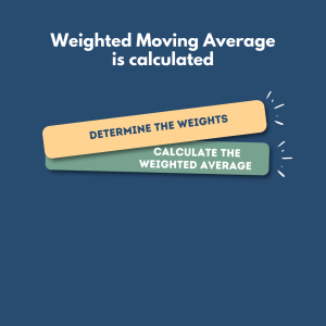
5. Weighted Moving Average
A Weighted Moving Average (WMA) is a type of moving average that assigns different weights to each data point within the calculation period. Unlike simple moving averages (SMA), where all data points are equally weighted, WMAs give more weight to recent data points, making them more responsive to recent price movements.
Here’s how a Weighted Moving Average is calculated:
- Determine the Weights: The weights assigned to each data point depend on the chosen period. Typically, the weights are assigned in such a way that recent data points have higher weights, while older data points have lower weights. The sum of the weights usually equals the period length.
- Calculate the Weighted Average: For each data point within the calculation period:
- Multiply the price of each data point by its corresponding weight.
- Sum up the products obtained in the previous step.
- Divide the sum by the total number of weights.
Mathematically, the formula for calculating a Weighted Moving Average (WMA) is:
𝑊𝑀𝐴=(𝑃1×𝑤1)+(𝑃2×𝑤2)+…+(𝑃𝑛×𝑤𝑛)𝑤1+𝑤2+…+𝑤𝑛WMA=w1+w2+…+wn(P1×w1)+(P2×w2)+…+(Pn×wn)
- Where:
- 𝑃1,2,…,𝑃𝑛P1,P2,…,Pn are the prices of the data points within the calculation period.
- 𝑤1,2,…,𝑤𝑛w1,w2,…,wn are the weights assigned to each data point.
- 𝑛n is the number of data points within the calculation period.
Interpretation:
- Weighted Moving Averages are more responsive to recent price movements compared to simple moving averages. Therefore, they tend to react more quickly to changes in the trend direction.
- The specific weights assigned to each data point can vary depending on the trader’s preferences and the characteristics of the market being analysed.
- Traders often use Weighted Moving Averages in conjunction with other technical indicators or as part of a broader trading strategy to identify trends, potential entry or exit points, and to smooth out price fluctuations.
Risk Management:
- Weighted Moving Averages can also be used for risk management purposes. Traders may use WMAs as dynamic support or resistance levels, placing stop-loss orders accordingly to manage risk.
- Weighted Moving Averages are just one type of moving average among many others, each with its own characteristics and applications in technical analysis. They are versatile tools that can be adapted to different trading styles and timeframes.
6. Parabolic SAR
The Parabolic SAR (Stop and Reverse) is a technical indicator primarily used to identify potential reversals in the direction of price movements. It was developed by J. Welles Wilder and is particularly popular among trend-following traders. The Parabolic SAR appears as a series of dots either above or below price candles, depending on the direction of the trend.
Here’s how the Parabolic SAR works:
Calculation:
The Parabolic SAR is calculated based on the previous period’s SAR value and the acceleration factor (AF). The AF typically starts at a small value (e.g., 0.02) and increases each period (e.g., by 0.02) up to a maximum value (e.g., 0.20).
The formula for calculating the SAR is iterative and depends on whether the current trend is up or down:
- For uptrends, the SAR value is calculated using the formula: SARup=Prior SAR+Prior AF×(Prior EP−Prior SAR)
- For downtrends, the SAR value is calculated using the formula: SARdown=Prior SAR−Prior AF×(Prior SAR−Prior EP)
- EP (Extreme Point) is the highest high (in an uptrend) or lowest low (in a downtrend) observed during the current trend.
Interpretation:
- Trend Direction: The Parabolic SAR dots appear below price candles during uptrends and above price candles during downtrends. When the dots switch sides, it suggests a potential trend reversal.
- Entry and Exit Signals: Traders use the Parabolic SAR to generate entry and exit signals. For example, when the SAR dots are below price candles, it’s considered a buy signal, and traders may enter long positions. Conversely, when the SAR dots are above price candles, it’s considered a sell signal, and traders may enter short positions.
- Trailing Stop: The Parabolic SAR also serves as a trailing stop-loss mechanism. As the trend progresses, the SAR dots move closer to price candles, providing a dynamic stop-loss level that adjusts with the trend.
- Adjustment:
- Traders can adjust the acceleration factor (AF) to control the sensitivity of the Parabolic SAR indicator. A smaller AF value makes the SAR more sensitive to price movements but may result in more whipsaws, while a larger AF value makes the SAR less sensitive but may lag behind price movements.
Risk Management:
- Traders often use the Parabolic SAR as a dynamic stop-loss level to manage risk. For long positions, the SAR dots serve as a trailing stop below price candles, while for short positions, they act as a trailing stop above price candles.
- Overall, the Parabolic SAR is a versatile indicator that helps traders identify trends, potential reversal points, and manage risk effectively. However, like any technical indicator, it should be used in conjunction with other analysis techniques and risk management practices for optimal results.
Key takeaways
- Chart patterns are recurring formations or configurations that appear on price charts of financial assets, such as stocks, currencies, commodities, and indices.
- Candlestick chart patterns are specific formations of candlestick shapes and arrangements that appear on price charts.
- Moving averages are not typically considered chart patterns in the same way that candlestick formations are. Instead, moving averages are technical indicators used to smooth out price data over a specified period and help identify trends.
- The Relative Strength Index (RSI) is a popular momentum oscillator used in technical analysis to measure the speed and change of price movements. Developed by J. Welles Wilder, the RSI is calculated using the average gain and average loss over a specified period (usually 14 periods), and it oscillates between 0 and 100.
- A Weighted Moving Average (WMA) is a type of moving average that assigns different weights to each data point within the calculation period. Unlike simple moving averages (SMA), where all data points are equally weighted, WMAs give more weight to recent data points, making them more responsive to recent price movements.
- The Parabolic SAR (Stop and Reverse) is a technical indicator primarily used to identify potential reversals in the direction of price movements. It was developed by J. Welles Wilder and is particularly popular among trend-following traders